


I get called in a lot after the paint is already ordered, and by then the interesting decisions are gone. The truth about curb appeal is that the shell in front of you — the massing, the roof pitch, the window rhythm, the porch depth — was set by whoever drew the original plan, and a good exterior renovation works with that geometry instead of fighting it. Here are nine directions I sketched for a single classic American house: same footprint, same porch, same window openings, nine very different faces. Every one of them started with the same question — what did the original drafter give me to work with?
How I Read an Exterior Before I Touch It
Before I pick a single color, I read the house the way I'd read a set of construction documents. Where does the roof plane change? Is that a load-bearing porch or a cosmetic one? Which openings are original and which got cut in later and never lined up with anything? On this classic American form — center door, symmetrical windows, full-width porch, gable roof — the drafter handed us a disciplined grid. That grid is the reason all nine of these schemes read as intentional rather than busy: the bones are doing half the work before the finishes arrive.
The other thing I do is separate framing-stage decisions from finish-stage decisions. Siding, paint, shutters, hardware, and planting are all finish-stage — reversible, relatively affordable, and where 90% of curb appeal actually lives. Structural moves (adding a dormer, deepening the porch, changing the roofline) are framing-stage and cost an order of magnitude more. None of the nine schemes below touch the structure, which is exactly why they're achievable. If you want more of this thinking across different house styles, my full library of exterior renovation walkthroughs works the same way — read the plan, then renovate with intent.
1. Coastal Navy & White Revival
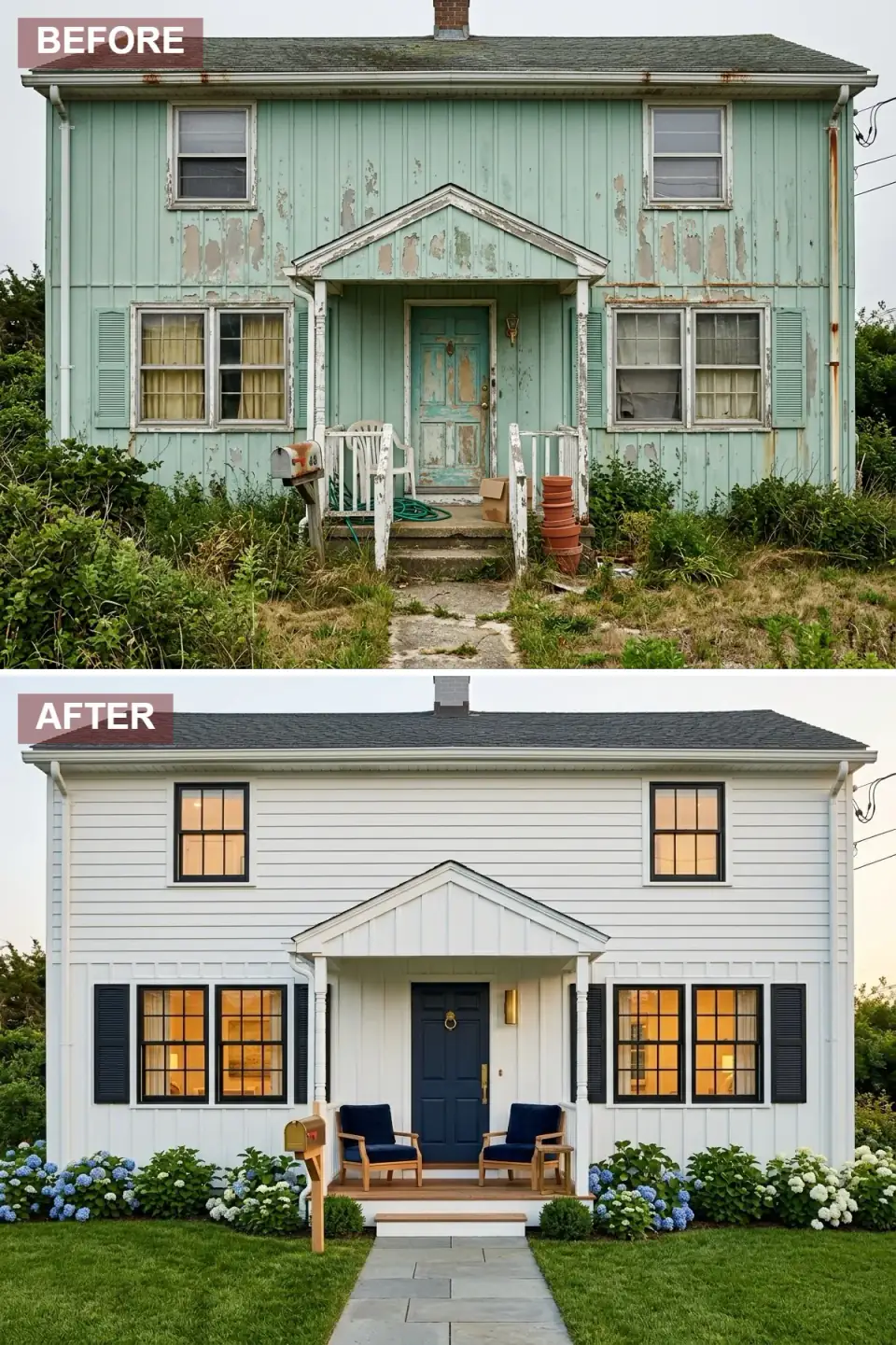
The failing mint siding comes off and crisp white clapboard goes on, topped with a charcoal architectural shingle roof for depth. Windows get black frames and black louvered shutters that echo the deep navy front door and its brass knocker. The porch is rebuilt with tailored white railings and dressed with teak lounge chairs and navy cushions. Bluestone pavers, a manicured lawn, and symmetric hydrangea beds finish the approach, with a brass mailbox on a natural wood post and a brass sconce warming the entry.
What makes this work structurally is that the porch was already full-width and centered — so the symmetry reads as designed, not forced. If I were speccing this in Beacon or Cold Spring, I'd run James Hardie ColorPlus in Arctic White for the clapboard so the white never needs repainting, and reserve a true marine-grade paint for the door. The one thing to verify before you commit to black shutters: they only look right on a house whose window openings are already balanced. On a lopsided facade they magnify the flaw.
Color Palette
White
#F7F7F2
Close to Benjamin Moore Chantilly Lace — a clean, slightly warm white that reads bright without going blue in coastal light.
Navy Blue
#1A2B4A
A Hale Navy–adjacent door color that anchors the entry with nautical weight against all that white.
Black
#0F0F0F
Tricorn Black on the window frames, shutters, and roof shingles for sharp architectural contrast.
Brass
#C5A059
Unlacquered brass on the knocker, sconce, and mailbox — it patinas over time and warms the cool palette.
2. Moody Midnight Modern
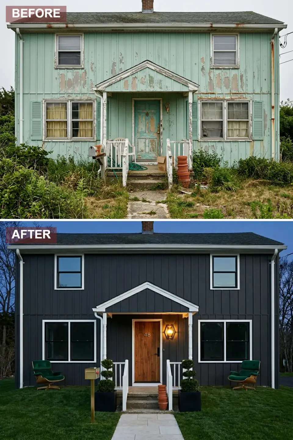
Here the house is cloaked in dark charcoal vertical siding, with crisp white trim carving out the geometry of every opening. A vertical-grain wood door with modern numerals brings organic warmth against the shadowed field. Sculptural topiaries sit in matte black planters, a pair of emerald velvet lounge chairs land on the lawn for drama, and a geometric brass sconce throws a honeyed glow at the entry. A sleek brass mailbox replaces the rusted original, and a clean concrete walkway keeps the ground plane quiet.
Dark siding is the single most transformative — and most unforgiving — move on this list. It absorbs light, which means every wave in the wall plane shows. That's why I'd only run charcoal on a house I know is straight, and I'd spec LP SmartSide or Hardie in a factory ColorPlus dark rather than field-painting, because a dark field paint fades fast in Northeast sun and telegraphs every seam. Vertical siding also reads as a deliberate departure from the original horizontal clapboard, so it needs the white trim to re-establish the traditional window grid — otherwise the eye loses the plan's rhythm entirely.
Color Palette
Charcoal
#2E3639
A Kendall Charcoal–to–Iron Ore range: deep matte siding that turns the facade into a contemporary canvas.
White
#FFFFFF
High-Reflective White trim outlining windows and the porch gable for graphic definition.
Walnut
#6B4E3D
A rift-cut walnut or thermally-modified wood door, sealed with Rubio Monocoat to keep the grain reading.
Brass
#D4AF37
Mailbox and sconce finishes delivering a targeted glow against the dark field.
3. Scandinavian Minimalist Haven
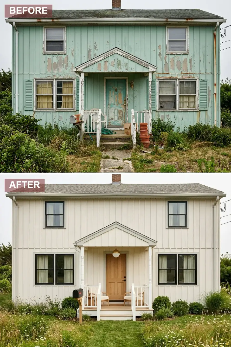
This scheme washes the house in understated off-white board-and-batten, giving the facade a quiet vertical rhythm. Thin-mullion black windows replace the yellowed originals, and a pale oak door holds the serene palette. A suspended globe pendant swaps in for wall sconces, and inside the white railings sit two pale-wood chairs with natural linen cushions. The landscape trades formal hedges for a meadow of native grasses, rounded boxwoods, and wildflowers, with a black mailbox on an oak post and lush grass running to the steps.
Board-and-batten is a smart move on this plan because the vertical battens visually lift a low, wide facade — a trick the original drafter could have used and didn't. The restraint here is the discipline: one warm white, one wood tone, one black accent, and nothing else. On the landscaping, I love that it goes native. In the Hudson Valley a meadow-style front yard of little bluestem and switchgrass survives our winters, cuts irrigation to near zero, and reads far more current than a clipped foundation hedge that needs shearing four times a season.
Color Palette
Off-White
#E8E3D5
A White Duck–style greige board-and-batten that feels organic and light without going stark.
Natural Oak
#D4C4A8
White-oak door and furniture tones keeping the palette grounded and natural.
Black
#1A1A1A
Marvin or Andersen black-clad window frames and mailbox for precise modern contrast.
Beige
#E5DCCF
Undyed linen porch textiles that reinforce the calm, textural mood.
4. Regal Navy & Emerald Formality
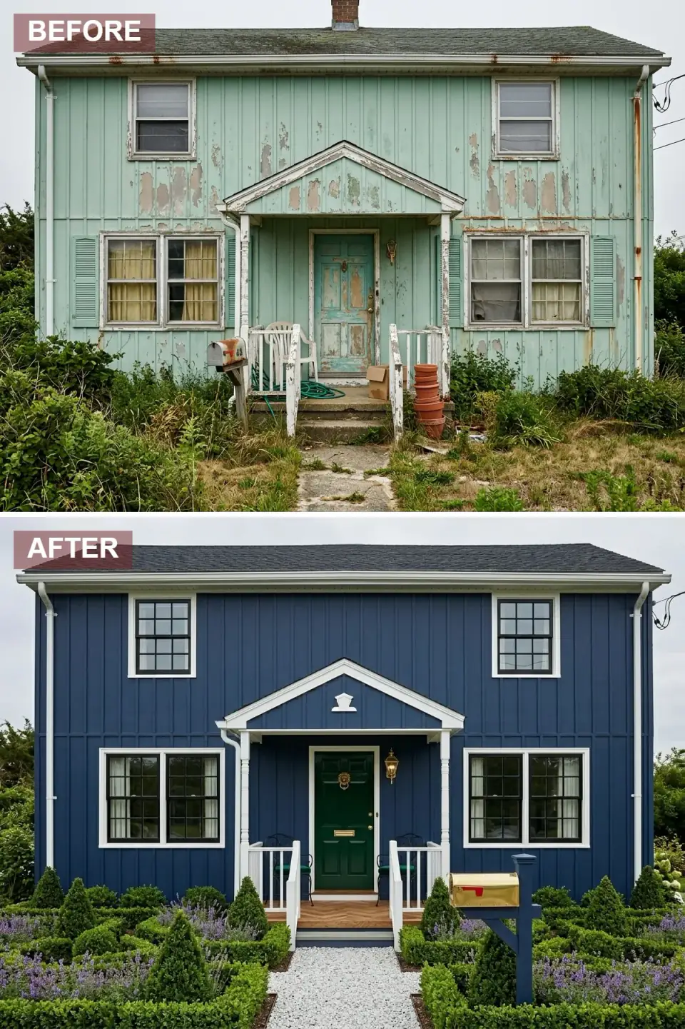
This is the most formal reading of the house: stately navy clapboard, bright white trim framing every opening, and a hunter green paneled door with a brass lion-head knocker as the jewel-box centerpiece. White railings and posts hold the classical order, while boxwood parterres, cone-shaped evergreens, and lavender rows create a controlled, almost ceremonial approach. A white gable ornament adds colonial pedigree, a brass mailbox rides a matching navy post, and brass lantern sconces flank the door in strict symmetry, with a white-gravel path edged in brick.
Formality is the one style that lives or dies on the plan's symmetry, and this facade earns it — the door is genuinely centered and the windows genuinely balance. That's not always true; plenty of "colonial" houses got a window added off-axis during some 1980s kitchen bump-out, and no amount of boxwood fixes that. The navy-and-green pairing is the sophisticated part: two dark saturated colors that most people would never combine, held apart by white trim. If you want to see how far a traditional facade can go, my colonial exterior transformations walk through the same discipline at length.
Color Palette
Navy Blue
#2B3A55
A Naval SW 6244–style siding color carrying heritage and depth across the whole facade.
Hunter Green
#1B4D2E
A jewel-toned door — think Forest Green–adjacent — offering a sophisticated surprise against the blue.
White
#F5F5F5
Pure White casements, trim, and railings providing sharp, formal delineation.
Brass
#B8973D
Hardware, mailbox, and lantern finishes reinforcing traditional elegance.
5. Warm Organic Modern
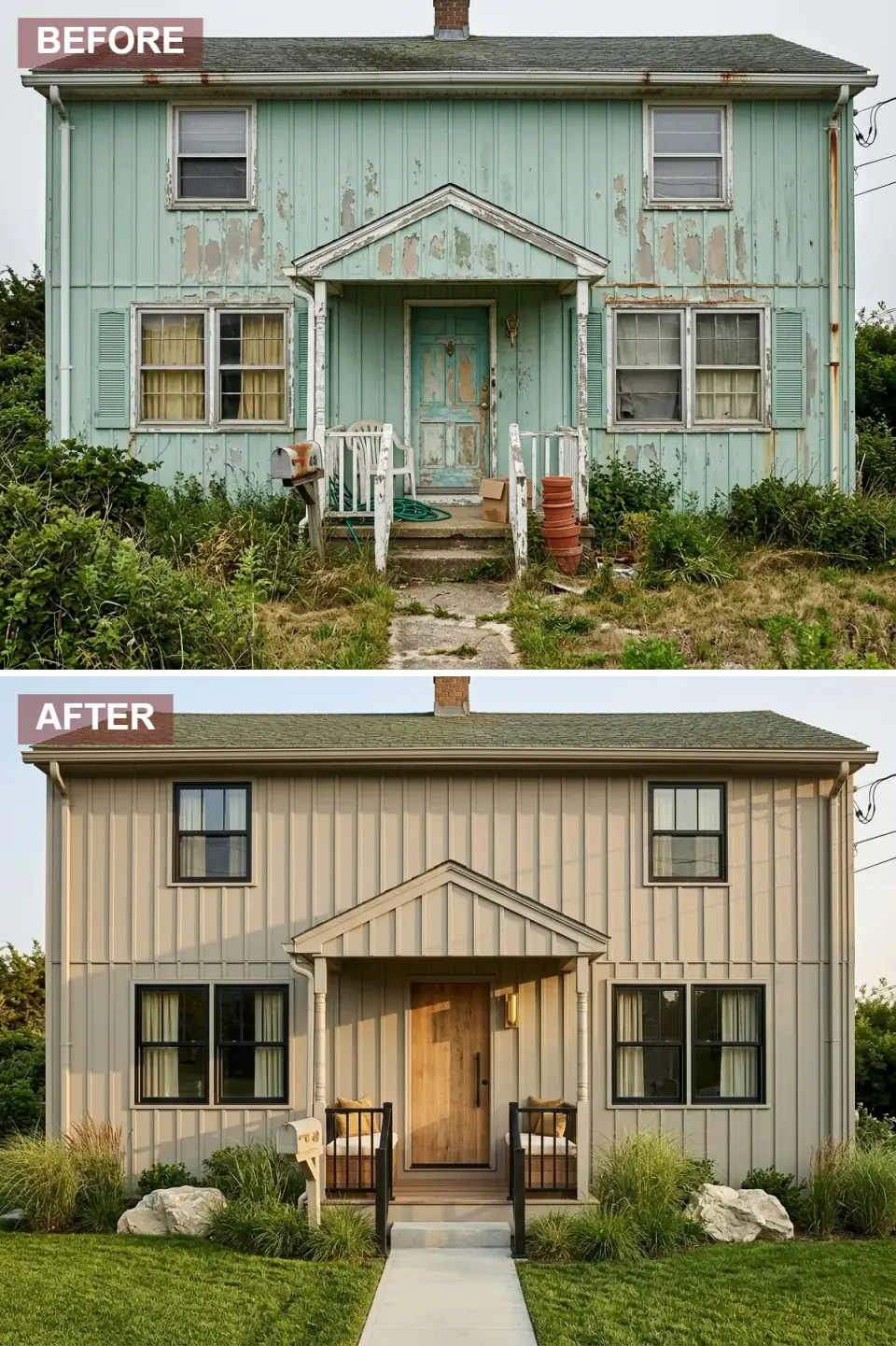
This version re-clads the house in warm taupe vertical board-and-batten that echoes natural stone. Black window frames continue the modern thread, and a wide-plank wood door with a vertical pull handle reads distinctly contemporary. The porch keeps white columns but switches to matte black railings — a deliberate mixed-finish move — with textured lounge chairs on the deck. The front yard is sculpted with tall ornamental grasses, large white limestone boulders, and minimal shrubs, finished with a brushed brass mailbox and a clean poured-concrete path.
The clever detail here is the mixed-finish railing: white posts, black rails. That's the kind of thing that looks like a mistake until you realize it's intentional, and it only works because the two finishes each connect to something else on the facade — white to the trim, black to the windows. Taupe is the quiet hero. It's a genuinely hard color to get right; too pink and it goes Pepto, too gray and it goes cold. I'd sample Balanced Beige or Accessible Beige on the actual north and south walls before ordering, because a taupe that looks perfect at the paint counter can shift dramatically in Hudson Valley overcast versus golden hour.
Color Palette
Taupe
#B0A898
A Balanced Beige–range vertical siding that bridges beige and gray with earthy depth.
Walnut
#8B6F5C
Rich door and furniture wood bringing organic warmth to the modern shell.
Black
#222222
Tricorn Black window frames and railings adding graphic weight and a contemporary edge.
Off-White
#E0DCD4
Boulder and concrete tones providing quiet, natural contrast at the ground plane.
6. Japanese-Inspired Zen Retreat
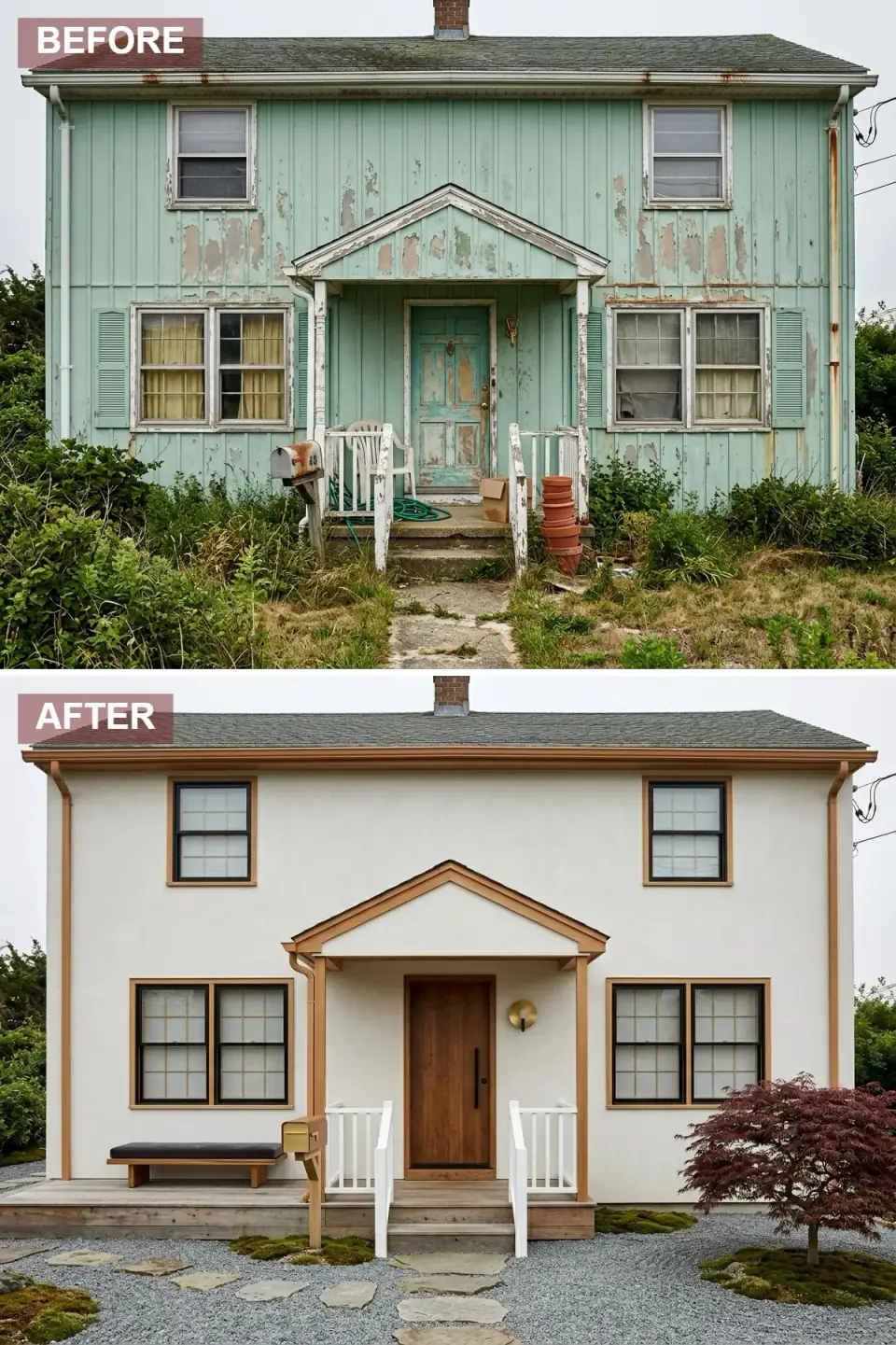
Here the facade is smoothed to a cream field with warm caramel-toned trim wrapping every window, corner, and the entire porch gable. A minimalist walnut slab door sits within the white-trimmed porch, and the deck extends left to integrate a floating bench with a black cushion. The lawn gives way to a raked gravel garden with large irregular flagstones, moss islands, and a sculptural Japanese maple. A brass disc sconce casts soft indirect light, and a brass mailbox on a pale-wood post stands at the garden's edge.
The move I'd flag to any homeowner here is the built-in bench that extends the porch deck. That's the one genuinely architectural gesture in the scheme, and it's the kind of thing you want drawn before the porch framing goes in — retrofitting an integrated bench later means opening up decking and blocking that a framer would rather do once. Everything else is finish-stage and reversible. The Japanese maple as a single specimen is exactly right for this house's scale; a mature Acer palmatum 'Bloodgood' handles Zone 5b Hudson Valley winters and gives you living sculpture instead of a fussy foundation bed.
Color Palette
Cream
#F0EBE1
An Alabaster-range smooth facade finish creating a serene, gallery-like canvas.
Caramel
#C49A6C
Cedar or accoya trim on the windows and gable, introducing warm joinery tones.
Walnut
#6E4C3D
Door and bench wood grounding the design in natural materiality.
Black
#333333
Bench cushion and door hardware adding quiet, precise punctuation.
7. Classic New England Coastal
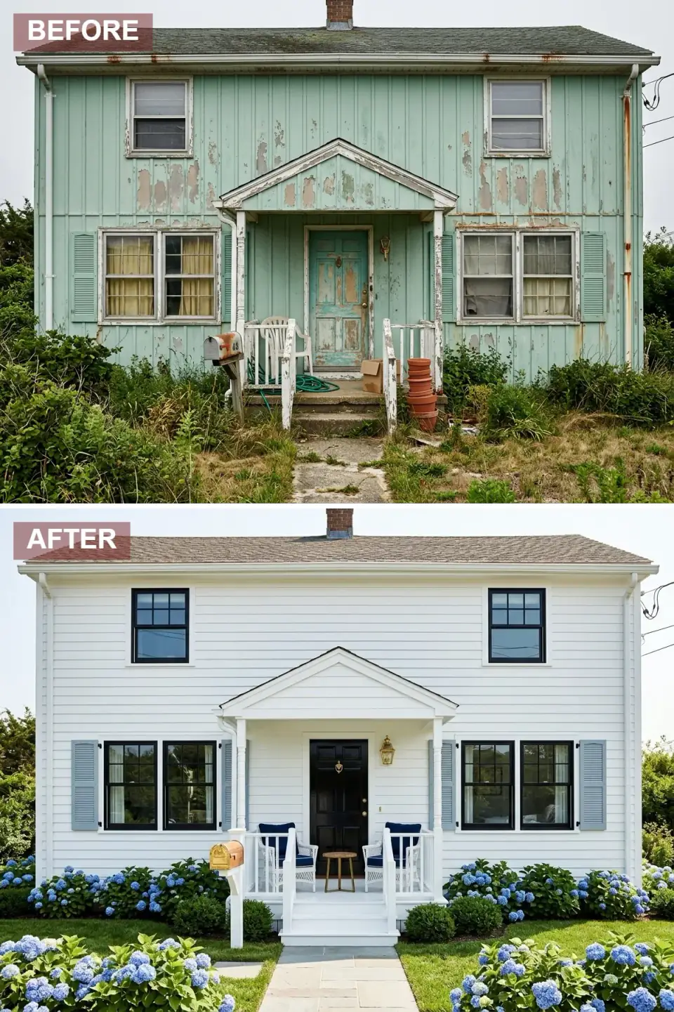
This is the house returned to its regional roots: bright white clapboard, soft gray louvered shutters, and a glossy black front door with a brass knocker. Black window frames with true six-over-six grids restore the historical read. The porch hosts white wicker armchairs with navy cushions and a small round table for seaside leisure. Brass lanterns and a brass mailbox on a white post carry the maritime metal theme, while symmetric blue hydrangeas line the foundation, paired with manicured lawn, bluestone pavers, and boxwood spheres for evergreen structure.
This is the most historically literate of the nine, and the six-over-six window grid is why. That muntin pattern is the tell of the period this house is imitating; run a single flat modern sash instead and the whole colonial pretense collapses. I'd spec simulated divided lites with a spacer bar rather than snap-in grilles — they hold the shadow line that makes the grid read as real from the curb. This scheme travels beautifully from Portland, Maine down through the Connecticut shoreline, and it's a close cousin to the approach in my cottage exterior makeover styles breakdown.
Color Palette
White
#FDFDFD
A Simply White clapboard evoking classic Cape Cod and coastal-cottage tradition.
Black
#0D0D0D
Glossy Onyx door and window frames for timeless, high-contrast punctuation.
Gray
#9BA3A8
A Coventry Gray shutter tone bridging the white siding and dark accents with coastal subtlety.
Periwinkle Blue
#6B8FC4
Foundation planting color echoing the porch cushions and reinforcing regional charm.
8. Desert Modern Oasis
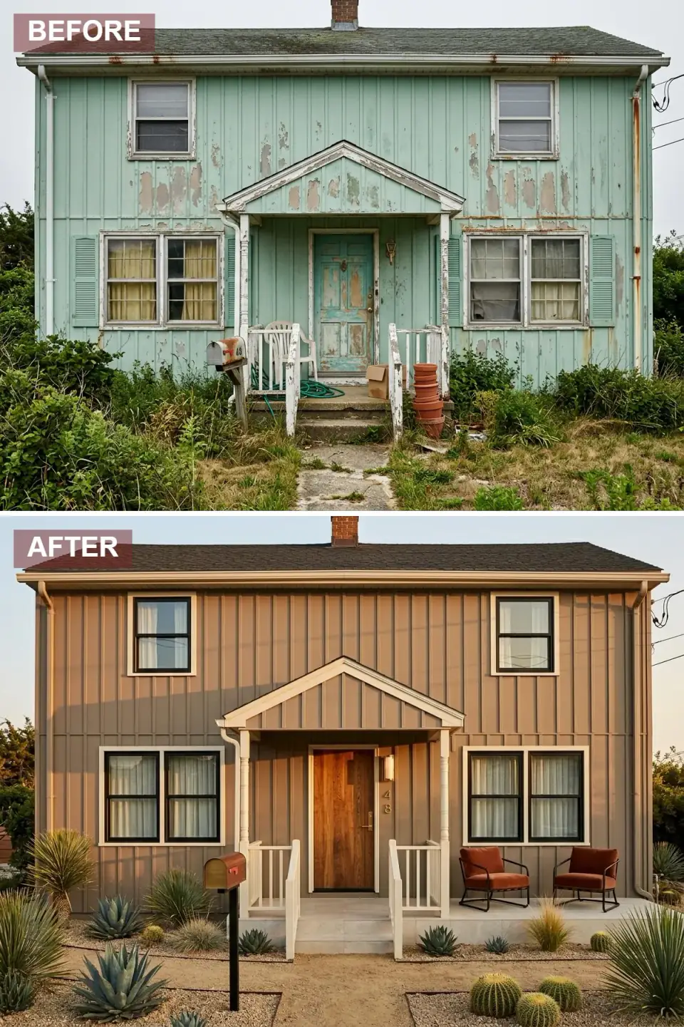
This reading wraps the facade in warm sand-toned vertical siding that resonates with an arid landscape. White trim outlines the windows and porch, and a natural wood door with house numbers adds warmth. The yard is fully xeriscaped: golden gravel, desert sand, agave, barrel cacti, yucca, and spiky grasses replace the weedy lawn. Rust-colored upholstered chairs on black metal frames sit on the porch, picking up the terracotta mailbox, and a poured-concrete path stays simple. The whole composition glows in golden-hour light.
Now, honesty from a Northeast designer: a true xeriscape belongs in the Southwest, not the Hudson Valley — agave and barrel cactus won't survive a Zone 5 winter. But the underlying idea travels. The transferable lesson is right-plant-for-climate: swap the cacti for our own drought-tolerant natives — little bluestem, sedum, Russian sage, ornamental alliums — and you get the same low-water, sculptural, gravel-and-grass discipline that reads modern and cuts your irrigation to nothing. The sand-toned siding is the part that's fully portable; a warm tan like Nomadic Desert works anywhere the light is generous.
Color Palette
Tan
#C9B18A
A Nomadic Desert–range warm siding that harmonizes with gravel and low sun.
Rust
#A0522D
Upholstery and mailbox tones drawn straight from the desert-soil palette.
Cedar
#A65E2E
A cedar door tone connecting the built structure to the landscape.
Sage Green
#7A8B69
Muted plant tones providing living color against the neutral architecture.
9. English Cottage Romance
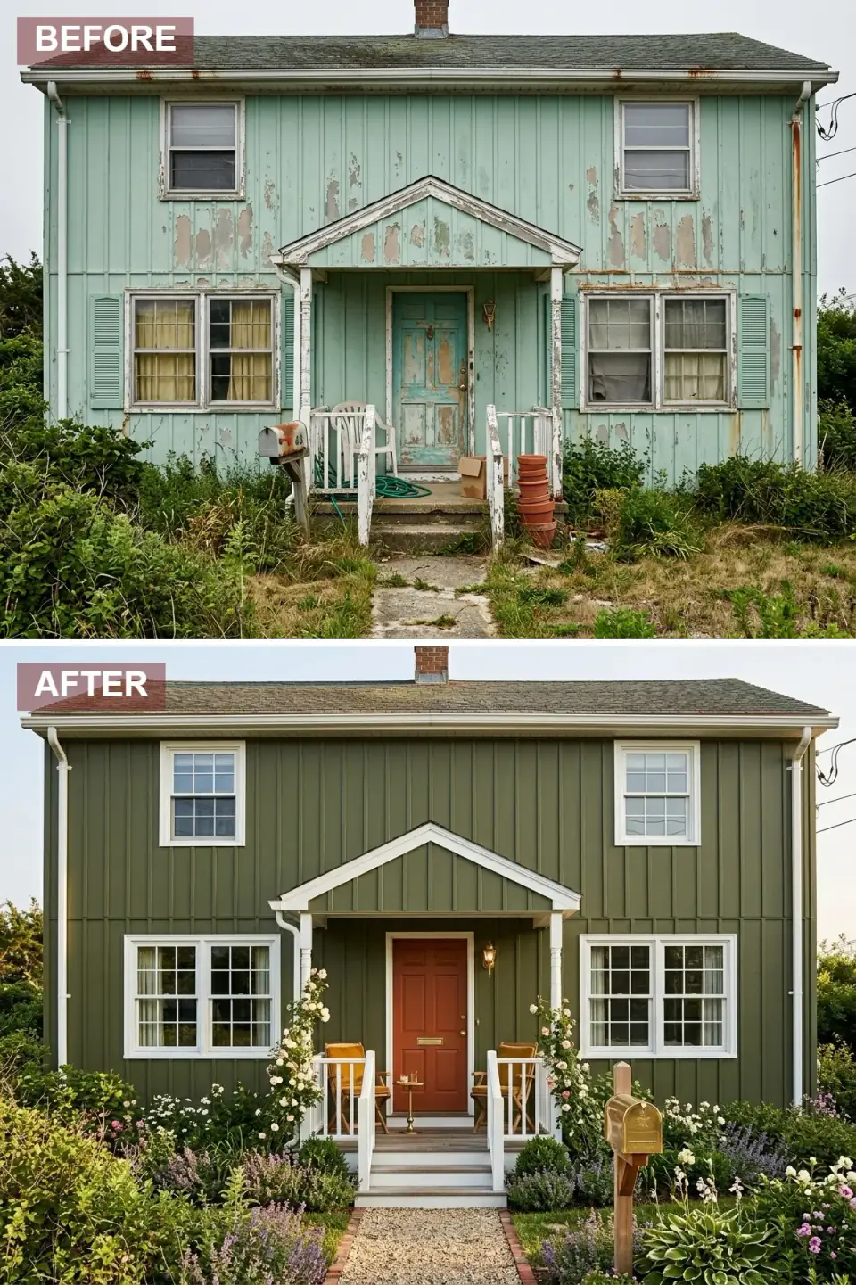
The final scheme paints the house deep olive green board-and-batten with crisp white casements and railings. A terracotta-red door with a brass mail slot and knocker becomes the vibrant heart of the composition. Mustard-yellow wooden chairs and a small brass side table invite an afternoon on the porch. Climbing roses ascend the posts, and the front yard overflows with an English mix of lavender, hostas, catmint, and white and pink perennials edged in clipped boxwood. A gravel path edged with brick leads to white steps, a brass mailbox on a natural post completes the scene, and a traditional brass sconce lights the entry.
This is the scheme that leans hardest into planting, and that's the honest tradeoff: it's the highest-maintenance of the nine. A true English perennial bed is gorgeous in June and needs real gardening the rest of the year — deadheading, dividing, cutting back. The olive green is the surprise that makes it work; a saturated dark green merges the house into its own garden instead of standing apart from it. If you love the romance but not the upkeep, take the olive-and-terracotta color story and pair it with a simpler, structured planting rather than the full cottage tangle.
Color Palette
Olive Green
#4A5D23
A saturated Dried Thyme–range siding that merges the house with its foliage.
Terracotta
#C15B51
A welcoming door color that reads both rustic and spirited against the green.
Mustard
#DAA520
Porch seating upholstery adding a cheerful, vintage-garden contrast.
White
#F2F2F2
Casements, railings, and climbing-rose blooms providing airy, romantic contrast.
Pro Tips From the Renovation Designer's Chair
- Structure before cosmetics. Repair rotting siding, failing flashing, and a soft porch deck before you spend a dollar on color. Paint over a problem and you've just made the problem more expensive to find later.
- Let the plan set the symmetry. Formal schemes need a truly centered door and balanced windows. If the original drafter's grid is off, choose an asymmetric style that hides it rather than a formal one that magnifies it.
- One metal, everywhere. Repeat a single finish — brass, black, or bronze — across knocker, sconce, house numbers, and mailbox. It's the cheapest cohesion move on any facade.
- Sample dark and saturated colors on the actual wall. Charcoal, taupe, and olive all shift dramatically between overcast and direct light. Two-foot squares on two elevations, two days of living with them, then order.
- Light the entry, the path, and the porch. Curb appeal that only exists in daylight is half-finished. Warm 2700K fixtures at three points extend the effect into the evening.
- Right plant for the climate. Steal the discipline of any landscape scheme, but plant what survives your zone. In the Northeast that means natives, not agave.
Cost-Saving Moves
- Paint before you re-clad. A quality exterior repaint runs roughly $8,000–$14,000 on a house this size in the Hudson Valley; full James Hardie replacement lands closer to $22,000–$40,000. If the existing siding is sound, color alone delivers most of the transformation for a third of the cost.
- Keep the window openings. Every one of these nine schemes reuses the original openings. New windows are worth it for efficiency, but moving or resizing an opening pulls in framing, header, and interior finish work — budget-multiplying, framing-stage decisions.
- Front-load the plants that grow. Buy fewer, smaller perennials and native grasses and let them fill in over two seasons rather than paying nursery prices for instant mature specimens. One statement tree is worth more than a dozen shrubs.
- Hardware and lighting are the high-leverage spend. A brass knocker, matching sconces, house numbers, and a good mailbox total a few hundred dollars and read as custom. That's the best dollar-per-impact ratio on the whole facade.
Reader Questions on Exterior Transformations
Which of these gives the biggest visual change for the least money?
Color and hardware, every time. If your existing siding is structurally sound, a quality repaint plus a single repeated metal finish on the door hardware, sconces, house numbers, and mailbox delivers most of the transformation you see in these images for a fraction of a full re-clad. The Coastal Navy and Classic New England schemes in particular are almost entirely paint, shutters, and brass — no structural work at all. Diagnose the siding first, and if it's solid, put your budget into color and detail rather than replacement.
Can I really do dark siding on an older house in the Northeast?
Yes, but with two conditions. First, the wall plane has to be genuinely straight — dark colors absorb light and broadcast every wave, so sight down the wall in raking light before committing. Second, spec a factory-finished dark cladding like James Hardie ColorPlus or LP SmartSide rather than field-painting, because a dark field paint fades faster in our sun and shows seams. Done that way, charcoal and deep green hold up well through Hudson Valley winters and read far more current than another coat of beige.
How do I know if my house can carry a formal, symmetrical scheme?
Measure to your front door. Formal styles like the Navy and Emerald scheme depend on the door being the true center of the facade with balanced windows on either side. Many older homes lost that symmetry to a later addition or a window cut in off-axis, and no amount of boxwood parterre fixes it — a formal treatment actually magnifies the imbalance. If your grid is off, choose an asymmetric organic-modern or cottage approach that works with the irregularity instead of drawing a spotlight to it.
Which scheme is the lowest maintenance long-term?
The Scandinavian Minimalist and the desert-inspired approach, once you translate the planting to your climate. Both pair a durable, factory-finished siding with native, drought-tolerant landscaping that needs little irrigation and minimal shearing. The English Cottage is the opposite end — stunning in June, but a true perennial border needs regular deadheading, dividing, and cutting back. If low upkeep is the priority, keep the cottage color story but simplify the planting to structured natives.
Do decorative shutters actually help curb appeal?
Only when they're sized and mounted correctly. A louvered shutter should look as though it would cover the window if it swung shut — that means each shutter is roughly half the window's width and full height, mounted tight to the casing. Half-width "decorative" shutters that couldn't possibly close read as builder-grade and cheapen an otherwise good facade. On the coastal and colonial schemes here, the shutters work precisely because they're proportioned to the openings the plan gave us.
Should I match my roof color to my siding or contrast it?
Contrast, but with intention. A charcoal architectural shingle is the safest, most versatile choice — it grounds white, navy, taupe, and green facades alike, which is why it appears across most of these schemes. What you want to avoid is a roof that competes: a warm brown shingle on a cool navy house, for instance, fights the palette. Pull your roof into the same temperature family as your trim and accent metals, and it recedes and lets the facade do the talking.
Where to Read Next
If one-shell-many-faces is your thing, I run the same read-the-bones exercise in my eleven exterior transformations that redefine curb appeal and, for a period house, my historic Second Empire exterior study. And when you're deciding between a repaint and a full re-clad, my breakdown of an exterior makeover by materials walks through the cost and durability tradeoffs siding by siding.
Sources & Further Reading
- National Park Service, Preservation Brief 14: Exterior Additions to Historic Buildings.
- This Old House, Siding materials, installation, and cost guides.
- Old House Journal, Historic exterior color and detailing archive.
- James Hardie, ColorPlus Technology factory-finish specifications.
- Marvin Windows and Doors, Divided-lite and clad window options.
- NAHB / Remodeling, Cost vs. Value Report — siding and curb-appeal returns.
- Benjamin Moore, Exterior color collections and light-reflectance data.
- Architectural Digest, Exterior paint color guidance.
- Lady Bird Johnson Wildflower Center, Native and drought-tolerant plant database by region.

Nora Whitfield
Renovation Designer & Interiors Editor · Beacon, New YorkNine years of design-build renovation work across the Hudson Valley and the Northeast. Nora runs the Renovations, Room Guides and Renovation Mind desks — before-and-after studies, room-by-room design guides, and the long essays on why what we renovate matters.
More from Nora →
Reader notes