


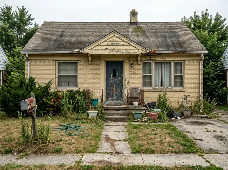
A failing exterior is rarely as far gone as it looks. Most of what reads as "dilapidated", peeling clapboard, rusted railings, a tired roof, is finish-stage decay sitting on bones that are often still sound. I came up as an architectural drafter before I moved into renovation work, so when I walk a neglected house in Beacon or Hudson my eye goes straight to what the original builder got right and what a thoughtful restoration should protect. The ten transformations below take genuinely rough historic structures and bring them back ten different ways. Under each, I've added the plan-literate read: which moves honor the original drawing, which ones quietly cost real money, and how to keep a restoration from sliding into a costume.
How I Read a Failing Exterior
Before I think about color or style on a neglected house, I separate three layers: what's structural, what's protective, and what's cosmetic. Sagging gables, rotted sills, and a roof that's let water in are structural and protective failures, fix those first, no exceptions, because every makeover below assumes a sound, dry shell underneath. Siding, trim color, railings, doors, and landscaping are the cosmetic layer, and that's where the visible drama lives. The mistake I see most often is owners spending the whole budget on the cosmetic layer while the real problem keeps quietly working behind the new paint.
The second thing I read is what the original drafter drew that's worth keeping. On older Northeast homes, the value is usually in the details, fishscale shingles in the gable, decorative trim, real divided-light windows, that a careless renovation strips off and a smart one restores. Those details are most of what separates a restoration from a flip. If you want the broader before-and-after logic, my look at five exterior transformations that redefine curb appeal walks through the same triage on different houses.
1. Rustic Revival with Cedar and Stone
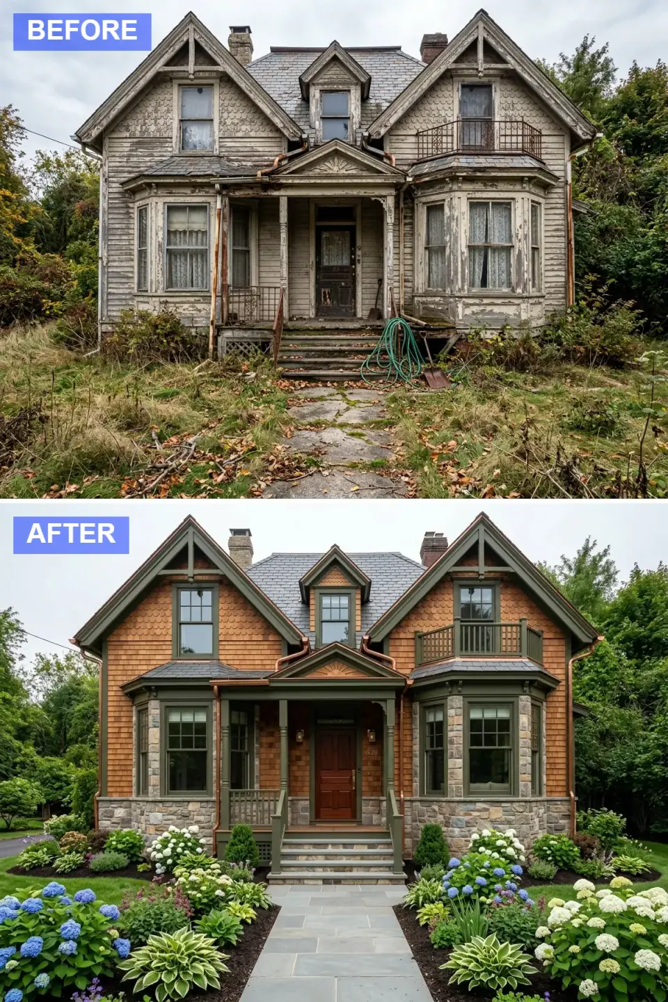
The rotting clapboard and peeling paint give way to warm cedar shake over a stone veneer base that anchors the house to its site. Rusty iron railings are replaced with custom olive-green trim and copper gutters that will patina over time, a rich mahogany door becomes the focal point, and the overgrown yard is layered into hydrangeas and hostas with a bluestone path. The restored gable details are the quiet hero here.
The plan-literate move I'd flag: the stone veneer at the base is doing exactly what good detailing should, putting the most durable, splash-resistant material where water and snow actually hit the wall. Just specify a true adhered veneer with a drainage gap and weep behind it, not a face-glued panel, or you trap moisture against the sheathing on the one part of the wall that gets the most abuse. Cedar shake is the high-maintenance face here; on exposed elevations I'd let it go silver naturally rather than fight a stain it won't hold, and reserve the copper gutters as the detail that ages into character.
Color Palette
Warm Cedar
#C0783F
Natural wood siding that adds organic texture and warmth.
Deep Olive
#4A553A
Rich green trim that complements the natural stone and wood.
Cool Gray-Blue
#8A9BA8
Stone walkway and steps providing timeless hardscaping.
Dark Mahogany
#4A2511
Deep stained wood door serving as a sophisticated focal point.
2. Scandinavian Modern Minimalism
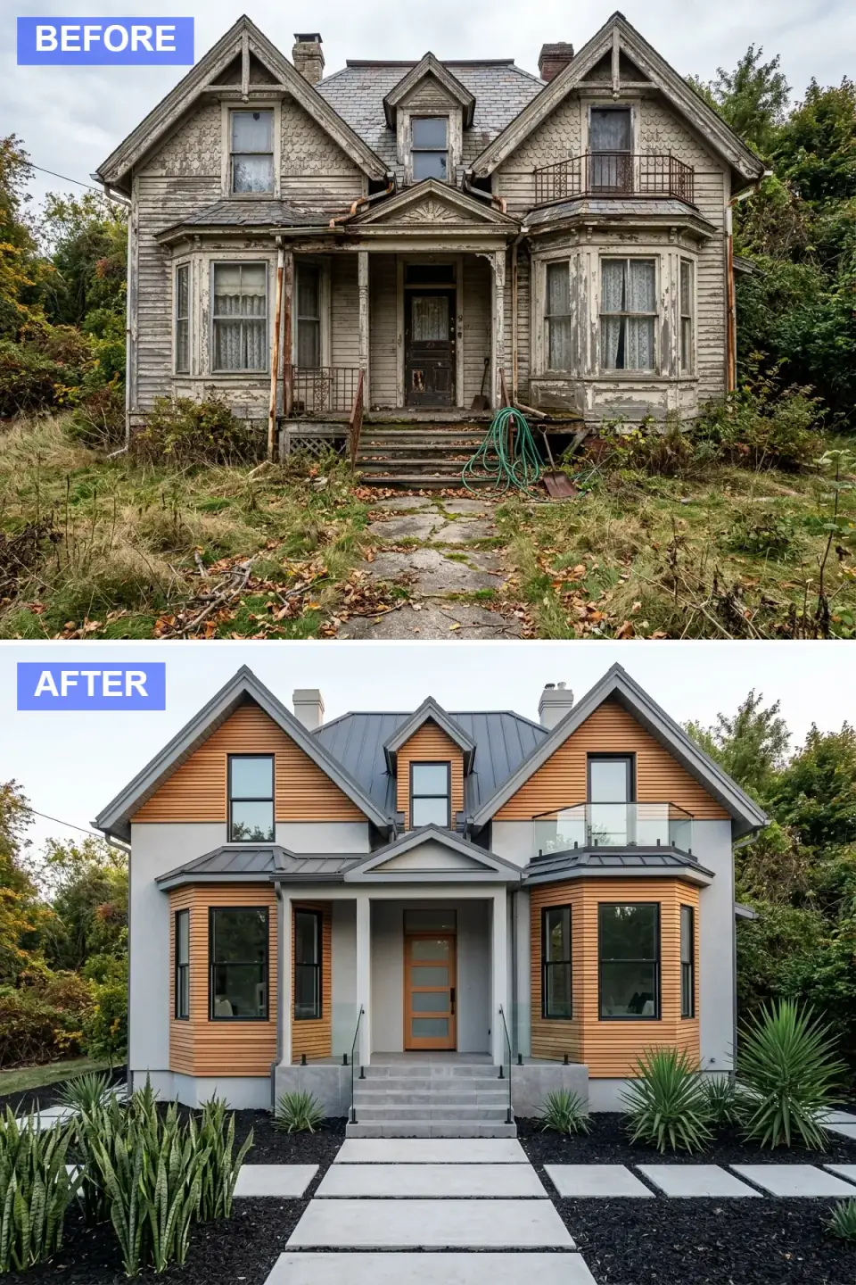
This one strips decades of decay for a sleek two-tone composition: smooth pale stucco paired with honey-toned horizontal cedar, a charcoal standing-seam roof, black aluminum windows, and frameless glass railings replacing rusted iron. A light oak door with frosted panels anchors the entry, and the wild yard becomes a minimalist xeriscape of snake plants and agave on dark mulch with oversized concrete pavers.
Honest preservationist caveat: this is the most aggressive departure from the original house of the ten, and on a genuinely historic structure in a regulated district, a full modern reskin like this can run into review board objections. Check your local rules before you fall for it. On the build, smooth stucco is unforgiving in a freeze-thaw climate, so it needs a proper drainage-plane system behind it, not a thin coat over the old sheathing. The honey cedar is what keeps it from going cold, and it's also the piece you'll re-oil; let the stucco and metal carry the low-maintenance load.
Color Palette
Warm Gray
#D5D0C5
Smooth plaster finish creating a clean, modern canvas.
Light Honey
#E3A857
Horizontal wood cladding adding warmth and texture.
Dark Gunmetal
#3A3F45
Standing-seam roof and window frames for sharp definition.
Pale Cement
#B8B5B0
Paver walkway and steps emphasizing minimalist geometry.
3. Bright Modern Farmhouse Freshness
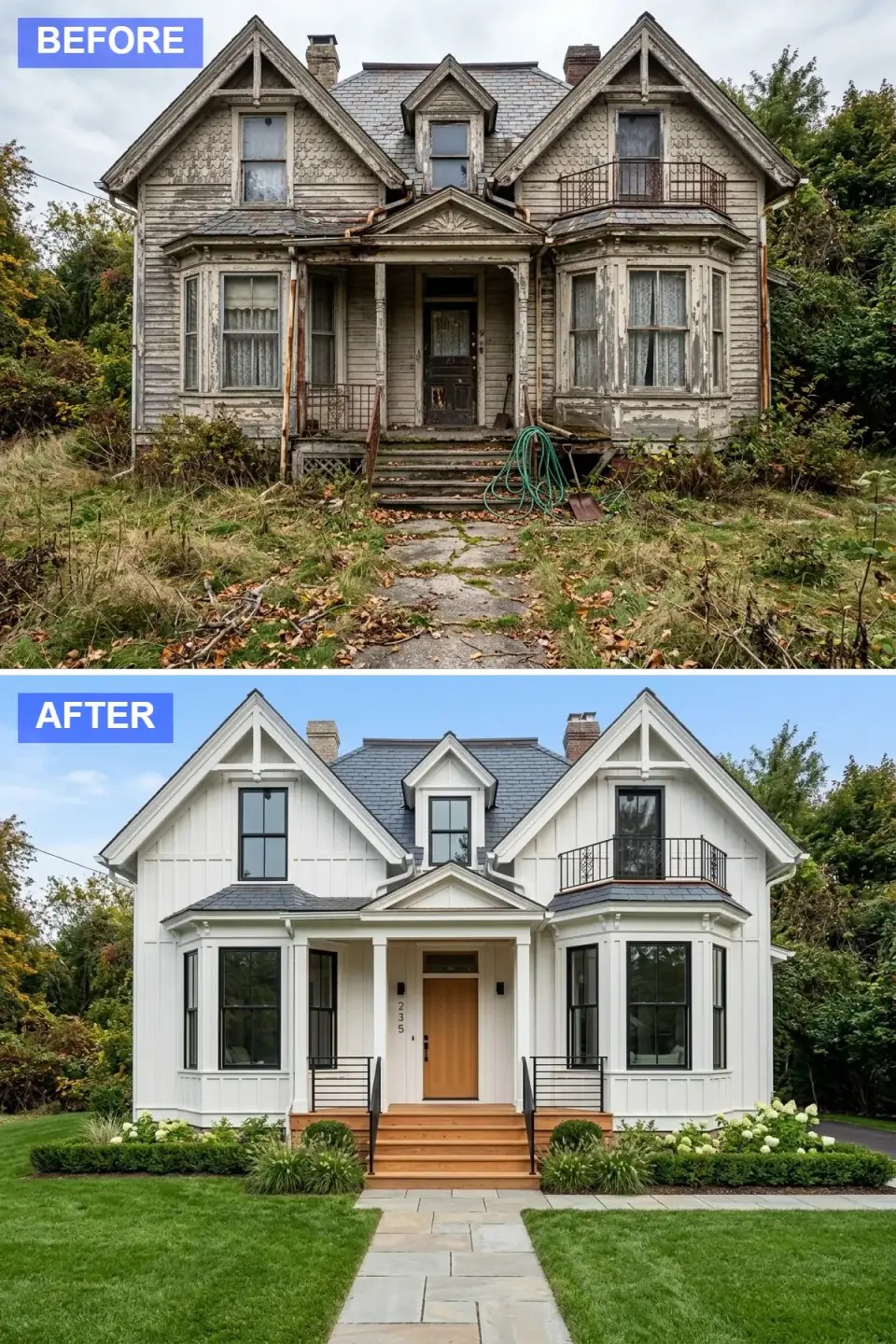
Decay is banished in a crisp all-white revival: bright board-and-batten siding, bold black window frames, new large panes in place of the broken ones, and simple black horizontal railings. A warm oak door and matching steps soften the entry, the lawn is sculpted into clean green flanked by manicured boxwood and ornamental grasses, and a light stone walk completes the symmetrical composition. It's the most universally appealing of the ten.
From a planning view, the smartest decision here is the cladding spec, not the color. White on a historic Northeast house gets dingy fast under pollen, mildew, and road grime, so I'd put the board-and-batten in James Hardie ColorPlus Arctic White rather than painted wood, baked finish, fifteen-year face, no chalking. The black windows are the graphic punctuation, but watch the swap on a historic home: large single panes can erase the period character the gables still carry. If the house had divided lights, keep at least a nod to them on the front elevation so the modern farmhouse reads as a respectful update, not an erasure.
Color Palette
Pure White
#F5F5F0
Crisp white siding creating a bright, airy exterior.
Matte Black
#1A1A1A
Window frames and railings providing graphic contrast.
Light Oak
#C4956A
Front door and steps introducing warm wood tones.
Soft Gray
#A8B2A8
Natural stone pathway complementing the green lawn.
4. Moody Victorian with Gilded Accents
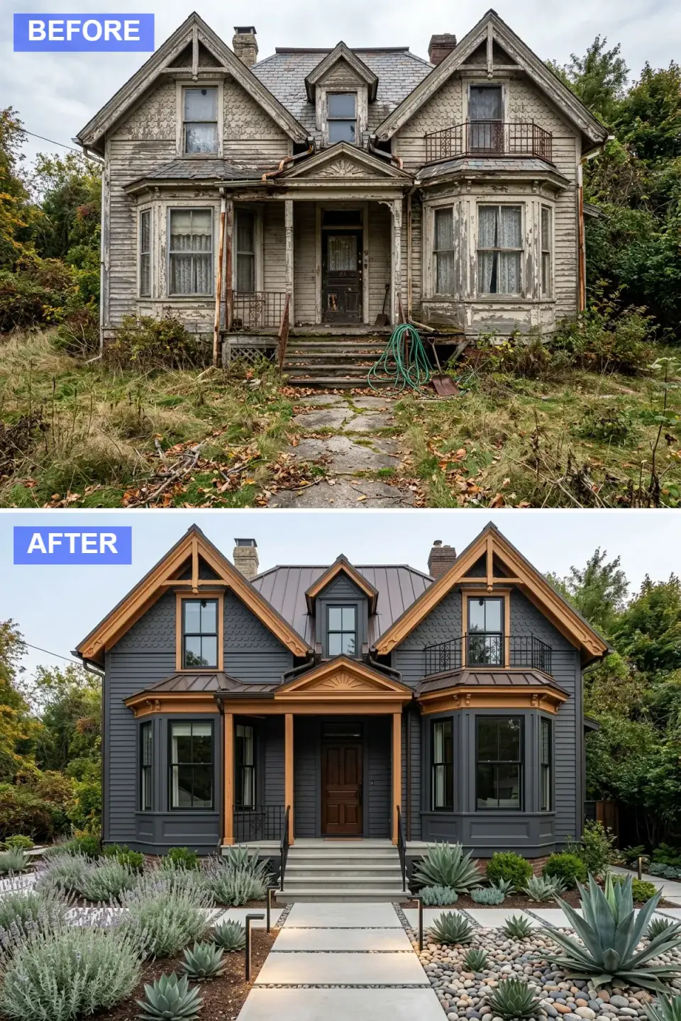
This is the daring one: deep charcoal siding with the original gingerbread trim picked out in honey gold, a copper-toned metal roof echoing the gable accents, refinished black iron railings, and a dark walnut door. The chaotic yard becomes a drought-tolerant scheme of lavender, agave, and river rock with subtle path lighting for moody nighttime appeal. It's drama done with discipline.
This is my favorite restoration logic of the ten, and it's worth naming why: a dark body color makes ornate Victorian trim read better, not worse. On a white house, gingerbread detail disappears into the field; against charcoal, every bracket and scroll the original drafter drew comes forward in the gold. That's preservation through contrast rather than replacement, the highest-value move you can make on a period home. One practical note, dark siding runs hot and can stress older wood; use a quality solid-body exterior stain like Benjamin Moore Aura in Wrought Iron over a properly primed surface, and keep the gold trim a real warm metallic-adjacent tone so it reads gilded, not yellow.
Color Palette
Deep Charcoal
#36454F
Dark exterior creating a bold, sophisticated envelope.
Warm Amber
#D4A24C
Gilded trim accents highlighting architectural heritage.
Bronze Copper
#B87333
Metal roofing that complements the warm wood tones.
Dusty Sage
#9CAF88
Drought-tolerant plantings softening the dark exterior.
5. Soft Sage Traditional Elegance
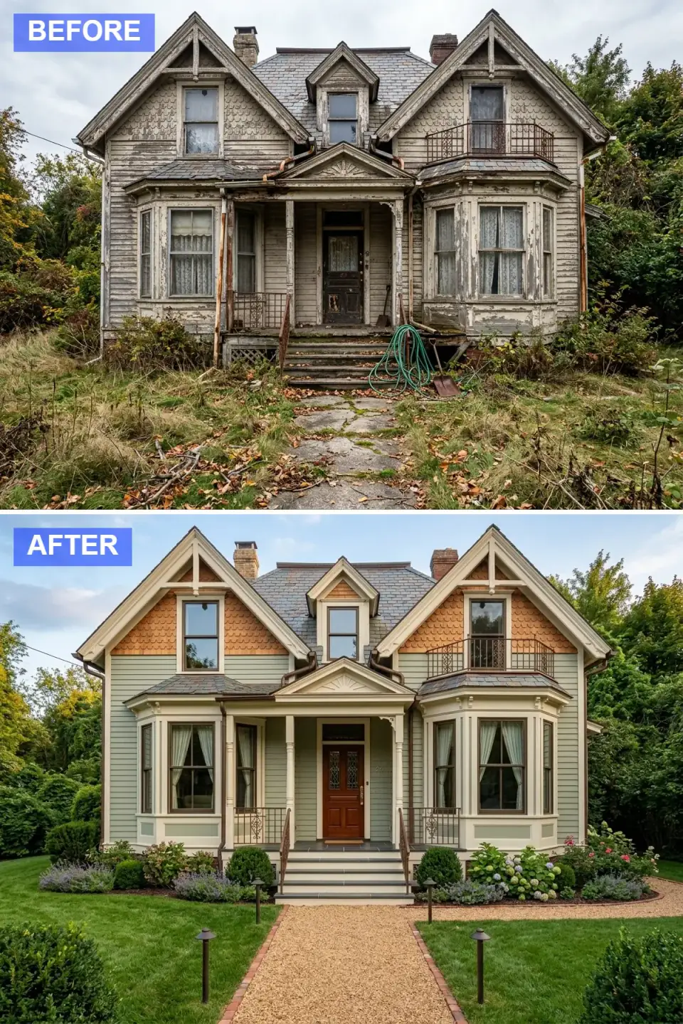
A gentle restoration: soft sage green clapboard with creamy off-white trim, original gable shingles preserved and stained natural cedar for contrast, refined wrought-iron railings, and a mahogany door with decorative glass as the centerpiece. The yard becomes a formal English-inspired garden of boxwoods, climbing roses, and hydrangeas, with a pea-gravel path edged in brick for a crisp, traditional approach.
This is the most restrained and, frankly, the most appropriate restoration of the ten for a genuine historic home, because it changes almost nothing structural and honors everything the house already was. Sage green is a documented historic-palette color; it sits a period home into its landscape instead of shouting over it. The decision I'd applaud is preserving and staining the original gable shingles rather than painting them, that keeps the texture and the age of the real material. Brick-edged gravel is also the right call: it's permeable, it's cheap to repair, and it reads correct on a traditional facade in a way a poured-concrete walk never will.
Color Palette
Muted Sage
#A8B5A0
Soft green offering a timeless, natural exterior.
Warm Ivory
#E8E0D5
Delicate trim highlighting mouldings and corners.
Natural Cedar
#C19A6B
Gable accents preserving original textural interest.
Terracotta
#C47E5A
Pathway edging adding traditional warmth and structure.
6. Nautical Navy Preppy Perfection
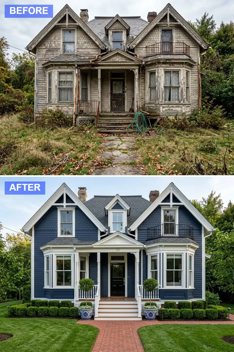
Coastal New England sophistication: deep navy siding, crisp white casings that make the dark blue pop, classic black louvered shutters on the bay windows, a high-gloss black door flanked by white railings, and a herringbone brick walk edged by clipped boxwood and matching topiaries in blue-and-white planters. It's tailored, traditional, and reads expensive.
The detail worth the money here is the shutters, and only if they're done right. Operable, properly proportioned louvered shutters that actually fit the window opening are an authentic period detail; undersized decorative shutters screwed flat to the wall are the single most common tell of a cheap renovation, and they cheapen everything around them. Size them to cover half the window so they'd close over it, mount them on real hardware, and the navy reads as a careful restoration. Spec the body in a deep, UV-stable navy, Benjamin Moore Hale Navy HC-154 is the reliable one, because saturated dark blues fade fastest of any exterior color.
Color Palette
Deep Navy
#1E3A5F
Bold blue exterior evoking classic coastal style.
Pure White
#FFFFFF
Crisp trim, railings, and casings for sharp contrast.
Red Clay
#B54A3F
Warm brick pathway adding traditional texture.
High-Gloss Black
#0D0D0D
Front door and shutters providing sophisticated depth.
7. Taupe and Cream Romantic Revival
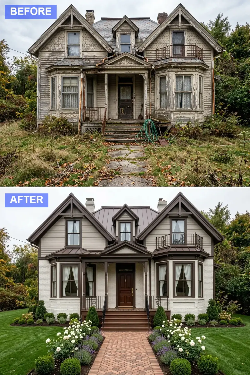
A gentle restoration in warm taupe upper siding over freshly painted white brick on the lower level, with dark chocolate trim outlining every window and porch column for rich definition. Rebuilt dark-stained steps match the door and refined iron railings, and the landscape leans romantic, white roses, lavender, and clipped boxwood along a herringbone brick path, with subtle evening lighting.
There's one decision in this one I'd make you stop and think about: painting the lower brick white. It looks fantastic and it's effectively permanent, painted brick can't easily be returned to bare, and it needs repainting every several years because it can trap moisture if the brick wasn't sound first. On a historic home, that's a real preservation trade-off, not a casual color choice; make sure the masonry is dry and in good repair, and use a breathable mineral paint like a silicate (Keim) rather than a film-forming latex that can spall the brick face in a freeze-thaw winter. The two-tone taupe-over-white is genuinely elegant, just go in knowing the lower half is a commitment.
Color Palette
Greige Taupe
#A89F91
Soft neutral siding creating an elegant, understated envelope.
Warm White
#F0EBE3
Whitewashed lower facade adding texture and brightness.
Dark Chocolate
#3E2723
Deep brown accents grounding the light color scheme.
Cream White
#F8F4E8
Flowering shrubbery adding soft, romantic highlights.
8. Earthy Monochrome Sanctuary
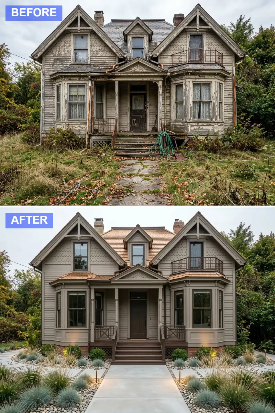
A tonal approach wraps the home in warm greige with slightly darker trim for a quiet, cohesive look. A new copper roof adds metallic warmth that will age gracefully, exposed brick peeks through on the lower facade, and the wild vegetation gives way to a modern xeriscape of blue fescue, ornamental grasses, and river stone that echoes the neutral palette. Subtle uplighting makes the approach feel serene and highly edited.
A tone-on-tone scheme like this is the hardest neutral to get right, because with no color contrast doing the work, the architecture itself has to carry the whole composition. That's actually a useful test: if a house looks good in monochrome greige, its proportions and trim profiles are genuinely strong, which on a well-drawn older home they usually are. Keep the trim only a step or two darker than the body, Sherwin-Williams Agreeable Gray SW 7029 with a deeper greige like Dovetail SW 7018 for trim is a dependable pairing, and let the copper roof and the blue fescue supply the only real warm and cool notes. Let the copper patina naturally rather than sealing it; the living finish is the point.
Color Palette
Warm Greige
#9E9589
Neutral body color creating a calm, cohesive envelope.
Dark Umber
#5C5046
Slightly darker trim for subtle architectural definition.
Aged Copper
#B87333
Metallic roofing adding warmth and vintage appeal.
Silver Blue
#8FA8B8
Ornamental grass softening the landscape with cool tones.
9. Classic Colonial with Black Shutters
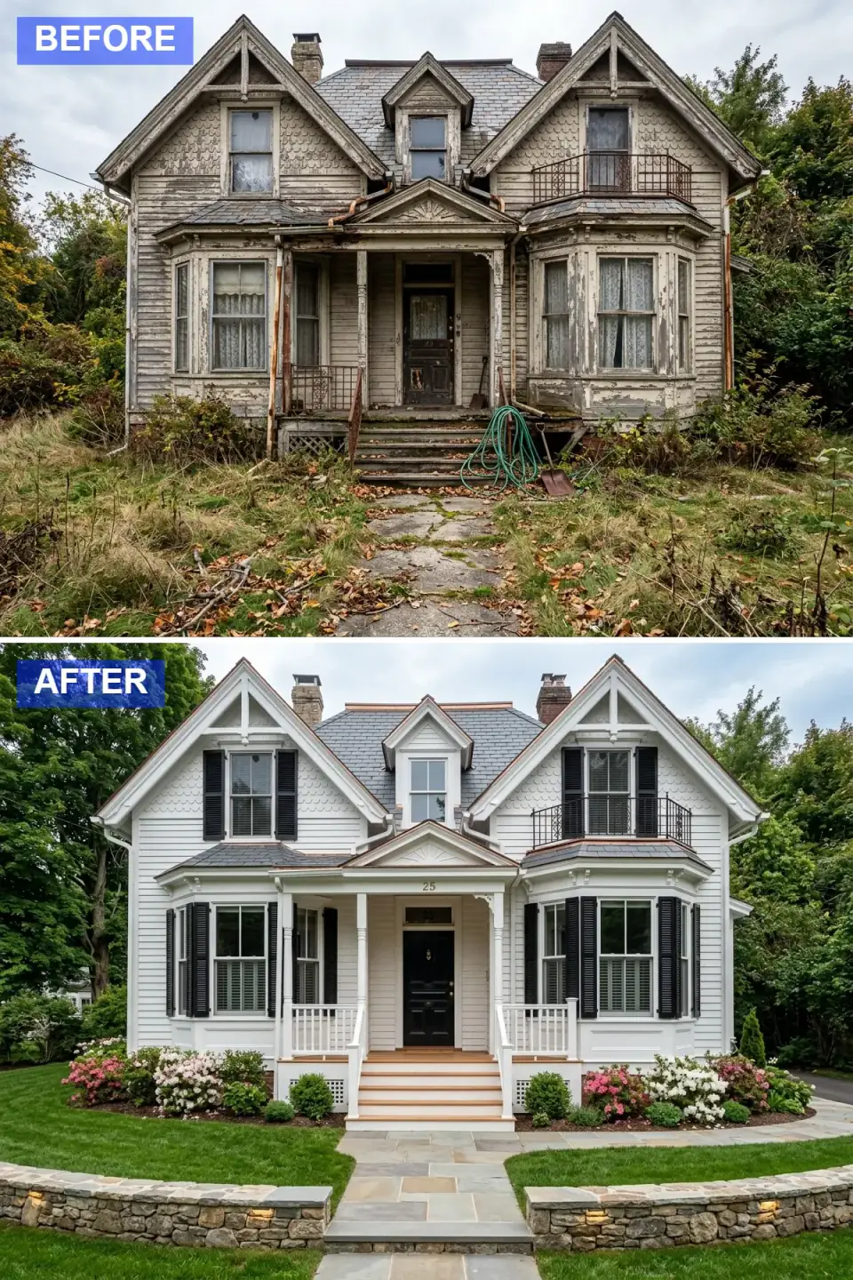
The dilapidated structure is reborn as a pristine colonial: bright white clapboard with preserved fishscale shingles in the gables, bold black louvered shutters on every window for rhythmic contrast, white porch railings, and a glossy black door over natural wood treads. The yard is brought to order with a manicured lawn, pink-and-white azaleas, and low stone retaining walls with integrated lighting feeding a formal bluestone approach.
This is textbook colonial restoration, and the single best decision in it is preserving the fishscale gable shingles. That decorative scalework is exactly the kind of detail the original drafter included to give a flat colonial face some life, and it's the first thing a lazy renovation covers with flat siding. Keeping it, even painted white to unify the scheme, is what makes this read as a restoration rather than a rebuild. The low stone retaining walls are the other quiet win: on a sloped Hudson Valley lot they solve a real grading and drainage problem while looking like pure curb appeal, which is the kind of two-jobs-at-once move I always push owners toward.
Color Palette
Bright White
#F8F8F5
Classic white clapboard siding for timeless curb appeal.
True Black
#0A0A0A
Shutters and door delivering high-contrast colonial style.
Cool Gray
#7A8B82
Natural stone walkway and wall caps.
Soft Pink
#E8A4B8
Flowering shrubs adding seasonal color to the landscape.
10. Pastel Cottage Garden Charm
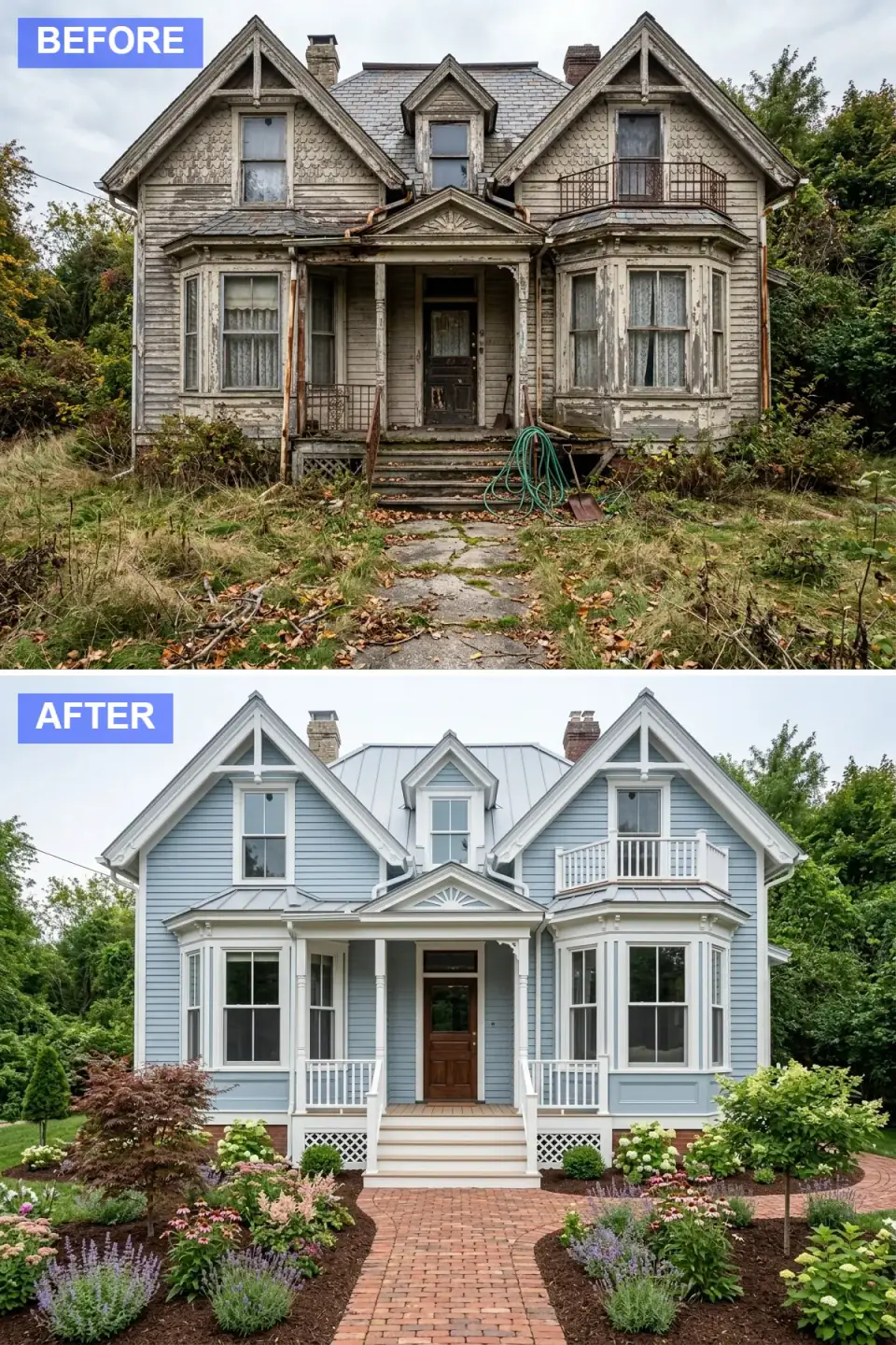
The cheerful finale wraps the home in soft sky-blue clapboard with bright white trim and railings for a storybook feel. A light silver metal roof reflects the sky, delicate white spindle railings dress the upper balcony, and a warm walnut door anchors the entry. The front yard explodes into a cottage garden of lavender, coneflowers, and hydrangeas along a curved brick walk, with a small Japanese maple adding sculptural interest at the foundation.
The plan-aware point here is about the path, not the paint. That curved brick walk is doing deliberate work: a straight shot to the door reads efficient and a little cold, while a gentle curve slows the approach and lets the garden unfold, which is exactly the cottage effect you want. From a build standpoint, lay brick on a proper compacted base with edge restraint or a Northeast frost cycle will heave it into a trip hazard within a few winters; a sand-set brick path is only charming if it stays flat. The silver metal roof is a smart, low-maintenance choice that reflects heat and sheds snow, modern function under a storybook face.
Color Palette
Soft Periwinkle
#8FAECC
Cheerful blue siding creating a welcoming cottage aesthetic.
Bright White
#FAFAFA
Trim and railings providing crisp, clean contrast.
Rich Walnut
#5D3A1A
Deep wood door grounding the pastel exterior.
Soft Lavender
#B8A9C9
Garden flowers echoing the blue siding for harmony.
Pro Tips From the Renovation Designer's Chair
- Fix the shell before you style it. Sagging framing, rotted sills, and a leaking roof are structural and protective failures. Every makeover here assumes a sound, dry house underneath, so spend there first even though none of it shows.
- Preserve original detail, don't bury it. Fishscale shingles, gingerbread trim, and decorative gables are most of what gives an older home its value. Restoring them reads as a restoration; covering them reads as a flip.
- Match the color to the architecture and the era. Sage, charcoal-with-gold, and navy all work because they suit the houses they're on. A documented historic palette sits a period home into its street.
- Know which moves are permanent. Painting brick and reskinning in stucco are hard or impossible to undo. Go in clear-eyed, and use breathable, climate-appropriate products when you do.
- Make landscaping do structural work. Retaining walls that solve grading, permeable paths that manage runoff, drought-tolerant beds that cut irrigation, the best curb appeal earns its keep twice.
- Check the rules before the render. Historic districts across the Northeast regulate materials, colors, and window changes. Confirm what's allowed before you order anything.
Reader Questions on Restoring a Failing Exterior
Where should I spend first on a dilapidated home's exterior?
Structure and water, before anything cosmetic. Repair rotted sills, sagging framing, and any failed roofing or flashing first, because every visible improvement assumes a sound, dry shell underneath. New siding over wet sheathing or fresh paint over rot just hides the problem while it keeps working. Once the house is structurally sound and watertight, move to the protective layer (roof, gutters, sealed envelope), then finally to the cosmetic layer of cladding, color, and landscaping. It's the least satisfying order because the early money doesn't show, but it's the only sequence that lasts.
Can I paint the brick on my historic home?
You can, but understand it's close to permanent and carries real risk on an older house. Painted brick can't easily be returned to bare, needs repainting every several years, and can trap moisture if the masonry wasn't sound and dry first. On historic brick especially, a film-forming latex can cause the brick face to spall in a freeze-thaw climate. If you commit to it, repair and dry the masonry first and use a breathable mineral or silicate paint that lets the wall release moisture. White-painted brick looks beautiful, just treat it as a one-way decision, not a color you might change back.
Do dark exterior colors damage older siding?
Dark colors absorb more heat, which can stress older wood siding through expansion and accelerate the breakdown of lower-quality coatings, but it's manageable. The moody charcoal Victorian in this set works because it's done on a properly primed, sound surface with a quality solid-body stain or premium exterior paint rated for dark tints. Use a top-tier product, make sure the wood is in good repair and well sealed first, and avoid the very darkest values on large unshaded southern elevations. Done correctly, a dark exterior is durable and makes ornate trim read far better than a pale one does.
How do I keep a renovation from looking cheap or fake?
Get the details right and proportioned. The most common tells of a budget job are undersized shutters screwed flat to the wall, fake stone panels with no depth, and original trim covered over instead of restored. Size shutters so they'd actually close over the window, use genuine adhered stone veneer with proper depth and drainage, and preserve real architectural details rather than flattening them. Material quality matters less than correct proportion and authentic detailing; a modest material installed with care reads better than an expensive one installed wrong.
Do I need permits or historic approval for an exterior renovation?
Often, yes, especially in the Northeast. Re-siding and re-roofing over the same footprint usually need a building permit but no zoning review. The moment you change window openings, alter the roofline, or add structure, you're into engineered drawings and a fuller permit path. Critically, many older towns, including parts of Beacon, Hudson, and similar historic districts, regulate exterior materials, colors, and window replacements on designated properties. Always check with your local building department and any historic commission before ordering materials; the approval process can shape the entire design, and unwinding unapproved work is expensive.
Where to Read Next
If neglected-home revivals are your thing, my ten exterior metamorphoses from dilapidated cottage to design icons runs a similar before-and-after arc, and nine architectural rebirths of a forgotten facade digs deeper into the design moves. For the full method on triaging a rough house, browse the exterior renovations archive.
Sources & Further Reading
- National Park Service — Preservation Briefs (historic exteriors & masonry)
- This Old House — Siding & Exterior Restoration
- Old House Journal — Period Restoration & Detailing
- James Hardie — Fiber-Cement Siding & ColorPlus Finishes
- Fine Homebuilding — Exterior Detailing & Weather Resistance
- Benjamin Moore — Historic & Exterior Color References
- U.S. EPA — Permeable Pavement & Stormwater Management
- Remodeling — Cost vs. Value Report (exterior projects)

Nora Whitfield
Renovation Designer & Interiors Editor · Beacon, New YorkNine years of design-build renovation work across the Hudson Valley and the Northeast. Nora runs the Renovations, Room Guides and Renovation Mind desks — before-and-after studies, room-by-room design guides, and the long essays on why what we renovate matters.
More from Nora →
Reader notes