

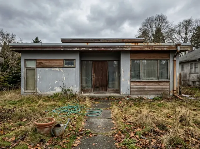
I keep a folder of one address shot eight different ways — same footprint, same rooflines, same window openings, eight completely different facades. It's the cleanest teaching tool I have, because it strips away the one variable everyone fixates on (the house itself) and leaves only the choices. As a renovation designer working out of the Hudson Valley, I spend most of my week explaining that an exterior is not a costume you drape over a building — it's a set of decisions that either respect the bones the original drafter left you or fight them. Here are eight exterior transformation styles on a single house, and what each one is really asking of the structure underneath.
How I Read These Exterior Transformation Styles
Before I look at a single paint chip, I look at the plan — or, when there isn't one, I sketch the one the original builder must have worked from. Where are the load-bearing planes? Where do the window headers sit, and can they move? Is the roofline a truss system I'd have to re-engineer, or a simple gable I can extend a fascia past? Every exterior style below lands on the same set of bones, so the honest question isn't "which is prettiest" — it's "which of these is a finish-stage decision and which one quietly drags you back to framing." That distinction is the whole game, and it's why I treat a facade makeover as a reading exercise first and a styling exercise second.
I sort the eight into two buckets. Skin-deep changes — paint, cladding swaps over existing sheathing, landscape, lighting — touch the surface and stay on a predictable budget. Structural-adjacent changes — new or enlarged window openings, a re-clad roofline that needs new fascia and flashing, a stone veneer that adds dead load the foundation has to carry — pull a permit and an engineer's stamp in most Hudson Valley towns. If you want a fuller catalog of how a single shell reads across styles, my walk through the chameleon house covers ten variations on the same idea, and the broader exterior renovations archive collects the rest.
1. The High-Contrast Minimalist
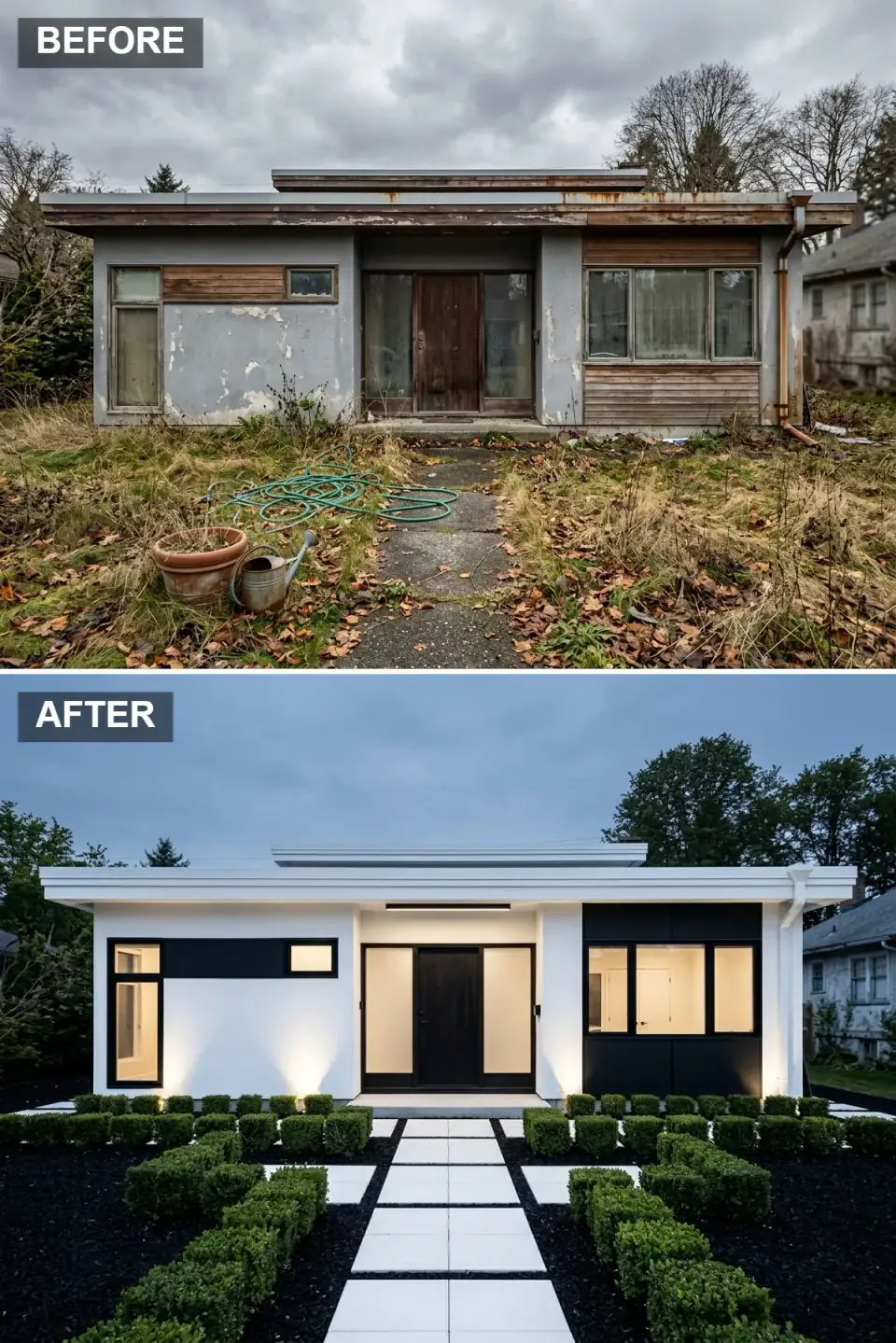
The tired gray facade gives way to smooth white stucco, and the whole house reads as a single clean plane. Matte-black frames on the windows, the door, and a horizontal datum line do the rest of the work — definition without ornament. Out front, the yard is rebuilt as geometry: black mulch beds, clipped hedges, and large light-gray pavers laid on a grid that pulls your eye straight to the entry. Up-lighting at the base grazes the stucco at night so the texture you can't see in daylight finally shows up.
Here's the plan-literate part. White stucco over a properly prepped substrate is a finish decision — but stucco is unforgiving of movement, and on a 1960s frame I'd want the sheathing checked and a drainage plane (rainscreen) detailed behind it before anyone troweled a coat. The black trim is the cheap, high-leverage move; the stucco is the one that quietly assumes your wall assembly is sound. In the Hudson Valley's freeze-thaw cycle, a one-coat synthetic system with a proper weep detail beats a traditional three-coat that traps water and spalls by year three.
Color Palette
Read it as Sherwin-Williams Pure White SW 7005 in a stucco-rated elastomeric — bright, flat, and forgiving of a textured surface.
Marvin Ebony or factory-finished black aluminum frames carry the contrast without on-site repainting down the line.
A half-step off pure black (think BM Iron Mountain 2134-30) so the door reads as a deliberate object, not a void.
Large-format concrete pavers (Techo-Bloc Blu 60) on a grid keep the geometry calm underfoot.
2. Rustic Warmth With a Modern Edge
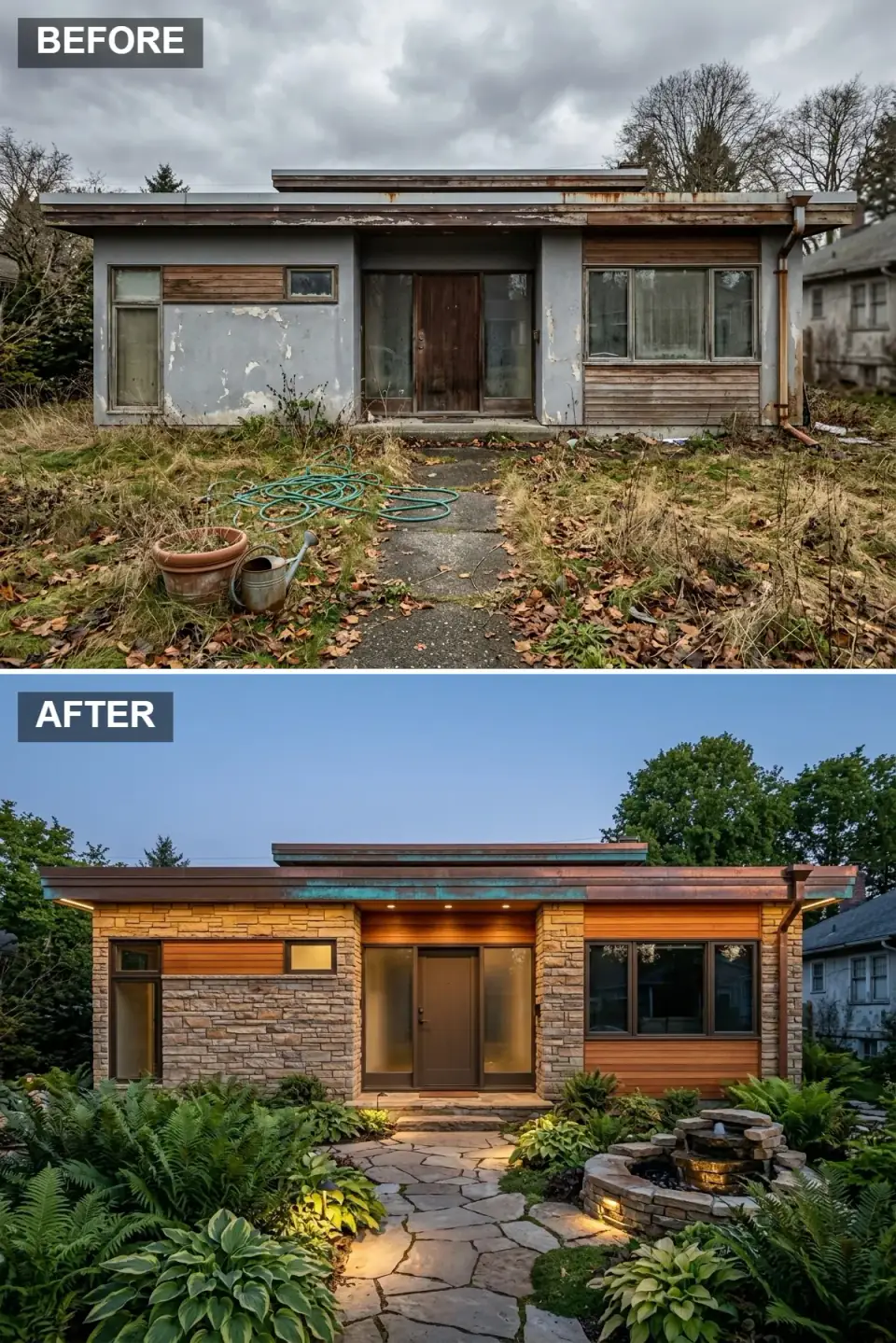
This version trades the flat plane for texture. Stacked stone veneer wraps the base and the entry mass, warm horizontal cedar fills the upper field, and a copper fascia draws a thin metallic line at the roof edge that will patina to brown-green over a decade. A wood door with glass sidelights brings daylight into the foyer. The planting is lush and informal — ferns, hostas, a low stacked-stone water feature — so the architecture and the landscape share the same material language.
Of the eight, this is the one I flag hardest on budget. Stone veneer is not paint. Even adhered manufactured stone (Boral, Eldorado) adds 12–15 lbs per square foot, and full-bed natural stone far more — which means a structural read of whether the foundation ledge and the wall framing can carry it, plus a weep screed and a drainage mat so trapped water doesn't rot the sheathing behind. Cedar over a rainscreen is the smart pairing here because it breathes. The copper is jewelry: gorgeous, but budget it as a feature, not a default. For a gentler take on this same warm-material direction, my cottage exterior makeover styles breakdown shows where stone and wood land on a smaller footprint.
Color Palette
Eldorado Stone Stacked Stone in a tan-buff blend grounds the facade with real texture and shadow.
Western red cedar sealed with Rubio Monocoat to hold the warm tone instead of weathering to silver-gray.
A living fascia material that shifts from bright penny to patina over years — character you can't fake with paint.
A deep warm neutral (BM Bittersweet Chocolate 2114-10) that ties the stone, wood, and copper together.
3. A Colorful Mid-Century Revival
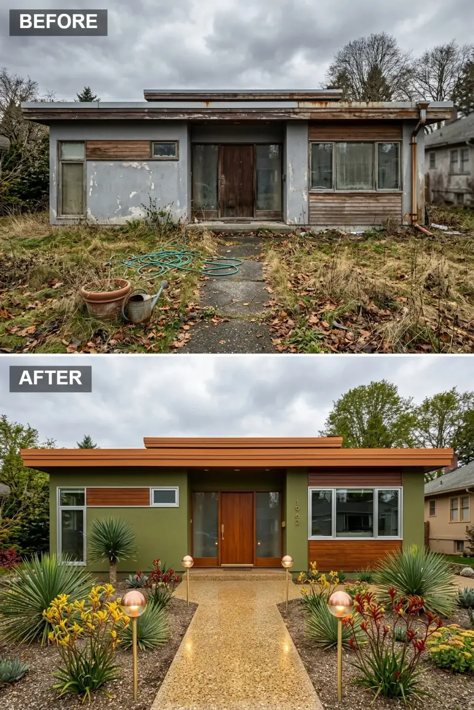
This one leans into the house's actual era instead of fighting it. Olive-green stucco becomes the field color, broken by warm horizontal teak siding sections, and a retro wood door with brushed-brass hardware anchors the entry. The planting goes sculptural and low-water — yucca, kangaroo paws, the kind of architectural foliage that holds its shape — while globe path lights line an exposed-aggregate walk. It's the most period-honest version of the eight, and the one that reads as "designed" rather than "renovated."
I love this approach because it costs the least to be brave. Color is the cheapest design risk you can take — a wrong olive is a repaint, not a tear-out. The plan move here is restraint: a mid-century house already has good horizontal lines and wide eaves, so the renovation's job is to re-clad selectively and let the original geometry carry the look. The teak sections want a UV-stable penetrating oil (Rubio again, or a marine-grade) because a mid-century color story falls apart the moment the wood grays out unevenly. Up here in the Beacon and Cold Spring weekend-house stock, era-faithful mid-century facades have quietly become some of the most sought-after street fronts.
Color Palette
An earthy, era-correct field tone — close to Sherwin-Williams Rosemary SW 6187 in a masonry finish.
Warm horizontal teak-toned siding that flatters the green and reads unmistakably mid-century.
Brushed-brass door hardware and globe fixtures for that touch of retro warmth at the threshold.
Exposed-aggregate concrete — durable, textured, and exactly the right vintage for the period.
4. The Tranquil Japanese-Inspired Retreat
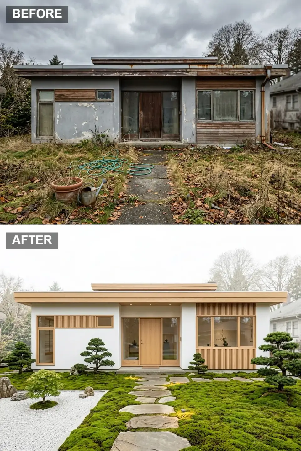
Quietest of the eight. Soft-white stucco with light-ash vertical batten details and a matching light-wood door keeps the building bright and recessive — the architecture deliberately steps back so the garden can lead. The front yard becomes a Zen composition: raked off-white gravel, a moss carpet, shaped bonsai, and a grey-stone stepping path that sets a slow, deliberate pace from the street to the door. It's less a facade than a sequence.
The plan insight here is that the landscape is doing the architectural work, which makes it the rare exterior where you can spend less on the building and more on the ground plane. Vertical battens are a finish-stage detail — a furring grid and trim boards over existing cladding — so the structural ask is low. The real maintenance line item is the garden: raked gravel and moss are a weekly discipline, not a one-time install, and bonsai are a horticultural commitment. In the Hudson Valley's hard winters I'd swap true moss for a hardy sedum-and-Irish-moss blend that survives a freeze.
Color Palette
A warm, low-glare white (BM White Dove OC-17) that recedes and lets the garden carry the composition.
Pale ash-toned battens add soft, natural warmth without breaking the calm of the white field.
Fine, light gravel that holds a raked pattern — the heart of a karesansui dry garden.
Irregular grey fieldstone set as a tobi-ishi path that paces the walk from gate to door.
5. Industrial Chic With Concrete Panels
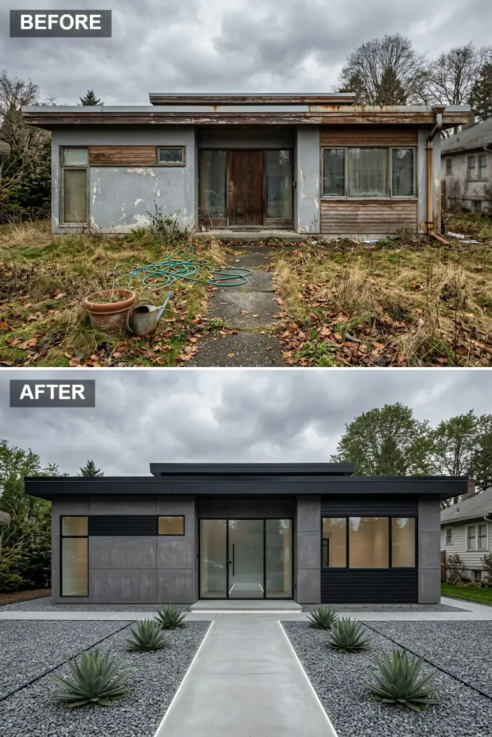
The most uncompromising version. The house is wrapped in large-format fiber-cement or concrete panels with crisp reveal joints, black aluminum window frames, and a tall glass front door that turns the entry into a vertical slot of light. The landscape goes full minimalist: a field of dark-gray gravel, sculptural agave, and a smooth concrete walk with integrated LED strip lighting that reads as a glowing line at night. Nothing is soft, and that's the point.
Read the joints. Large-format panel systems (Equitone, Swisspearl, James Hardie's Architectural Collection) live or die on the layout of their reveal joints, which is a design-and-shop-drawing exercise before it's an install — you set the grid to the window openings, not the other way around. That's a plan-stage decision masquerading as a cladding choice. The substrate and a continuous rainscreen cavity matter as much as the panel itself in our climate. The glass door is the structural flag: a tall single light may need a header re-sized, so price it as an opening change, not a swap.
Color Palette
Through-color fiber-cement panel (Equitone Natura) for a raw, even, low-maintenance industrial face.
True black aluminum frames draw a graphic outline against the gray field.
A low-water, low-maintenance alternative to lawn that extends the panel palette to grade.
Trowel-finished concrete with a recessed LED channel for a clean, glowing path edge.
6. The Dramatic Monochromatic Statement
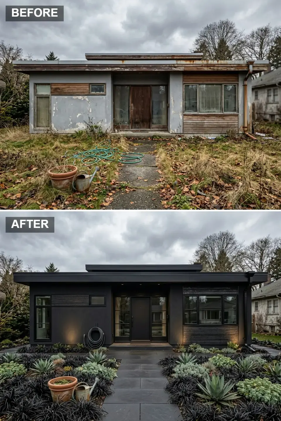
Everything goes dark. Stucco, wood siding sections, and trim all drop into varying shades of deep black and charcoal, so the house reads as one continuous sculptural mass rather than a collection of parts. The planting plays along — black mondo grass and dark-foliage plants — with a single aged-terracotta planter breaking the spell. Warm up-lighting is doing essential work here: without it, a black house flattens into a silhouette after dusk.
This is the most psychologically bold move on the cheapest physical footing — it's almost entirely paint and stain, no structural ask at all. The plan-aware caution is thermal: dark facades run hot, and in our summer sun a black wall assembly wants real attention to the ventilation gap behind the cladding and to UV-stable products, or the finish chalks and the wall cooks. Use texture, not color, to keep it from going flat — a matte stucco against a satin siding against a low-sheen trim, all in the same family. The terracotta pot isn't decoration; it's the one warm note that tells the eye the black was a choice.
Color Palette
A deep, near-true black (BM Black Beauty 2128-10) in a matte stucco finish for a unified mass.
A shade off the stucco so the wood reads as texture, not a seam — ideally a charred-effect or Shou Sugi Ban siding.
Carries the dark theme to the ground plane so the house and its hardscape read as one gesture.
A single earthy, warm note that breaks the monochrome and signals intent.
7. Sophisticated Luxury With Stone & Wood
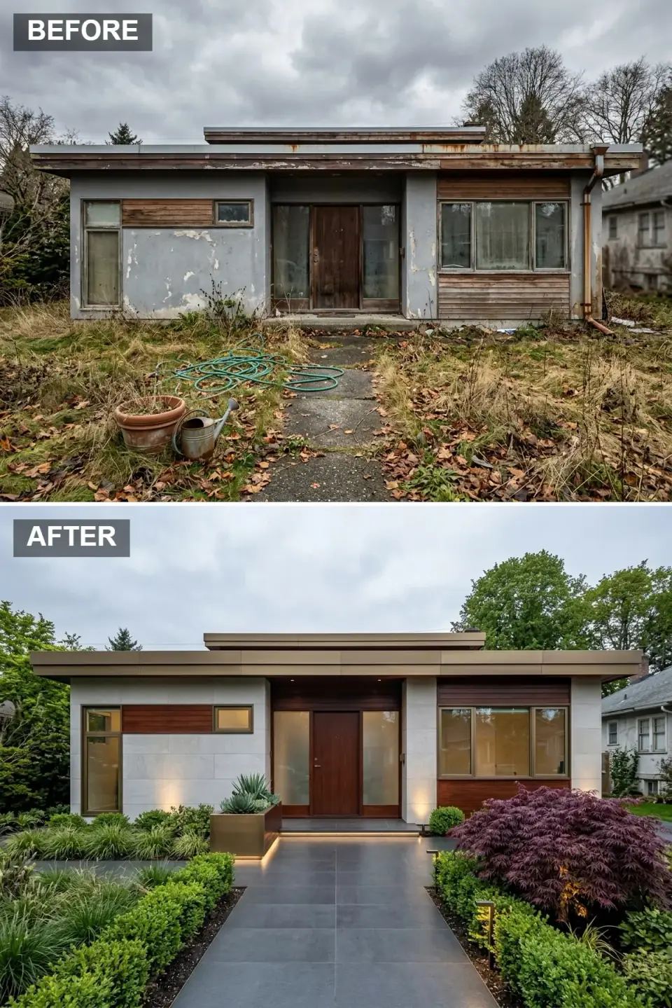
The high-end version. Large-format, light cream limestone cladding pairs with rich walnut panels and a matching wood door, while a custom bronze planter with integrated lighting and a large-format porcelain-tile walk dress the entry. The landscape is layered and intentional — clipped boxwood masses, a vibrant Japanese maple as the specimen note — so the planting reads as composed as the building. Every material here is the expensive version of itself, and the eye registers that immediately.
From a plan standpoint, this is the rustic-stone version with the budget turned up and the joints tightened. Large-format stone means fewer, cleaner lines, which demands precise substrate prep and a real anchoring system — full-thickness stone is a structural load, thin-veneer porcelain-look panels are not, and the choice between them is a foundation-and-framing conversation. The walnut wants protection from our wet shoulder seasons; an oil finish on a vertical rainscreen is the detail that keeps "luxury" from turning into "warped and gray." Spend here on the materials touching the entry — the threshold is where guests read quality.
Color Palette
Bright, sophisticated limestone in large format — fewer joints read as more expensive.
Deep walnut tone for warm contrast against the pale stone — a high-end pairing that never reads cold.
Brushed-bronze planter and trim for a metallic note of restraint, not flash.
Large-format porcelain pavers — frost-rated, low-maintenance, and crisp underfoot at the entry.
8. Organic Modern Beauty in Natural Wood
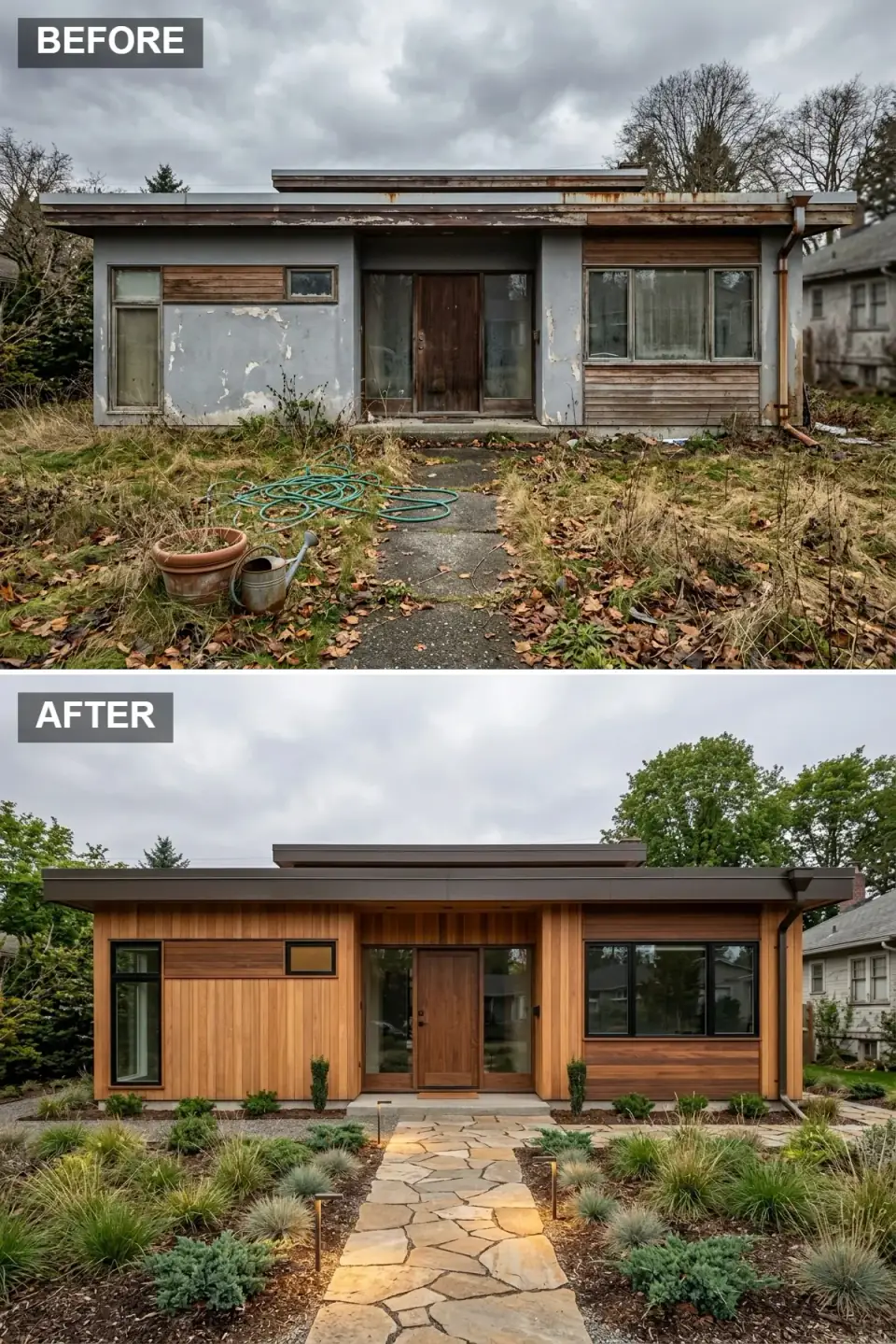
The warmest of the eight, and my personal favorite to detail. The whole house is wrapped in vertical natural cedar, which stretches the building visually taller and gives it an organic, hand-built quality. Dark-bronze fascia and black window frames draw the edges so the wood doesn't go shapeless. The landscape is informal and regional — a winding flagstone path through native grasses and low junipers — so the house sits in its setting rather than on it. It's the version that ages into the land instead of standing apart from it.
Vertical board cladding is a deceptively technical choice: run vertically, your battens and furring have to shed water correctly and your trim has to manage the end grain, or you get the rot you were trying to avoid. The honest decision every cedar owner makes upfront is whether to seal it warm with a UV-stable oil or let it weather to a silver-gray patina — both are legitimate, but they're different maintenance lives, and pretending you'll do nothing is how cedar fails. This is the direction I steer most Hudson Valley clients toward, because it reads as architecture and dissolves into the landscape at the same time.
Color Palette
Vertical western red cedar — the dominant material, sealed with a UV-stable oil to hold the warm tone.
Defines the roofline and edges with a strong, warm-dark line that keeps the wood from reading shapeless.
Black frames modernize the look and make the glazing read as crisp openings in the wood.
Irregular natural flagstone that carries the organic theme from the facade to the ground.
Pro Tips From the Renovation Designer's Chair
- Separate skin from structure on day one. Before you pick a style, sort every change you want into "finish-stage" (paint, cladding over sheathing, landscape) and "structural-adjacent" (new openings, roofline, heavy veneer). That single sort sets your real budget.
- Black trim is the highest-leverage dollar. Across six of these eight, dark window frames and trim do most of the visual heavy lifting for a fraction of the cost of re-cladding.
- Veneer is a load, not a finish. Stacked stone and full-bed limestone add real weight. Get a structural read on the foundation ledge and wall framing before you commit to the look.
- Rainscreen everything in the Northeast. Stucco, panels, cedar — every cladding here needs a drainage gap behind it. In our freeze-thaw climate, a trapped-moisture assembly fails in years, not decades.
- Cladding joints are a plan decision. Large-format panels and stone are designed at the joint layout, set to your window openings. Decide the grid before you order the material.
- Light the facade you chose. Dark and textured exteriors flatten at dusk without warm grazing light. Budget the lighting as part of the facade, not an afterthought.
Cost-Saving Moves
- Paint before you re-clad. Color is the cheapest design risk you can take. A mid-century color revival or a monochromatic facade costs a fraction of a stone or panel job and is fully reversible.
- Re-clad selectively, not wholesale. Stone or wood on the entry mass and base — where the eye lands — reads as a full transformation at a portion of the material cost of wrapping the whole house.
- Spend at the threshold. Concentrate premium materials at the front door and walk. Guests read quality at the entry; the far elevations can run simpler and cheaper.
- Keep the windows, change the frames. Factory-finished clip-on trim or capping over sound existing windows delivers the black-frame look without the cost of full replacement.
Reader Questions on Exterior Transformations
Which of these eight exterior styles is the cheapest to pull off?
The mid-century color revival and the monochromatic black statement, by a wide margin. Both are essentially paint-and-stain jobs over your existing cladding, with no structural changes and no heavy material to carry. Color is the lowest-risk design move you can make — a wrong choice is a repaint, not a tear-out. If your budget is tight, start with color and landscape, then add selective cladding to the entry mass later. The stone-and-wood luxury version and the concrete-panel industrial version sit at the opposite end of the cost range.
Do I need a permit to change my home's exterior?
It depends on what you're actually changing. Paint, like-for-like siding replacement, and landscape work generally don't require a permit in most Hudson Valley towns. But new or enlarged window openings, a re-clad roofline, heavy stone veneer that adds structural load, and anything touching the building envelope's structure usually do — and may need an engineer's stamp. Always check with your local building department first; the line between a finish change and a structural one is exactly where permitting kicks in, and it's the most common surprise homeowners hit.
Why does stone veneer cost so much more than it looks like it should?
Because it isn't a finish — it's a load. Adhered manufactured stone adds 12–15 pounds per square foot, and full-bed natural stone considerably more. That weight has to be carried by the foundation ledge and the wall framing, which often means a structural read and sometimes added support. On top of that, stone needs a weep screed, a drainage mat, and correct flashing so trapped water doesn't rot the sheathing behind it. The stone itself is only part of the bill; the assembly and the structural prep behind it are the rest.
Is a black house a bad idea in a cold, snowy climate?
Not bad, but it demands attention. Dark facades absorb more heat, so in summer sun a black wall assembly runs hot — which makes the ventilation gap behind the cladding and UV-stable, fade-resistant products non-negotiable. Done right, with a proper rainscreen and quality finishes, a black house performs fine year-round in the Northeast and looks stunning against snow. Done cheaply, the finish chalks and fades and the wall cooks. The aesthetic is bold and low-cost; the durability comes from the detailing behind it.
Which exterior style adds the most resale value?
There's no single winner — it depends on your house and your street. The reliable principle from the NAHB Cost vs. Value data is that exterior projects with restraint and material honesty return better than bold, polarizing ones. A clean high-contrast minimalist or an organic cedar facade tends to read as broadly desirable, while a heavily stylized version may delight some buyers and alienate others. For resale specifically, I steer clients toward the styles that respect the home's era and neighborhood rather than the ones that fight them.
Where to Read Next
If the one-house-many-faces format is your thing, my masterclass on ten exterior destinies for a single home pushes the idea further, and seven facades of revival on an abandoned modernist shell shows the same logic applied to a true gut renovation rather than a cosmetic refresh.
Sources & Further Reading
- National Association of Home Builders, Remodeling Cost vs. Value Report — exterior project ROI benchmarks.
- This Old House, Siding & Exterior Cladding guides — material comparisons and installation detailing.
- James Hardie, fiber-cement siding and panel specifications — product data and rainscreen guidance.
- Marvin, window and door specifications — black-frame and large-format glazing options.
- Natural Stone Institute, stone veneer and installation standards — weight, anchoring, and weep detailing.
- Equitone, through-color fiber-cement panel system — joint layout and reveal-detail references.
- U.S. Department of Energy, Building America Solution Center — rainscreen and wall-assembly moisture management.
- Remodelista, exterior and landscape design references — material and palette inspiration.

Nora Whitfield
Renovation Designer & Interiors Editor · Beacon, New YorkNine years of design-build renovation work across the Hudson Valley and the Northeast. Nora runs the Renovations, Room Guides and Renovation Mind desks — before-and-after studies, room-by-room design guides, and the long essays on why what we renovate matters.
More from Nora →
Reader notes