

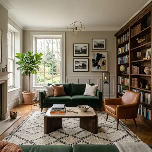
I'm Theo Caldwell, a renovation designer working out of the Hudson Valley, and after seven years of walking Beacon, Rhinebeck, Kingston, and the occasional Brooklyn brownstone, I've stopped trusting first impressions of a finished room. What a house looks like in a photograph and what a house tells me about its owner when I'm actually standing in the kitchen are almost never the same thing. The closer I look, the more I'm convinced that a home isn't decorated so much as written — slowly, in dialect, by someone who doesn't always realize they're writing. This piece is for The Renovation Mind file: a slower read on what the decor in your house is quietly confessing about your interior life, your cognitive style, and the parts of yourself you may not have named yet.
How I Read a Room
On a renovation walkthrough I spend the first ten minutes ignoring the finishes and looking at the small accumulations — what's on the side table, which chair has the throw, where the reading light is actually plugged in, what's leaning against the wall waiting to be hung. Those details are the most honest sentences in the room. They tell me what the owner does when no one is watching, which is the only useful starting point for a design conversation. Trends, mood boards, and Pinterest folders can lie. The wear pattern on a velvet armchair can't.
The framework I work with is plain: a home is an externalized map of an interior life, drawn slowly over years of small decisions. The renovation question isn't "what's on trend" but "what does the existing map tell us about this person, and how can the construction honor it rather than overwrite it." For a companion read in the same register, my essay on the silent storyteller works the same territory from a slightly different angle.
1. The Library as a Cognitive Blueprint
A bookshelf is the single most legible autobiography in a Hudson Valley living room — more legible than the kitchen, more revealing than the bedroom, more honest than any vignette an owner stages for guests. What I read first isn't the titles but the state of the collection. Pristine hardbacks with unbroken spines are cultural armor: the owner wants the room to suggest intellectual depth without committing to it. Creased paperbacks, sticky notes poking out the tops, and obvious read-in-the-bath water damage are the opposite signal — actual engagement, ongoing thought, a person who treats books as tools rather than props. Neither category is more virtuous, but they tell radically different stories about how the owner relates to ideas.
The arrangement is a second layer of information. Color-coded shelves usually point to an inhabitant who values visible order and is comfortable letting the cover do the social work. Subject-based grouping with vertical and horizontal stacks, books standing in front of other books, and one stray cookbook on the philosophy shelf reads as a mind that prefers organic association over imposed system. Closed cabinetry below and open shelving above is the most common pattern I see in renovated Rhinebeck farmhouses — it suggests a person who edits in public but stores in private. None of these readings demand a renovation response. They just demand that the renovation not erase them.
2. Color as Emotional Weather
The dominant color of the room you spend the most time in is the emotional weather you have chosen to live under. That's not poetry — it's the practical reality of how the visual cortex processes saturation and value during a sixteen-hour waking day. Deep saturated greens (Farrow & Ball Studio Green No. 93, Benjamin Moore Hunter Green 2041-10, Sherwin-Williams Pewter Green SW 6208) almost always signal a desire for cocoon, recovery, and visual quiet after high-stimulus working hours. I see this palette most often in clients whose external lives are loud — finance, medicine, parenting, anything where attention is constantly fragmented.
Cool whites and pale greys (Benjamin Moore White Dove OC-17, Farrow & Ball Cornforth White 228, Sherwin-Williams Snowbound SW 7004) read more often as an attempt to impose clarity on an internally crowded life. The owner is using the room to do cognitive housekeeping. Warm earth tones (Benjamin Moore Pashmina AF-100, Sherwin-Williams Accessible Beige SW 7036, Farrow & Ball Jitney No. 293) signal a desire for grounding and reassurance — the visual equivalent of being held. The color report a client gives me about themselves is usually less reliable than the color choices they've quietly returned to over the past decade. I pay more attention to the second.
3. Biophilia and the Appetite for Living Systems
A house with a thriving fiddle leaf fig in the corner, a tray of propagated cuttings on the kitchen sill, and a slightly overgrown herb pot on the back step is telling me something specific. It's not just that the owner likes plants. It's that they have an appetite for living systems — for nurturing something that grows on its own schedule, requires consistent attention, and rewards patience rather than performance. Biophilia, as Edward O. Wilson framed it in 1984 and as architects like Stephen Kellert later translated into practical design vocabulary, isn't a styling choice. It's an evolved psychological appetite, and the homes that satisfy it are measurably calmer to live in.
The renovations I work on most often in the Hudson Valley use biophilic moves not as a planting statement but as a structural one — west-facing window seats designed to hold a row of citrus pots through the winter, a kitchen island with an end-cap herb planter on a drip line, a primary bath laid out to keep a six-foot Ficus alive without it blocking the shower door. If the topic is worth pursuing in a single room, my biophilic bedroom guide walks the bedroom-specific moves in detail. What I notice in clients who maintain plants successfully is that they're rarely the same clients who renovate impulsively. They tend to make slow, considered, system-aware decisions in both gardens and houses.
4. Texture, Comfort, and the Vocabulary of Vulnerability
A room reads emotionally through the hands and the back as much as through the eyes. The tactile inventory of a living room — the pile of a Beni Ourain rug, the give of a velvet cushion, the patina of an aged leather chair, the rough warmth of a Pendleton wool throw, the cool weight of a stoneware lamp base — is the part of the design that I find tells me most about the owner's relationship with comfort. A heavily layered tactile palette signals someone who needs sensory grounding to come down from a demanding outside life. The textures aren't decorative; they're regulatory.
The opposite pattern — sleek surfaces, low-pile rugs, hard-edged furniture, materials chosen for cleanability rather than touch — usually signals a different psychological priority: visual order, lower emotional maintenance, a preference for the room to recede so the inhabitant can think clearly. Neither register is wrong. What concerns me on a site visit is the in-between: a room layered in materials that look soft but feel rigid (faux velvet that doesn't compress, "performance" linens that have the texture of upholstered cardboard, rugs that photograph deep but feel like indoor-outdoor carpet underfoot). That mismatch tells me the room was designed for the camera rather than the body. A renovation that takes comfort seriously is one of the quietest acts of self-respect a homeowner can make.
5. Curation Versus Clutter, and the Right to Edit
The visual difference between curation and clutter can be smaller than people expect — both involve a lot of stuff on display. The psychological difference is enormous. Clutter is what accumulates when a person can't make a decision: every object stays because deciding what to remove is harder than letting it sit. Curation is the opposite — every object on display has earned its place through an active choice, and the unchosen objects have been deliberately released. The room I'd call cluttered isn't necessarily messier than the room I'd call curated; it just hasn't been edited recently.
The clients I work with who maintain genuinely curated homes share one trait: they're comfortable with editing their own narrative. They can look at a credenza and say "that vase belonged to my mother, and I'm done with it." They can pull an inherited painting off the wall without feeling that they've dishonored a memory. Renovation conversations with these clients are noticeably faster, because the deeper editorial work has already been done. For clients who haven't, the renovation often surfaces a separate question — not "what should this room look like" but "what story am I willing to tell about my life right now." That's the harder, longer, more rewarding question, and it's usually where the real renovation lives.
6. The Dialogue Between Heritage and the Present
In a Hudson farmhouse with original crown molding, a working fireplace, and herringbone oak flooring laid in 1903, the most informative design choice isn't what the owner has added — it's how they're relating to what was already there. Owners who preserve and highlight original features (refinishing the floors rather than covering them, retaining the original mantle even if it's slightly battered, restoring rather than replacing the wavy-glass windows) are usually telegraphing a respect for continuity and a comfort with constraint. They're saying that the house gets a vote in its own renovation.
Owners who layer contemporary moves against that heritage backdrop — a sculptural Apparatus fixture over a 1920s dining table, an abstract painting against original wainscoting, a Vipp kitchen island in a room with original tin ceilings — are running a different program. They're not erasing the past; they're refusing to be governed by it. That dialogue between heritage and the present is one of the most reliable signs of a thoughtful renovation, and it's almost always more compelling than either pole on its own. Pure period-correct restoration tends to read as museum work; pure contemporary insertion tends to read as a missed opportunity. The middle path — what the trade often calls transitional, though that label sells it short — is where most of the strongest Hudson Valley renovations actually live.
7. The Living Room as Stage, Sanctuary, or Both
The living room is a liminal room — semi-public when guests arrive, deeply private the rest of the time — and the layout tells me which mode the owner has prioritized. Furniture arranged in a conversational cluster, two sofas facing each other across a low coffee table, accessible side tables on every chair, ample ambient lighting at multiple levels: this is a room designed for talking. The owner values gathering, hospitality, and the kind of slow Sunday afternoons that end with three people still in their seats at 5 p.m.
A room oriented around a single large television, with sightlines pulled toward the screen and seating arranged for solitary viewing, is a different declaration — usually about how the owner recovers from demanding work, not about how they entertain. The pattern I worry about is the rigid, formally arranged living room that nobody actually sits in: too-firm sofa, decorative cushions that don't compress, fragile side tables, no accessible reading light. That room is the stage with no audience and no performance — pure protective display. The renovation conversation in that case usually starts with asking the owner which room they actually live in. The honest answer is sometimes the kitchen island, sometimes the bedroom, sometimes a back porch. The renovation should follow them there. My quiet luxury living room guide goes deeper on the lived-in living room as a renovation target.
Reading Prompts for Your Own Rooms
- Audit your bookshelf without rearranging it. Walk past in the order the books currently sit and notice the clusters, surprises, and aspirational unread titles. That's the honest cognitive blueprint — don't tidy it before you've read it.
- Name the long-term dominant color of your most-used room. Ignore any palette you've adopted in the past eighteen months under the influence of trends. Look for the color you keep returning to across a decade. That's the emotional weather you have actually chosen.
- Count the living systems in your home. Plants, herbs, a sourdough starter, a tank of fish — anything you maintain on its own schedule. The number, and how many are thriving, is a real read on your appetite for slow, system-aware effort.
- Touch every piece of upholstery in your living room. Test the give of the cushions, the pile of the rug, the temperature of the surfaces. If anything looks softer than it feels, you're being designed for by the camera rather than for yourself.
- Identify one display surface where you've made deliberate choices. A mantel, a tray, a shelf you've actually edited. Then identify one where you haven't. The difference between the two tells you where curation already lives and where the next edit is waiting.
- Walk into the room you actually live in. Not the one you'd photograph for guests — the one where you read, eat dinner standing up, or fall asleep on the couch. That room is your real living room. The renovation should follow.
Reader Questions on Reading Your Decor
How do I tell whether my home is curated or just cluttered?
The cleanest test isn't a count — it's a question. Pick any object on a visible surface and ask why it's there. If the answer comes quickly and specifically ("it was a wedding gift from someone who matters, it sits here because it catches the late-afternoon light"), that object is curated. If the answer is vague or comes back as "it's been there for years and I never moved it," that object is clutter, regardless of how nice it looks. Curation is about active choice and active maintenance. Clutter is about decisions postponed indefinitely. The fix is rarely buying more containers; it's giving yourself permission to release the items you can't speak for.
My partner and I have completely different decor instincts. How do we read that?
Two-person households almost never share a single design profile, and that's actually the more honest situation. What I look for in a couples renovation is which rooms each partner has emotional ownership of, and whether the public shared rooms are genuinely shared or quietly dominated by one person's taste. The strongest result usually isn't a compromise — it's a conscious split: the primary bedroom reflects partner A, the kitchen reflects partner B, the living room is built around the actual rituals you share. Forcing a single unified aesthetic across the whole house often produces a result neither partner fully recognizes.
Can my home shape me, or only reflect me?
Both, and that's the part of environmental psychology that's easiest to underestimate. The reciprocity is real: you choose a deep green palette because you need cocoon, and then living in that palette for two years subtly raises your tolerance for slowness, quiet, and reflection. The space starts reinforcing the disposition that chose it. This is why renovation is more consequential than decoration. A room you'll live in for ten years isn't just expressing your current self; it's quietly editing the self you'll become. Choose accordingly, and don't dismiss the seemingly small decisions — they compound.
What if my decor was inherited and doesn't feel like me?
Inherited interiors are common in Hudson Valley properties, especially in family-held farmhouses that pass through two or three generations. The mistake to avoid is the wholesale purge. The opposite mistake is treating the inherited interior as untouchable. The middle path: identify the three or five inherited pieces that have genuine meaning to you (the brass lamp, the dining table, the rug from the front parlor), give them prominent places in the renovation, and release the rest with intention. The inherited home becomes legitimately yours when you've consciously chosen which parts of the inheritance to keep.
How much weight should I give to design trends?
Use trends as vocabulary, not as instruction. A trend can give language to a preference you've quietly held for years — the "quiet luxury" vocabulary, for instance, helped a lot of Hudson Valley clients articulate a palette they'd been gravitating toward for a decade. But a trend that asks you to override an instinct you've held consistently is almost always the wrong move. Renovations executed on borrowed taste age badly because the underlying conviction was never there. Renovations executed on honest taste — even unfashionable taste — tend to deepen over time.
Where do I start if I want my home to feel more like me?
Start with the room you actually live in, not the room you'd photograph for guests. Walk in, sit where you naturally sit, and notice what your eye lands on. If what your eye lands on doesn't feel like you, that's the first thing to change. The smallest possible edit — swapping a single piece of art, repositioning a chair, removing one object — is usually a more honest starting point than a full redesign. Identity-aligned homes are almost always built incrementally, with the owner gaining clarity from each small change before committing to the next.
Where to Read Next
If you want to keep going down the Renovation Mind file, my essay on the silent confessions picks up the daily-ritual side of this argument, and the inheritance of space goes deeper into how rooms archive who you were raised to be. The full archive lives in the Renovation Mind category.
Sources & Further Reading
- Clare Cooper Marcus, House as a Mirror of Self: Exploring the Deeper Meaning of Home — the foundational text on environmental autobiography.
- Edward O. Wilson, Biophilia — the original framing of human attraction to living systems.
- Stephen R. Kellert, Judith Heerwagen, and Martin Mador, Biophilic Design — applied biophilia for residential and commercial interiors.
- Winifred Gallagher, House Thinking: A Room-by-Room Look at How We Live — environmental psychology at room scale.
- Sally Augustin, Place Advantage: Applied Psychology for Interior Architecture — useful reference for the design-build conversation.
- Christopher Alexander et al., A Pattern Language — the architectural-pattern reference for designing rooms around how people actually live.
- Witold Rybczynski, Home: A Short History of an Idea — historical context for the private interior as a Western development.
- The Joint Center for Housing Studies of Harvard University, Improving America's Housing report series — current data on how American homeowners renovate, prioritize, and live.
- Architectural Digest, Clever editorial archive — the lived-in, identity-driven side of residential design.
- Remodelista, Inspirations editorial archive — reference for interiors that prioritize honesty over performance.

Nora Whitfield
Renovation Designer & Interiors Editor · Beacon, New YorkNine years of design-build renovation work across the Hudson Valley and the Northeast. Nora runs the Renovations, Room Guides and Renovation Mind desks — before-and-after studies, room-by-room design guides, and the long essays on why what we renovate matters.
More from Nora →
Reader notes