

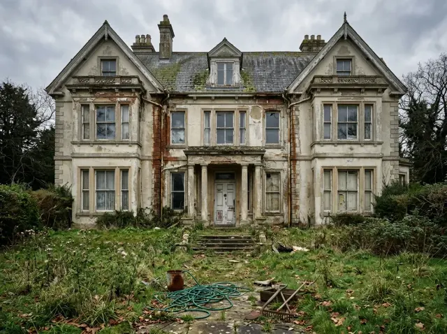
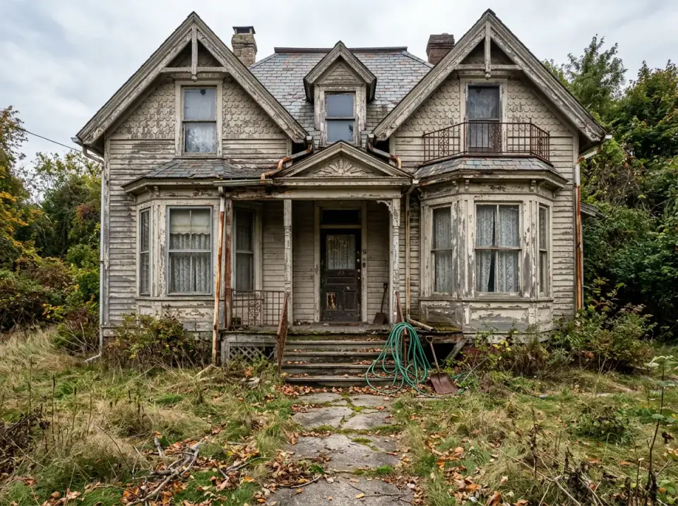
A failing estate is rarely a lost cause — it is a strong plan buried under bad decisions. I am Theo Caldwell, and across seven-plus years reading blueprints and walking renovation sites through the Hudson Valley, I have learned to look past peeling render to the bones underneath: the symmetry the original drafter set, the load path, the way the roof meets the wall. These ten transformations all started from the same forlorn shell. Each one shows a different design-build answer to the same question I ask on every site — what was this house always trying to be, and what would a thoughtful renovation finally let it become?
How I Read a Derelict Facade
Before I let anyone pick a paint color, I read the elevation like a drawing. Where is the central axis the original builder laid down? Are the window openings aligned floor to floor, which tells me the wall is doing structural work, or scattered, which tells me later owners cut openings wherever they pleased? Is the roof pitch original or has it been re-framed? A historic estate carries a logic in its proportions, and the difference between a transformation that sings and one that fights itself is almost always whether the renovation respected that logic or papered over it.
The other read is what I call framing-stage versus finish-stage. Cladding, render, roof material, window replacement — those are framing-stage decisions that touch the envelope and the weather line, and they have to be settled before a single decorative choice is made. Mulch color, lantern style, door hardware — finish stage. Most failed renovations I see invert that order, chasing a mood board while the envelope still leaks. If you want the longer version of how I separate the two, I walk through it in my guide to exterior makeover materials. Read the plan first; renovate with intent second.
1. The Indigo Enigma — Moody Monochrome Revival
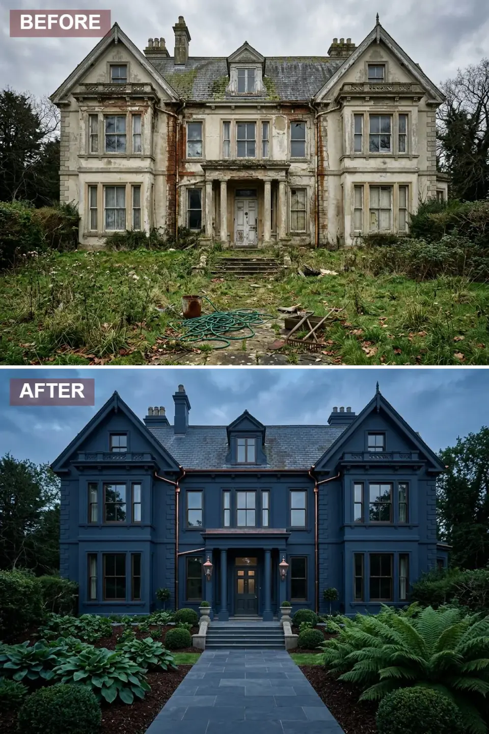
Where decaying plaster and exposed brick once read as neglect, a single deep-indigo render now pulls the whole facade into one gallery-like envelope. The rusted drainage is gone, replaced by ornate copper gutters and downspouts that will patina over the years instead of streaking. The roof is fully restored in clean slate, the overgrown yard becomes a formal shade garden of hostas, ferns, and sculpted boxwood against dark mulch, and a wide stone path gives the entry a proper procession. Period copper lanterns flank the restored portico.
Here is what the plan would tell you: a uniform dark render is the single best move for a facade that has been patched a dozen times, because it erases the visual record of every old repair. But it is a finish-stage decision that depends on a framing-stage truth — the substrate has to be sound and the flashing right, or that beautiful indigo just makes the failures shadow through. I would specify Benjamin Moore Hale Navy HC-154 or Farrow & Ball Hague Blue in a true exterior masonry coating, and I would insist the copper be real copper, not a coated lookalike, so the patina is the genuine living finish the scheme is selling.
Color Palette
Deep Navy Blue
#1E2A4A
The dominant render, close to Benjamin Moore Hale Navy, unifying the whole envelope.
Warm Copper
#B87333
Real copper gutters, downspouts, and lanterns that develop a living patina.
Charcoal Grey
#4A5568
Restored slate roofing giving quiet contrast to the indigo walls.
Deep Green
#2D5016
Layered shade foliage and clipped boxwood softening the formal approach.
2. Scandinavian Dawn — A Breath of Coastal Calm
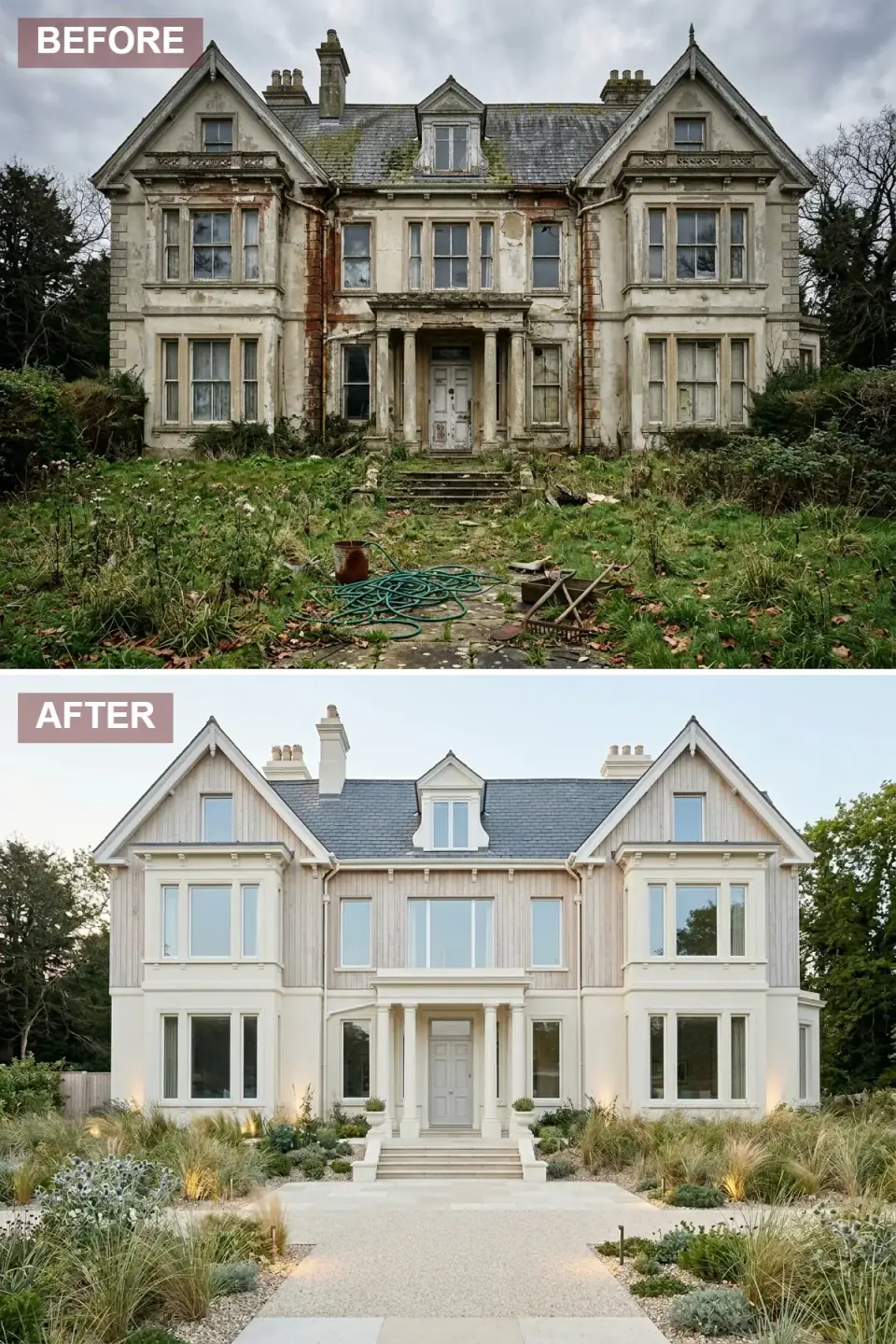
The crumbling stucco and weathered brick give way to pale vertical wood siding and a soft cream render, stripping decades of decay for a bright Nordic palette. Larger windows with minimal mullions replace the broken panes and pull daylight deep into the rooms. The chaotic yard becomes a serene gravel courtyard framed by ornamental grasses and drought-tolerant plantings, discreet ground-level uplighting washes the facade after sunset, and the roof is refinished in soft grey slate to complete the sand-toned, ethereal read.
The plan-literate caution here is the windows. Enlarging openings on a historic wall is a structural move, not a cosmetic one — every opening you widen needs a properly sized header, and on a load-bearing masonry facade that can mean steel. This is the decision that quietly blows budgets when owners treat "bigger windows" as a finish choice. I would run the vertical siding in something that takes the Nordic mood without rotting in Northeast freeze-thaw: prefinished cedar or, for lower maintenance, a James Hardie vertical panel in a warm off-white. Andersen or Marvin fiberglass-clad units carry the minimal-mullion look while actually performing in a Zone 5 winter.
Color Palette
Pale Beige
#E6DCC4
Vertical siding and render forming a warm, sun-bleached Scandinavian base.
Off-White
#F7F5F0
Trim and detailing giving crisp definition without stark contrast.
Soft Grey
#A8B2C1
Refined slate roofing that complements the pale walls without visual weight.
Muted Gold
#C4B896
Ornamental grasses and gravel echoing a windswept coastal palette.
3. Regal Stone Renaissance — Old-World Luxury Redefined
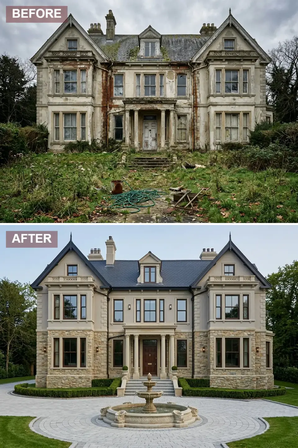
Where peeling paint and exposed substrate signaled neglect, a two-tier material strategy now reads as permanence. The lower level wears rusticated beige stone; the upper stories take a complementary smooth stucco in a warm neutral. A circular cobblestone motor court anchors the approach, centered on a tiered fountain that turns arrival into a ceremony. Boxwood parterres and manicured lawn replace the weeds, dark slate roofing with sharp black gable trim restores the roofline's authority, and bronze sconces with a mahogany door amplify the classical luxury.
Two-tier cladding is one of the oldest and smartest moves in the book — heavy material low, lighter material high, which is exactly how the load wants to be expressed. The renovation reality check is weight and water. Real stone veneer needs a proper ledge or engineered support and a drainage plane behind it; skip that and you trap moisture against the wall. If the budget is tight, a quality adhered manufactured stone reads convincingly from the motor court for a fraction of the structural cost. Tie the windows together with one dark frame color across both materials — that single consistency is what makes mixed cladding read as one composition instead of two houses stacked.
Color Palette
Warm Beige
#D4C5B0
Rusticated stone grounding the lower facade in timeless texture.
Pale Taupe
#C8B89E
Smooth upper render unifying the central and upper volumes.
Dark Blue-Grey
#3A4A5C
Roof slate and gable trim adding sharp contrast and depth.
Deep Emerald
#1B4D3E
Boxwood hedges and lawn framing the symmetry in structured green.
4. Noir Minimalist — The Sculptural Shadow
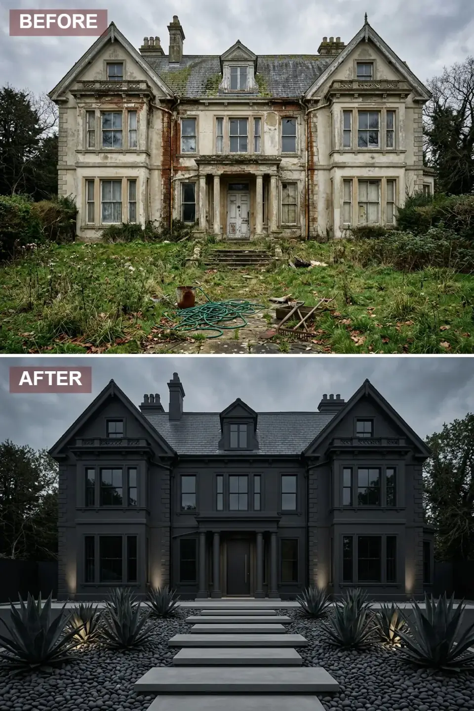
This scheme commits fully to darkness, wrapping the facade in an unapologetic matte black that turns the structure into a geometric monolith against the sky. The dilapidated plaster and broken detailing vanish under the uniform ebonized finish. The landscape shifts to a stark contemporary xeriscape — black river rock around floating concrete steppers, architectural agave standing in like living sculpture. Concealed uplighting grazes the dark walls without revealing its source, and the entrance is stripped to a flush modern door and minimal hardware for a gallery-quiet arrival.
An all-black envelope is the highest-difficulty finish I work with, because black hides nothing about the surface and everything about the form. Every ripple, every proud fastener, every wavy clapboard reads in raking light. That makes surface prep the whole game — a matte finish like Sherwin-Williams Tricorn Black SW 6258 or Iron Ore SW 7069 forgives more than a sheen, but only if the substrate is genuinely flat first. Replace divided-light sash with dark uninterrupted panes so the windows disappear into the mass, and keep the agave count low; against a monolith, three sculptural plants do more than thirty.
Color Palette
Soft Black
#1C1C1C
The all-over facade color, near Tricorn Black, absorbing light and emphasizing form.
Pale Grey
#B0B0B0
Floating steppers and detailing providing tonal relief.
Charcoal
#36454F
River-rock ground cover extending the monochromatic scheme.
Blue-Green Grey
#5F7470
Sculptural plantings adding organic texture without breaking the mood.
5. Timber & Stone Harmony — The Warm English Revival
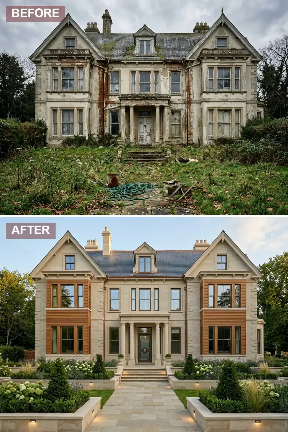
The derelict shell is reimagined as a warm country manor through natural cedar cladding on the projecting bays, set against smooth limestone-colored stucco. New multi-pane windows with dark bronze frames restore period authenticity while improving efficiency. Raised stone planters of hydrangeas, lavender, and clipped yew frame the entrance in place of the chaotic undergrowth, a wide stone path with integrated lighting leads to the columned portico, and the roof is finished in dark slate with terracotta ridge accents. Rebuilt brick chimneys ground the whole in traditional craft.
This is the scheme I find easiest to sell to Hudson Valley and southern New England owners, because it reads as a house that has always belonged. The plan-aware note is to use the timber surgically — cladding only the projecting volumes, where it articulates the massing, rather than wrapping everything and flattening the design back out. Specify real cedar with a UV-stable penetrating finish like Rubio Monocoat, or accept that untreated cedar will silver, and choose. Pair it with oil-rubbed bronze window frames; that single mid-tone is what bridges warm wood and cool stone so neither fights the other.
Color Palette
Warm Amber
#C19A6B
Natural timber cladding on the bays adding organic warmth and texture.
Warm Grey-Beige
#D6CFC7
Smooth stucco and path material for a classic limestone effect.
Dark Bronze
#4A3C31
Window frames and door hardware giving deep, rich contrast.
Creamy White
#F5F5DC
Blooming garden accents and trim offering soft luminosity.
6. Modern Farmhouse Grandeur — Crisp Contrast and Cottage Charm
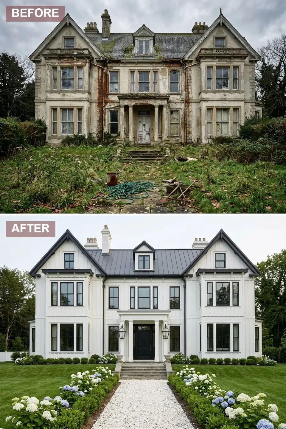
The decaying mansion takes on a fresh identity as a sophisticated modern farmhouse, wrapped in crisp white clapboard with sharp black trim. A new charcoal standing-seam metal roof replaces the moss-covered slate, bringing agricultural vernacular to a grand scale. The overgrown wilderness is cleared for lush lawn and classic hydrangea borders in white and periwinkle lining a white gravel path. Black window frames and a bold black paneled door create graphic contrast against the white envelope, low boxwood runs the foundation, and lantern sconces add a note of nostalgia to the contemporary refresh.
High-contrast black-and-white is the most reliable way to modernize a historic silhouette without erasing it, because it celebrates the outline the original drafter drew. The standing-seam roof is the upgrade worth its cost here — a quality metal roof carries a fifty-year service life against twenty-odd for architectural asphalt, and in the snow-load belt that durability pays back. I would run the white in Benjamin Moore Chantilly Lace or White Dove and the trim in Tricorn Black, then keep the foundation boxwood deliberately low and uniform so nothing competes with the clean clapboard lines.
Color Palette
Pure White
#F8F8FF
Crisp clapboard, near Chantilly Lace, brightening the facade and clarifying the lines.
True Black
#1A1A1A
Window frames, door, and trim creating bold architectural definition.
Dark Grey
#4B4B4D
Standing-seam metal roof introducing a durable, modern-agricultural material.
Soft Blue
#A8BCD4
Hydrangea accents adding gentle pastel notes to the graphic palette.
7. Industrial Heritage — The Urban Loft Estate
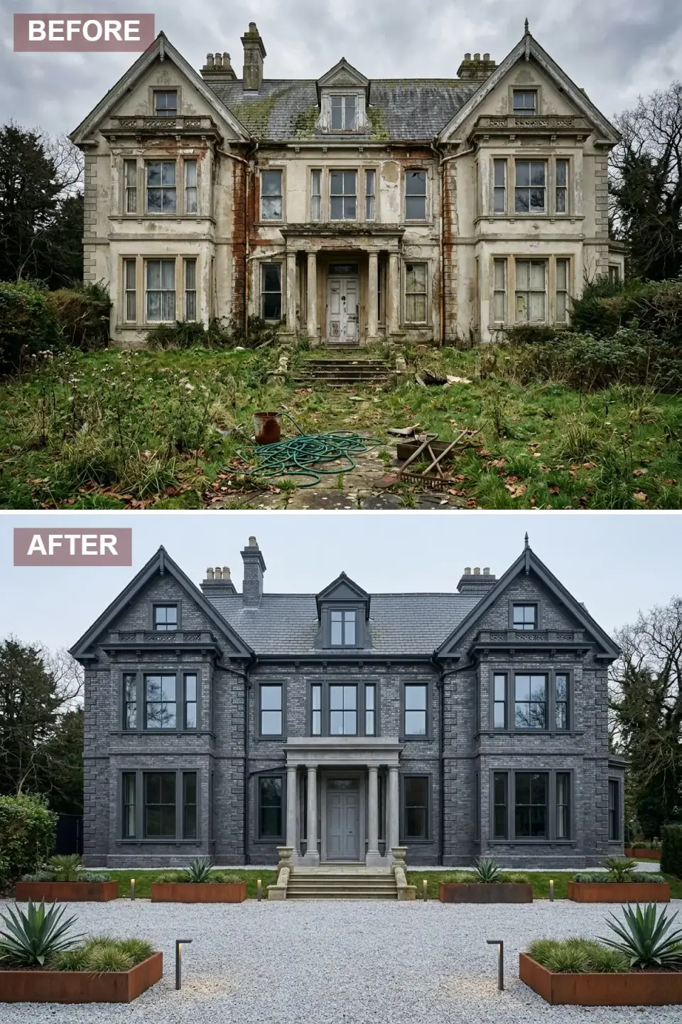
This transformation strips the decay back to a moody, warehouse-inspired read, cladding the facade in dark grey brick that mimics aged industrial masonry. The wild yard becomes a minimalist gravel courtyard organized by rusted Corten steel planters holding spiky agave and ornamental grasses. Slim modern bollards dot the landscape, subtle uplighting catches the brick texture, the windows are unified in dark frames, and the portico columns are simplified. A dark grey door with minimal detailing completes the utilitarian-luxe mood, turning the Victorian bones into a brooding contemporary statement.
I love this move on a brownstone or rowhouse in Brooklyn, where the industrial vocabulary actually belongs to the neighborhood. On a freestanding Victorian it works too, as long as you let the original trim profiles show through the dark masonry rather than filling them flush — the tension between ornate bones and industrial skin is the entire point. Corten is the star: it arrives bright steel and rusts to a stable sealed patina over a season or two. Just detail it so the rust runoff lands on gravel, never on a pale path or stone, where it stains permanently.
Color Palette
Dark Grey
#434B4D
Brick facade establishing an industrial, weathered base.
Burnt Orange
#B7410E
Steel planters bringing oxidized warmth and sculptural geometry.
Pale Grey
#C0C0C0
Crushed-stone courtyard reinforcing the utilitarian aesthetic.
Blue-Grey
#708090
Roofing and trim reinforcing the cool industrial palette.
8. The Timberframe Rebalance — Rustic Modern Warmth
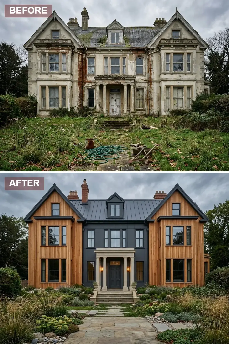
The ruined estate revives through a textural dialogue between natural cedar siding and charcoal render. The projecting wings wrap in warm vertical timber while the central block reads in dark grey stucco, building a modern barn-like composition. A mixed-material path of flagstone and grass runs through a naturalistic garden of native grasses, rounded shrubs, and river stone. The roof is re-clad in dark metal, the windows unified in black, and the portico keeps its classical columns in simplified form. Warm sconces light the entry, bridging pastoral warmth and contemporary boldness.
What makes this scheme work is that the material change tracks the architecture — timber on the volumes that project, dark render on the volume that recedes. That is the plan reading the massing back to you, and it is the difference between intentional and arbitrary. A dark standing-seam metal roof mediates beautifully between rustic wood and modern stucco, and it earns its keep in snow country by shedding load cleanly. Plant the native grasses and mounded shrubs loosely for movement; this is the one scheme on the list where formal rigidity would actually work against the design.
Color Palette
Warm Honey
#D4A373
Natural wood cladding on the wings adding organic texture.
Deep Grey
#3E3E3E
Central stucco block grounding the composition with dark sophistication.
Warm Grey-Tan
#B8B0A8
Flagstone path and river rock tying the design to the landscape.
Muted Green
#8F9779
Native grasses and soft shrubs blending hardscape into nature.
9. Neo-Classical Blanc — Crisp Geometry and Lawn Sculpture
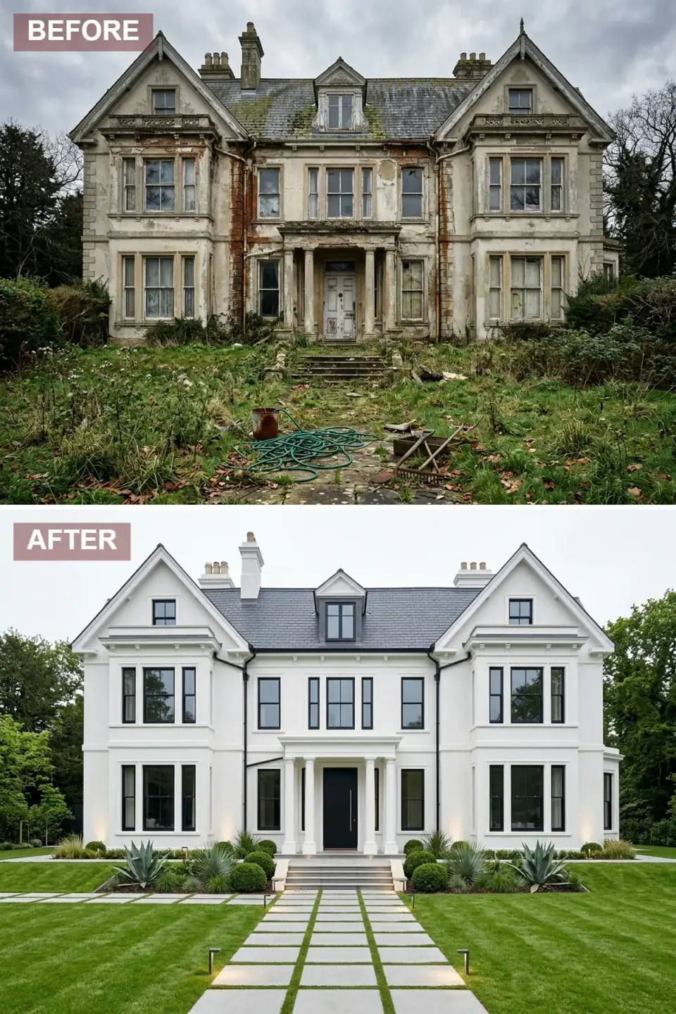
The mansion is reborn as a pristine neo-classical villa, enveloped in brilliant white render with sharp black window frames that read as precise geometric cutouts. The roof is re-laid in cool grey slate, and the entrance features a bold black modern door with a vertical pull. The chaotic wilderness becomes a disciplined lawn gridded with square stone pavers and grass strips, flanked by sculptural agave and spherical boxwood. Low bollards mark the path while subtle wash lights graze the white facade at night, landing on a high-contrast, resort-like read that feels both historic and boldly current.
This is the most demanding finish to maintain of the ten, and honesty about that is part of being plan-literate. A brilliant white render shows every drip, algae streak, and splash-back, so the spec has to include a high-quality elastomeric or silicone render with a clean drip edge at every horizontal, plus enough roof overhang to keep water off the wall. Get the envelope detailing right and the payoff is real — white amplifies daylight and throws the black window reveals into sharp relief. Extend the building's symmetry into the gridded lawn and the architecture and landscape finally speak the same geometric language.
Color Palette
Bright White
#FFFFFF
Immaculate render creating a luminous architectural canvas.
True Black
#0A0A0A
Window frames and entry door giving razor-sharp graphic contrast.
Cool Grey
#6B7B8C
Roofing offering subtle blue-grey tonal variation.
Blue-Green
#6B8E7B
Sculptural plantings introducing controlled organic form against the geometry.
10. Illuminated Contemporary Stone — Indoor-Outdoor Fluidity
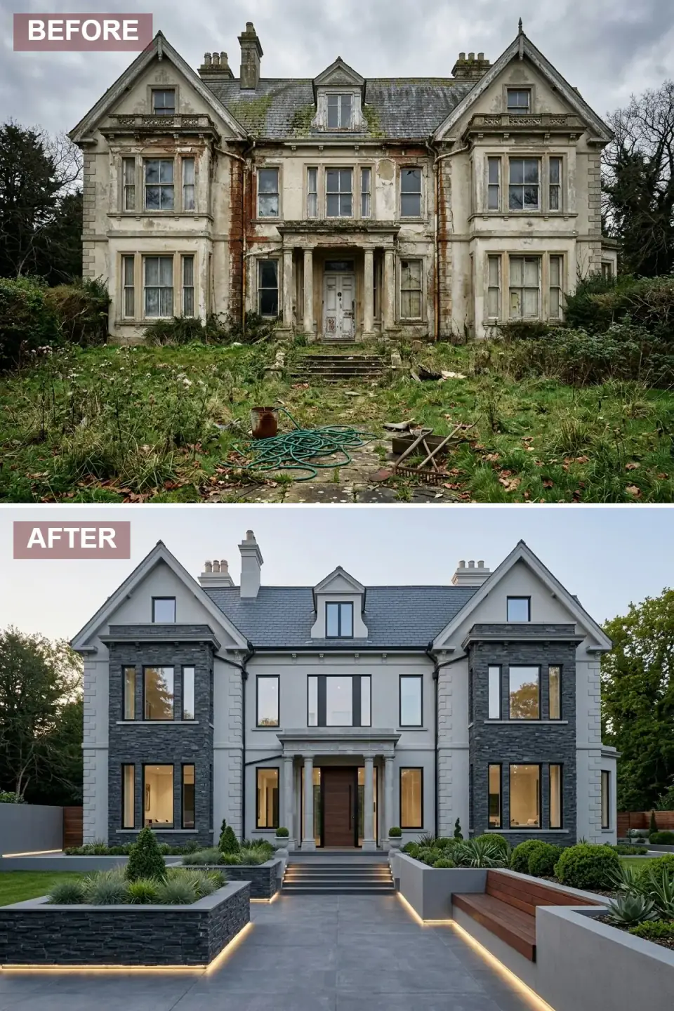
This vision reinterprets the mansion as a sleek contemporary retreat, cladding the side wings in dark stacked stone while keeping the central volume in smooth light grey stucco. Full-height ground-floor glazing replaces the small broken windows, dissolving the line between interior and landscape. A wide porcelain-tiled walkway runs between illuminated stone planters and a floating timber bench, with integrated LED strip lighting turning the approach into a runway after dusk. Raised beds of succulents and clipped spheres frame the path, and a warm walnut door anchors a cinematic, curated arrival.
Full-height glazing is the headline and the structural reckoning at once. Replacing modest punched windows with a wall of glass changes how load travels down the facade — you are likely introducing a structural header or a moment frame, and that has to be engineered before anyone talks tile. It is the clearest example on this list of a renovation choice that lives at the framing stage, not the finish stage. Done properly, the indoor-outdoor read is genuinely transporting; bring the warm walnut door and the timber bench in deliberately, because against all that cool stone and glass the eye needs one warm point to land on.
Color Palette
Dark Grey
#3A3A3A
Stacked-stone cladding on the wings adding rugged depth and texture.
Light Grey
#D3D3D3
Smooth central stucco and large-format walkway tile forming a continuous plane.
Rich Brown
#5C4033
Warm wood front door serving as the tactile focal point amid cool materials.
Medium Brown
#8B5A2B
Integrated timber seating bringing organic warmth into the stone hardscape.
Pro Tips From the Renovation Designer's Chair
- Settle the envelope before the mood board. Structure, flashing, and weatherproofing are framing-stage decisions; render color and lantern style are finish stage. Invert that order and the prettiest facade in the county still fails at the weather line.
- Respect the central axis. Every scheme here keeps the original symmetry. Use landscape and lighting to reinforce the axis the drafter set, never to fight it — the eye reads imposed asymmetry as a mistake.
- Treat enlarged openings as structural work. Widening a window or going full-height needs a properly sized header, and on a masonry wall that can mean steel. Price it as engineering, not glazing.
- Choose materials that age the way you want. Copper patinas, cedar silvers, Corten rusts, white render streaks. Decide which of those is a feature and which is a failure before you spec it.
- Pick one warm anchor in a cool scheme. A walnut door, a bronze frame, a cedar bay — a single warm point keeps an all-grey or all-black facade from reading clinical.
- Layer the lighting for the night read. Ambient wash, accent uplight, and path light together carry curb appeal past sunset, which is when most people actually arrive home.
Cost-Saving Moves
- Adhered manufactured stone over full veneer. A quality manufactured stone reads convincingly from the path and skips the structural ledge and most of the labor — often less than half the installed cost of natural stone in the Hudson Valley.
- Render the whole facade one color before re-cladding it. A uniform exterior coating erases a dozen old patches for a fraction of what new siding costs, and it is the move behind several of the schemes above.
- Keep openings where they are. Reusing existing window rough openings avoids headers, lintels, and structural sign-off — by far the biggest hidden line item in a facade renovation.
- Spend on the roof, save on the planting. A metal roof's fifty-year life pays back in the snow belt; mature specimen trees rarely do. Buy small plants and let them grow into the design.
Reader Questions on Estate Exterior Transformations
Which of these schemes is the cheapest to pull off on a tight budget?
The monochrome render schemes — the Indigo Enigma and the Noir Minimalist — give the most dramatic change per dollar, because a uniform exterior coating hides a history of patches without the cost of new cladding. The expensive variable is always the substrate prep underneath, especially for black, which shows every flaw. Keep the existing window openings and the original roofline and you avoid the structural costs that quietly double a facade budget.
Can I really change a historic facade this much without destroying its character?
Yes, as long as you keep the architecture's three load-bearing truths: the symmetry, the window rhythm, and the roofline. Every scheme here changes material and color while leaving those intact, which is why they read as the same house reborn rather than a different building. Where local rules complicate things is a designated historic district — there you may need approvals for material or color changes, so check before you commit. Character lives in proportion, not in the original paint.
Is a dark exterior color a problem in a cold Northeast climate?
Dark colors absorb more heat, which in the Hudson Valley is a minor winter help and a summer fade risk rather than a real performance issue on a masonry or properly ventilated wall. The genuine concerns are fade and chalking, so specify a fade-rated exterior coating, and make sure the wall assembly can dry — trapping moisture behind any finish, dark or light, is what actually causes failure. On wood siding, a quality dark stain or coating holds up fine when the prep and drainage are right.
How much does replacing all the windows add to a project like this?
Reusing existing openings, quality replacement windows are a known, manageable cost. The expense explodes when you enlarge openings or go full-height, because that becomes structural — new headers, possibly steel, and engineering sign-off. That single decision is the most common budget-buster I see. If the goal is more daylight on a budget, swapping to clearer glazing within the existing openings gets you most of the way there without touching the structure.
Which materials actually improve as they age, and which just deteriorate?
Real copper, natural cedar, Corten steel, and natural stone all develop a finish that gets better with time — copper patinas, cedar silvers, Corten seals into stable rust. Render, painted surfaces, and especially bright white finishes do the opposite: they streak, chalk, and need periodic cleaning. Neither is wrong, but you should choose knowingly. Pick the aging materials where you want a living finish, and the painted ones where you are prepared to maintain a crisp look on a schedule.
Should I match the roof to the walls or contrast it?
A roof slightly darker than the walls is the safest move — it caps the composition and reinforces the silhouette, which is what these schemes do with grey or charcoal slate and metal. Hard contrast can work, like the charcoal standing-seam against white clapboard in the farmhouse scheme, but only when the trim color bridges the two. What rarely works is a roof lighter than the walls; it makes the house look top-heavy and fights the eye's expectation of weight settling downward.
Where to Read Next
If these ten schemes set your imagination going, walk through more before-and-afters in my roundup of eleven exterior transformations that redefine curb appeal and the focused study of a historic Second Empire home reimagined ten ways. For the design-build thinking behind choosing one cladding over another, see my guide to exterior makeover materials, and browse the full exterior renovations archive for more plan-aware case studies.
Sources & Further Reading
- National Park Service, Preservation Brief 14: New Exterior Additions to Historic Buildings.
- National Park Service, Preservation Brief 2: Repointing Mortar Joints in Historic Masonry Buildings.
- This Old House: Exterior siding materials, costs, and comparisons.
- Old House Journal: Historic exterior restoration and material guidance.
- Remodeling Magazine: Cost vs. Value Report — exterior project payback data.
- Natural Stone Institute: Stone veneer specification and installation standards.
- James Hardie: Fiber-cement siding product and ColorPlus specifications.
- Marvin: Window replacement and historic-opening options.
- U.S. Department of Energy: Cool roofs and exterior color heat absorption.
- Architectural Digest: Exterior color and material trend reference.

Nora Whitfield
Renovation Designer & Interiors Editor · Beacon, New YorkNine years of design-build renovation work across the Hudson Valley and the Northeast. Nora runs the Renovations, Room Guides and Renovation Mind desks — before-and-after studies, room-by-room design guides, and the long essays on why what we renovate matters.
More from Nora →
Reader notes