


I get asked the same thing on every job walk: "Is this room a lost cause?" The honest answer, after seven years of design-build work in the Hudson Valley, is almost never. What you're looking at here is one tired shell — same window, same footprint, same workspace-and-lounge program — read nine different ways. I treat each version the way I'd treat a plan markup: figure out what the bones allow, fix the damage first, then commit to a single design language instead of hedging. These nine radical room transformations are proof that a room's worst day is just an unbuilt drawing waiting on a decision.
How I Read a Room Before I Redesign It
Every one of these nine schemes started from the same dilapidated base — water-stained ceiling, failing plaster, a freestanding bookshelf doing structural work it was never meant to do. Before I let anyone pick a paint chip, I do the unglamorous part: trace where the load-bearing line runs, find the window's true orientation, and confirm the moisture source is dead. A finish applied over a live leak is money set on fire. Only once the shell is sound do I ask the real design question — what is this room for, and which single language tells that story without contradicting itself.
That discipline is what separates a room transformation that holds up from one that photographs well and falls apart in a season. The footprint here is a workspace-and-lounge hybrid — a desk against the back wall, a seating zone facing the daylight — and that program never changes across the nine. What changes is the dialect. If you want to see the same one-room-many-ways exercise pushed even further, I walked through twelve styles for one forgotten room in a separate piece; this one is the tighter, nine-language edit.
1. Sunlit Sanctuary — Warm Modern Organic
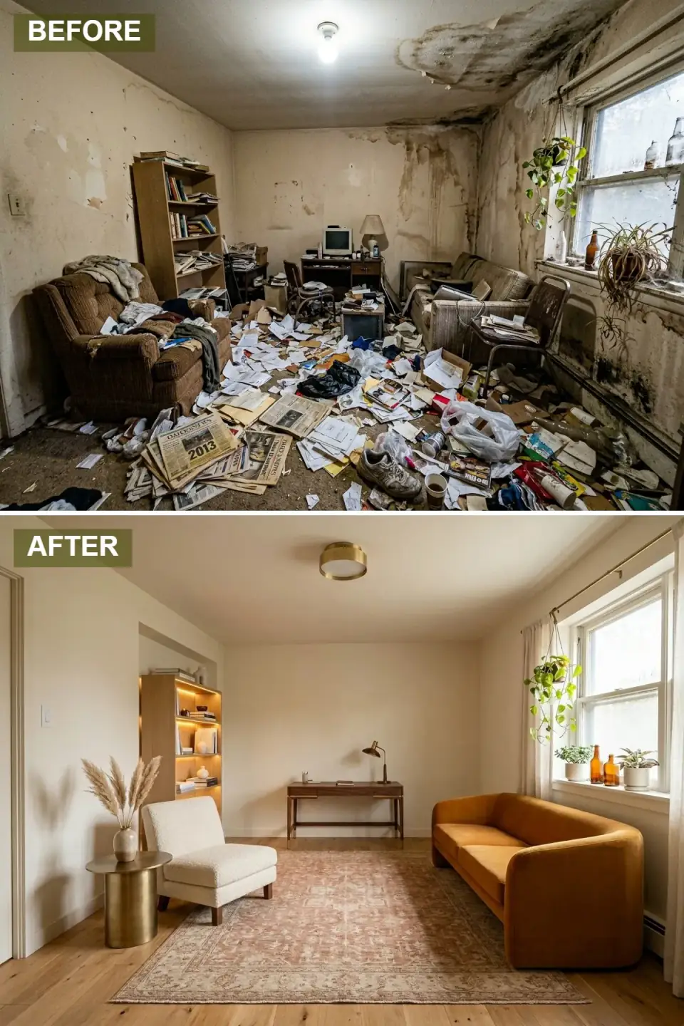
The structural damage is fully gone — the water-stained ceiling and peeling plaster replaced with flat-skim surfaces and pale oak flooring. The old freestanding bookshelf has been swapped for a recessed wall niche with integrated LED, which is the move I'd flag at framing stage, not finish stage: building a niche means stealing depth from the stud cavity, so you confirm it isn't a load-bearing wall before you ever cut. A curved mustard velvet sofa and a creamy bouclé chair anchor the lounge zone, a walnut desk with a brass task lamp takes the back wall.
What makes this read as designed rather than decorated is restraint with the metal — brass shows up only in the flush ceiling fixture and the cylindrical side table, so it threads through instead of shouting. For the workspace half of the room I'd lean on the same logic I use in my home-office reinventions: one desk, one warm lamp, daylight from the side rather than behind the screen.
Color Palette
Matte skim-coat wall that bounces north light without going cold
Curved sofa upholstery carrying the room's warmth and retro line
Light hardwood floor finished in a hardwax oil for grain you can read
Unlacquered brass on the ceiling fixture and accent table
2. Noir Elegance — The Moody Executive Lounge
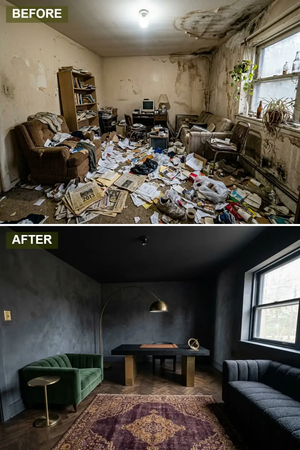
Here the whole envelope goes dark — charcoal Venetian plaster on walls and ceiling, which dissolves the corner lines and makes the room feel like a single enclosed volume. Painting the ceiling the same value as the walls is the trick: it removes the visual stop where wall meets ceiling, so a modest room reads as intimate rather than small. Dark herringbone oak grounds it, two opposing sofas — emerald channel velvet against textured charcoal — frame a black ash desk on brass pedestal legs.
A dark room lives or dies on its light source. The brass arc lamp does the heavy lifting as one sculptural gesture rather than a scatter of small fixtures, and a plum-and-gold patterned rug pins the seating zone so the dark floor doesn't swallow it. If you go this moody, budget for layered lighting from day one — a single overhead in a charcoal room reads as a cave, not a lounge.
Color Palette
Polished Venetian plaster on wall and ceiling, absorbing light
Channel-tufted sofa fabric supplying the one jewel tone
Sculptural floor lamp and hardware accents
Parquet floor with directional grain anchoring the dark scheme
3. Gilded Decadence — High-Gloss Art Deco Revival
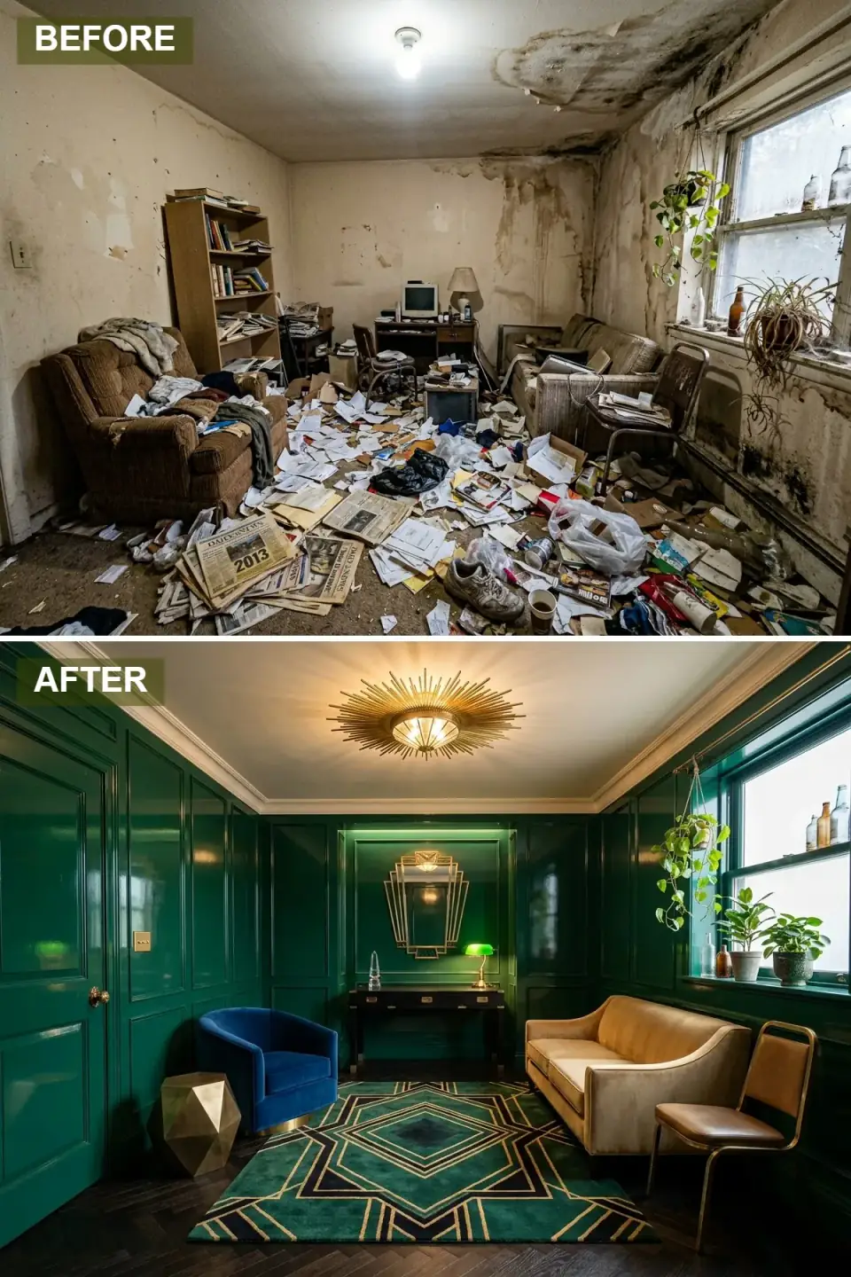
This is the most architecturally aggressive of the nine — the walls are re-clad in high-gloss emerald lacquered millwork, raised panels wrapping the room into a jewel box. That panel layer is real carpentry, not a paint effect: you build the picture-frame molding first, fill and sand, then lacquer, because high gloss is a mirror and it will broadcast every flaw underneath. A geometric teal-and-gold rug holds the center, and the furniture is unapologetically theatrical — cobalt velvet tub chair, champagne settee, brass cantilevered chair around a black lacquer desk.
Overhead, a stepped Deco mirror and a brass sunburst fixture do the period storytelling. The saturation works because it's balanced against metallic neutrals — pull the brass out and the jewel tones would tip into costume. This is a high-skill finish; if your drywall is anything less than level-five smooth, gloss lacquer is the wrong call and you should reach for an eggshell.
Color Palette
Paneled wall finish in a true brilliant lacquer sheen
Plush tub chair creating the high-contrast accent
Settee upholstery bridging the warm metallics and the green
Ceiling fixture and decorative metal finishes
4. Silent Poetry — Japandi Minimalist Retreat
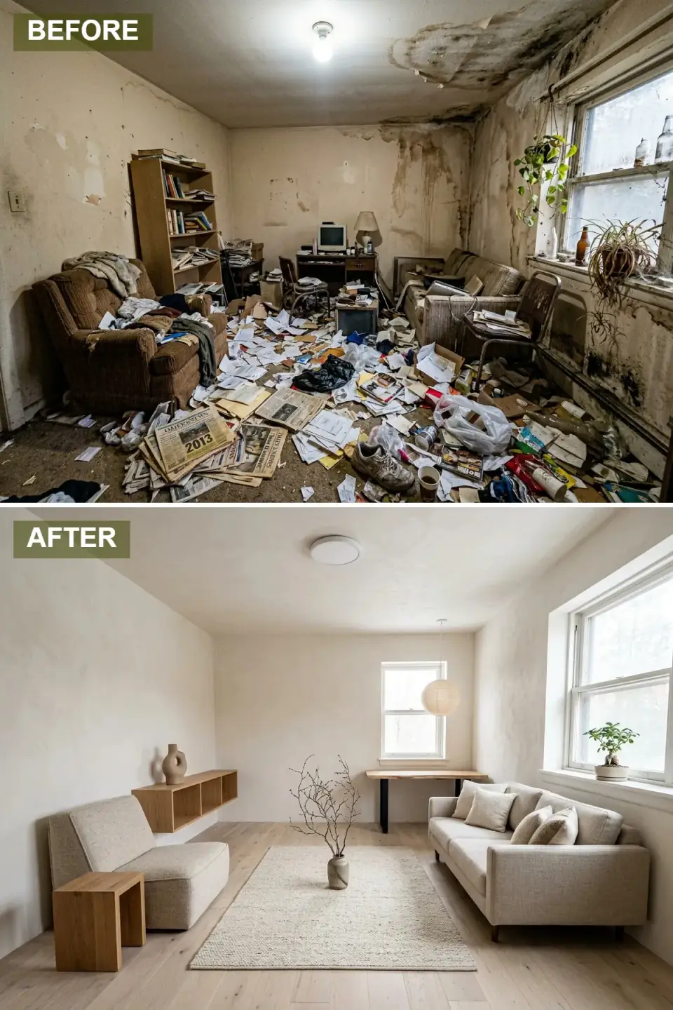
Stripped to essentials, the room now runs on chalky limewash walls and pale birch flooring carried in every direction. A low linen sofa and matching chaise hold a single horizontal line, and the old heavy storage is gone in favor of floating oak shelves that read as weightless. Minimalism like this is harder than it looks — every joint, every reveal, every floor transition is exposed, so the trade work has to be near-perfect. There's nowhere for a sloppy scribe line to hide.
The palette is deliberately subtractive — warm white, pale wood, the faintest gray — which hands the decorative job to daylight itself. A ceramic vessel of bare branches stands in as living sculpture, and a paper lantern pendant keeps the workspace meditative. This is the quietest of the nine, and the closest in spirit to the restraint I unpack in my quiet-luxury home-office guide.
Color Palette
Limewash wall with subtle mineral movement and matte depth
Light hardwood flooring and floating shelving in one wood tone
Upholstery on the low-profile seating
Blackened desk legs and the few sparse accent details
5. Terracotta Dreams — Earthy Bohemian Haven
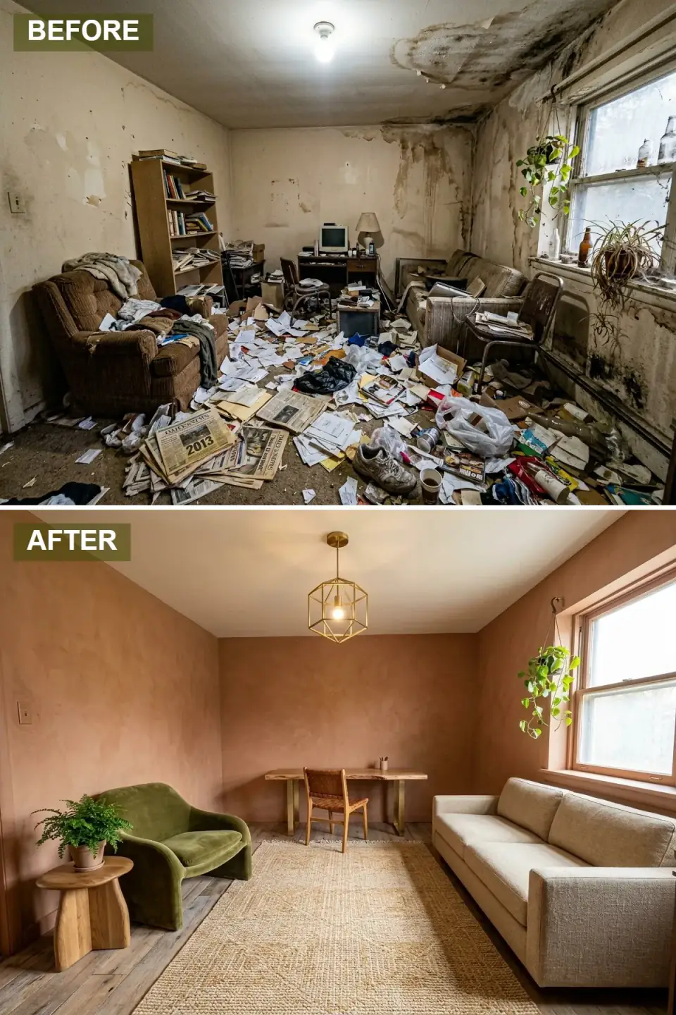
The walls are finished in warm terracotta plaster that reads like sunbaked clay, and that pigmented plaster does something flat paint can't — it holds depth and shifts with the light through the day. Against it, a sculptural moss-green velvet armchair brings a biomorphic curve that plays retro and organic at once. A raw-edge walnut desk on brass legs and a woven leather-strap chair carry the handcrafted texture into the work zone.
Underfoot it's light distressed wood layered with a thick jute-and-wool rug; overhead, a brass geometric pendant. The discipline that keeps a bohemian room from sliding into chaos is repetition — one metal finish across the pendant and the desk legs ties the eclectic pieces into a family. The trailing pothos isn't decoration so much as the thread pulling the whole earthy palette back to nature.
Color Palette
Warm pigmented clay plaster on all four walls
Sculptural armchair upholstery in deep velvet
Handwoven area rug adding warmth without busy pattern
Geometric pendant and desk-leg finish, repeated for unity
6. Soft Focus — Neutral Contemporary Calm
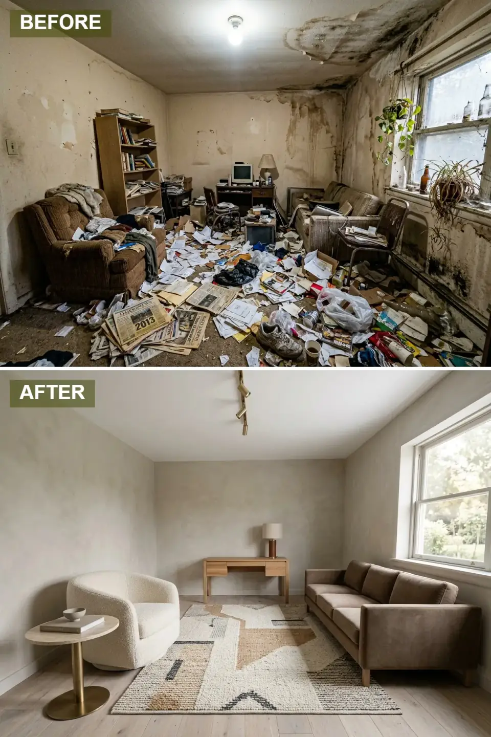
This is the scheme for the homeowner who wants quiet sophistication without committing to a color. Warm greige plaster walls and pale oak flooring recede on purpose, and the whole composition runs on texture instead of hue — a structured taupe velvet sofa facing a plush ivory bouclé swivel chair over an abstract rug in cream, camel and charcoal. A white oak desk and a cylindrical lamp hold the back wall; a marble-top side table on a brass pedestal gives you one spot for curated objects.
A brass track system adds subtle geometry overhead without breaking the calm. The reason it doesn't read as boring is the texture layering — velvet against bouclé against marble against matte plaster, all in the same tonal lane. The swivel chair is the smart functional pick here: in a workspace-and-lounge hybrid, a piece that turns lets one chair serve both the desk and the conversation.
Color Palette
Plaster wall blending gray and beige undertones
Sofa upholstery in soft, muted velvet
Textured swivel chair adding tactile contrast
Ceiling track fixture and side-table base metal
7. Timekeeper's Study — Vintage Industrial Grandeur
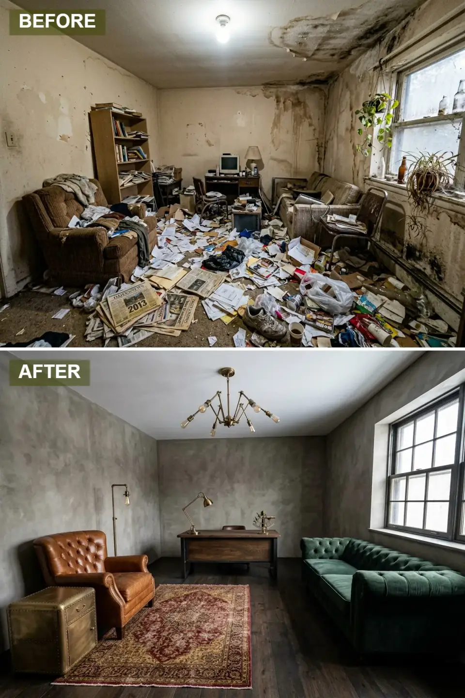
This one channels a railway-era study — concrete-look plaster in weathered gray, dark plank flooring, and a black steel window frame that does the industrial-loft talking. A burnished cognac leather Chesterfield sits beside a brass steamer-trunk side table; across the room, a deep emerald tufted Chesterfield sofa answers it. A substantial oak desk with iron detailing carries the work zone, and a sputnik chandelier with Edison bulbs spreads warm light evenly — which matters in a dark room, where one point source leaves you with hot spots and shadow.
A red-and-gold Persian rug layered over the dark wood brings the patina and history the new finishes can't fake yet. The anchor strategy here is one genuine statement piece — that leather Chesterfield — with everything else supporting it. Source the hero, then build down; it's cheaper and more convincing than trying to make ten medium pieces feel old at once.
Color Palette
Textured wall finish reading as aged concrete
Tufted Chesterfield with patina-like warmth
Jewel-tone velvet sofa balancing the leather
Wide-plank flooring with heavy grain and stain
8. Candy Cloud — Pastel Scandinavian Freshness
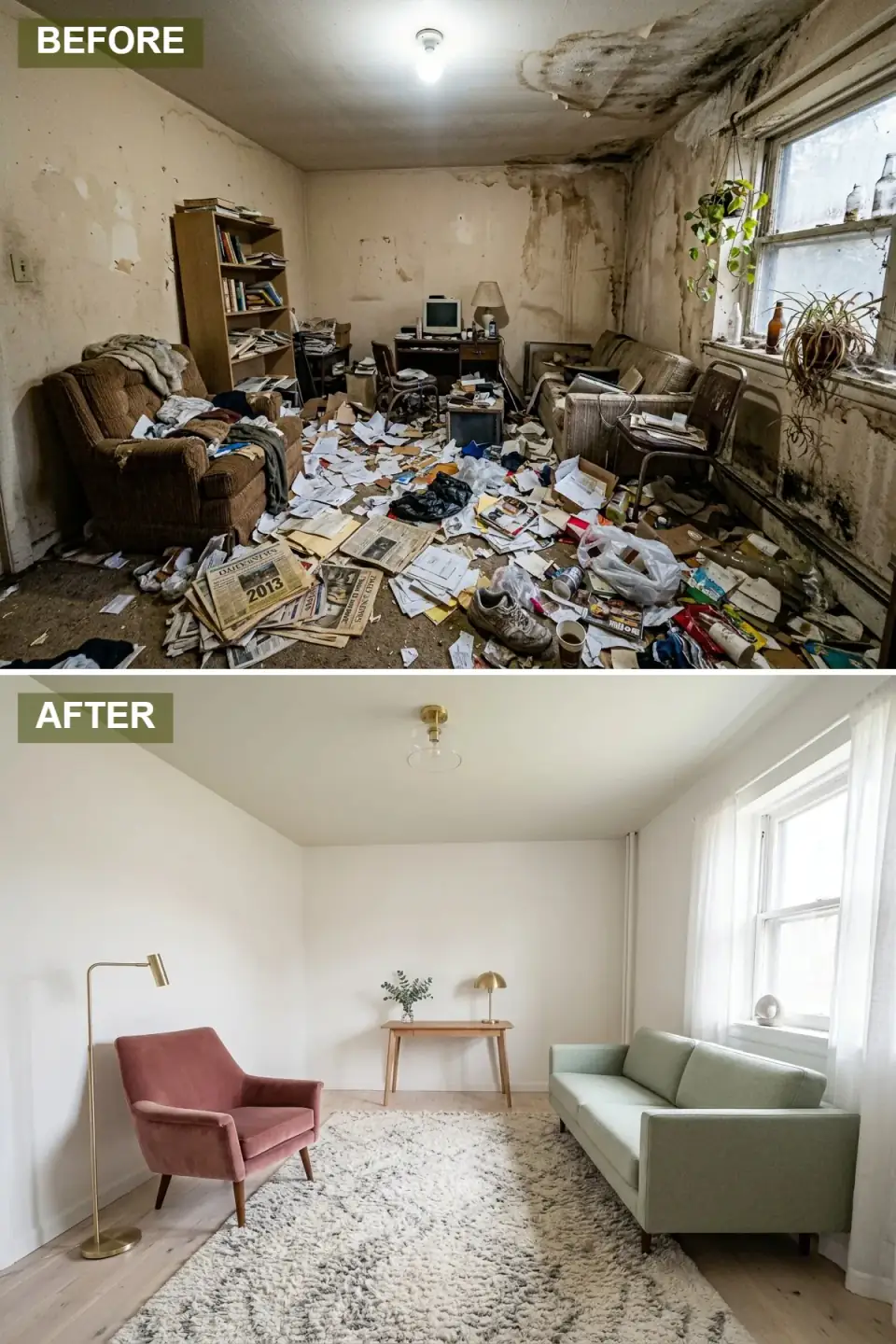
Painted pure white from baseboard to ceiling, this version feels impossibly airy — and that's the whole strategy. The color comes in as pastel punctuation against the white field: a dusty rose velvet armchair on tapered walnut legs and a mint green linen sofa carrying spring energy. A pale oak desk against the far wall stays minimal, just a brass dome lamp and a single sprig of greenery on top.
A plush white-and-gray Moroccan shag rug adds cloud-like softness over the pale wood floor, and brass lighting in clean silhouettes provides warm highlights without competing with the soft colors. Sheer white curtains filter the daylight so it stays optimistic rather than glaring. Pairing two pastels against a white backdrop is the move that keeps this youthful instead of saccharine — the restraint of the envelope is what licenses the playfulness of the furniture.
Color Palette
Crisp wall and ceiling paint reflecting maximum light
Velvet armchair in a muted, grown-up rose
Sofa fabric in soft pastel green
Desk and flooring in light bleached oak
9. Heirloom Study — Classic Traditional Elegance
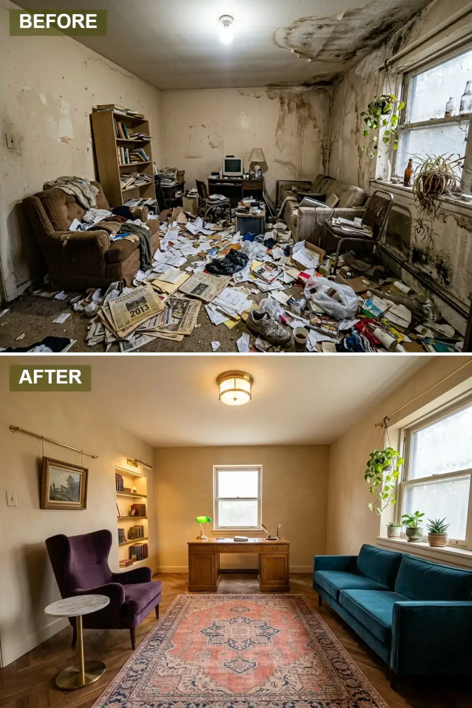
The traditional read restores the room with warm buttermilk walls and herringbone oak flooring that lend instant pedigree. An oak pedestal desk with brass pulls commands the back wall, flanked by a green banker's lamp and brass desk accessories — the shorthand that signals "study" the second you walk in. A plum velvet wingback with a marble-topped brass side table makes a reading nook on one side; a teal velvet tuxedo sofa answers with saturated color on the other.
A salmon-and-navy Persian rug ties the seating together, while brass picture rails and built-in illuminated shelving turn book storage into a design feature. Picture rail is the detail I'd push hardest here — it lets you hang art without drilling plaster and reads as genuine period architecture. This is the scheme with the longest shelf life of the nine; traditional done with real millwork doesn't date the way trend-driven rooms do.
Color Palette
Warm wall creating a timeless, gallery-like backdrop
Tuxedo sofa upholstery in deep, saturated teal
Wingback chair adding regal depth
Classic parquet flooring with warm undertones
Pro Tips From the Renovation Designer's Chair
- Fix the shell before the surface. Repair structural and moisture damage first — a finish applied over a live leak or failing plaster will fail with it, and you'll pay for the room twice.
- Pick the language before the furniture. Decide on one design dialect up front so every piece serves a single story; mixing three half-committed styles is what makes a room read unresolved.
- Let the window set the layout. Use the existing window placement to drive furniture position so daylight lands on work surfaces from the side, not behind a screen — this is a plan decision, not a styling one.
- Buy one great rug per room. A single high-quality area rug defines the seating zone and absorbs sound in a hybrid workspace-lounge far better than two cheap ones.
- Repeat one metal finish. Carrying a single brass or bronze tone through lighting and furniture legs is the cheapest way to make eclectic pieces feel like a collection.
- When in doubt, edit down. Negative space almost always does more for a transformation than another accessory. Subtract before you add.
Cost-Saving Moves
- Spend on the envelope, save on the pieces. A plaster or limewash wall finish and a quality floor read as permanent value; furniture can be sourced over time. In the Hudson Valley I see limewash run roughly $4–7 per square foot installed versus far more for full Venetian plaster — choose the finish that matches your skill or budget.
- Paint the ceiling with the walls. The moody schemes get their drama from one extra gallon and the same labor pass, not from costly materials.
- Recess instead of building out. A wall niche reclaims floor space for free where the stud cavity allows — confirm it's non-structural first and you skip a furniture purchase entirely.
- Anchor with one hero piece. One genuine statement item (a leather Chesterfield, a real Persian rug) lets everything around it be modest and still convince.
Reader Questions on One-Room Transformations
Can any room really pull off all nine of these styles?
Within reason, yes — every scheme here sits on the same footprint, the same window, and the same workspace-and-lounge program. What limits you isn't the room, it's ceiling height and natural light. The moody and industrial reads want decent height and layered lighting to avoid feeling cramped, while the Japandi and pastel Scandinavian schemes thrive in smaller, brighter rooms. Match the language to what the bones already give you rather than fighting them.
Which transformation gives the most impact for the least money?
The neutral contemporary and Japandi schemes, by a wide margin. Both lean on a wall finish, a floor, and texture rather than expensive lacquer work, custom millwork, or statement antiques. A limewash or quality flat paint, a good rug, and two well-chosen seating pieces will get you most of the way. The Art Deco lacquer and traditional built-in schemes are the most expensive because they're real carpentry and high-skill finishing, not just paint and furniture.
Do I really need to fix the ceiling and plaster before decorating?
Always. Every one of these started with a water-stained ceiling and failing plaster, and none of the finishes would have lasted a season applied over that. First confirm the moisture source is dead — a roof flashing, a plumbing leak, condensation — then repair the substrate. A high-gloss or limewash finish in particular will broadcast every flaw underneath. Skipping this step is the single most common way a beautiful transformation becomes a repeat project within a year.
How do I keep an eclectic or bohemian room from looking like clutter?
Repetition and editing. Pick one metal finish and carry it through every fixture and furniture leg so the eclectic pieces read as a deliberate family. Use natural-fiber rugs to add warmth without introducing competing pattern, and pair one curvy organic piece against straighter lines for tension rather than chaos. Then subtract — a bohemian room that works is curated, not crammed. If a piece doesn't earn its spot through texture or function, it comes out.
Is high-gloss lacquer worth the cost on a small room?
Only if your substrate is near-perfect. Gloss lacquer reflects light beautifully and makes a jewel-box room feel larger, but it acts like a mirror for every dent, seam, and uneven joint underneath. On a level-five drywall finish over proper millwork it's stunning; on ordinary builder-grade walls it will magnify the flaws and look worse than a simple eggshell. Budget for the prep, not just the paint, or pick a lower sheen and spend the savings elsewhere.
Where to Read Next
If this one-room-many-ways exercise hooked you, my six home-office reinventions takes the workspace half deeper, and the longer twelve-style forgotten-room walkthrough stretches the same idea further. For why a room ends up reading the way it does in the first place, I get into the psychology of it in the hidden language of your home's decor, or browse the full interior renovations archive.
Sources & Further Reading
- This Old House — diagnosing and fixing moisture and ceiling damage before refinishing.
- Old House Journal — plaster repair and traditional millwork detailing.
- Architectural Digest — style references for Art Deco, Japandi, and bohemian interiors.
- Remodelista — limewash, plaster, and minimalist finish guidance.
- Fine Paints of Europe — Hollandlac Brilliant high-gloss lacquer spec and prep requirements.
- Benjamin Moore — color references for Revere Pewter, Manchester Tan, and Chantilly Lace.
- Sherwin-Williams — Alabaster and neutral color specifications.
- Natural Stone Institute — care and selection of marble and stone surfaces.
- U.S. Department of Energy — layered and efficient lighting for low-daylight rooms.

Nora Whitfield
Renovation Designer & Interiors Editor · Beacon, New YorkNine years of design-build renovation work across the Hudson Valley and the Northeast. Nora runs the Renovations, Room Guides and Renovation Mind desks — before-and-after studies, room-by-room design guides, and the long essays on why what we renovate matters.
More from Nora →

Reader notes