


I tell clients the same thing every time we stand in a cluttered open-concept living-dining space: the room isn't the problem, the indecision is. The architecture here never changed — same footprint, same kitchen wall, same coat corner by the door. What changed across these eight makeovers is the vision laid over the bones. Coastal calm, moody jewel tones, Japandi restraint, industrial grit: each one reads the same shell and commits to a single story. That's the whole game. Below, I walk through all eight, what each one actually did, and the plan-aware move I'd borrow from each before I touched a paintbrush.
How I Read a Room Before I Decorate It
Before I pick a color or move a sofa, I clear the room to its architecture and ask what it's already telling me. Where does the light land in the afternoon? Where does the eye stop? In an open plan, the kitchen wall, the window line, and the front-door drop zone are fixed points — those are framing-stage facts you decorate around, not against. Most "cluttered" rooms aren't over-furnished; they're under-decided, holding three half-committed styles at once.
The eight versions below all sit on one footprint, which is exactly why they're useful to study side by side — it isolates the decisions from the architecture. None of these required moving a wall; they're finish-stage moves, the kind any homeowner can make. If you want the structural cousin of this exercise, our builder-grade box to bespoke living-room transformation shows what changes when you do touch the bones. Start by deciding which single story you're telling — then everything else gets easy.
1. Seaside Calm: A Breezy Coastal Refresh
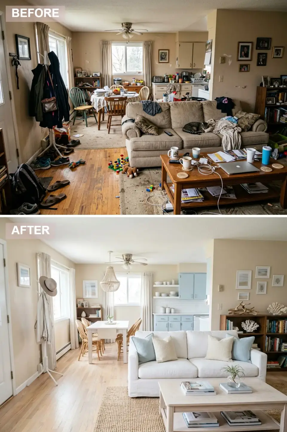
This version trades chaos for an airy beach retreat. The walls stay light but freshen to a crisp cream; the kitchen cabinets go a soft sky blue paired with open white shelving. The bulky beige sofa is swapped for a clean-lined white couch with pale blue and ivory pillows, and a beaded chandelier pulls the eye up. Jute rugs, rattan dining chairs, and whitewashed wood ground the whole thing.
What makes it work — and what most coastal rooms get wrong — is restraint. The coat rack is edited to a single hat and scarf; the bookshelf gets coral and driftwood, not a beach-shop's worth of seashells. For the cabinets I'd reach for Benjamin Moore Yarmouth Blue or Sherwin-Williams Rainwashed, both of which read serene rather than nursery. In a Hudson Valley weekend house, that blue-and-cream calm is the look I get asked for most — it's coastal without needing to be near a coast.
Color Palette
Soft Sky Blue
#A8C8D8
Cabinets in a muted sky blue, close to Benjamin Moore Yarmouth Blue, set the seaside tone.
Warm White
#F5F0E6
Warm white upholstery and walls give a bright, sun-bleached canvas.
Sand Beige
#D4C4A8
Woven jute and natural fibers add organic texture underfoot.
Pale Aqua
#B8D4D0
Watery aqua pillows bring quiet color to the neutral seating.
2. Dark and Dramatic: A Jewel-Tone Masterpiece
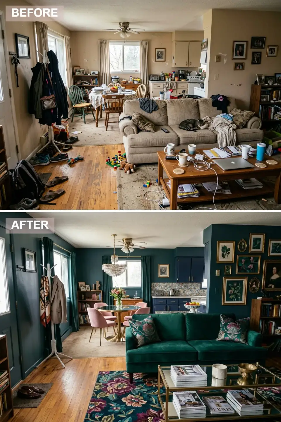
This one embraces contrast — deep teal walls turn the open space into an intimate, gallery-like backdrop. The sofa upgrades to emerald velvet with floral embroidery, echoed by a dramatic floral rug under a glass-and-brass coffee table. The kitchen cabinets go navy against a patterned encaustic backsplash, and a crystal chandelier crowns a glass dining table ringed by blush-pink velvet chairs.
People fear dark paint in an open plan; they shouldn't. Wrapping every wall in one deep hue — think Benjamin Moore Hale Navy on the cabinets and a Farrow & Ball Vardo depth on the walls — actually unifies a multi-zone room and lets the furnishings pop. The trick is the gallery wall: matching brass frames turn scattered family photos into one curated statement. That coat rack styled with a silk scarf and a tailored blazer is doing real work too — in a moody room, the entry has to read intentional or the whole spell breaks.
Color Palette
Deep Teal
#1B4A4A
Rich teal walls create a moody, enveloping backdrop across the open space.
Forest Green
#0F6B4A
A deep emerald sofa anchors the living area with saturated luxury.
Dusty Rose
#D4A5A5
Soft pink velvet dining chairs supply sophisticated, unexpected contrast.
Antique Gold
#C5A059
Brass and gold finishes on frames and furniture add warmth and refinement.
3. Quiet Harmony: A Japandi-Inspired Sanctuary
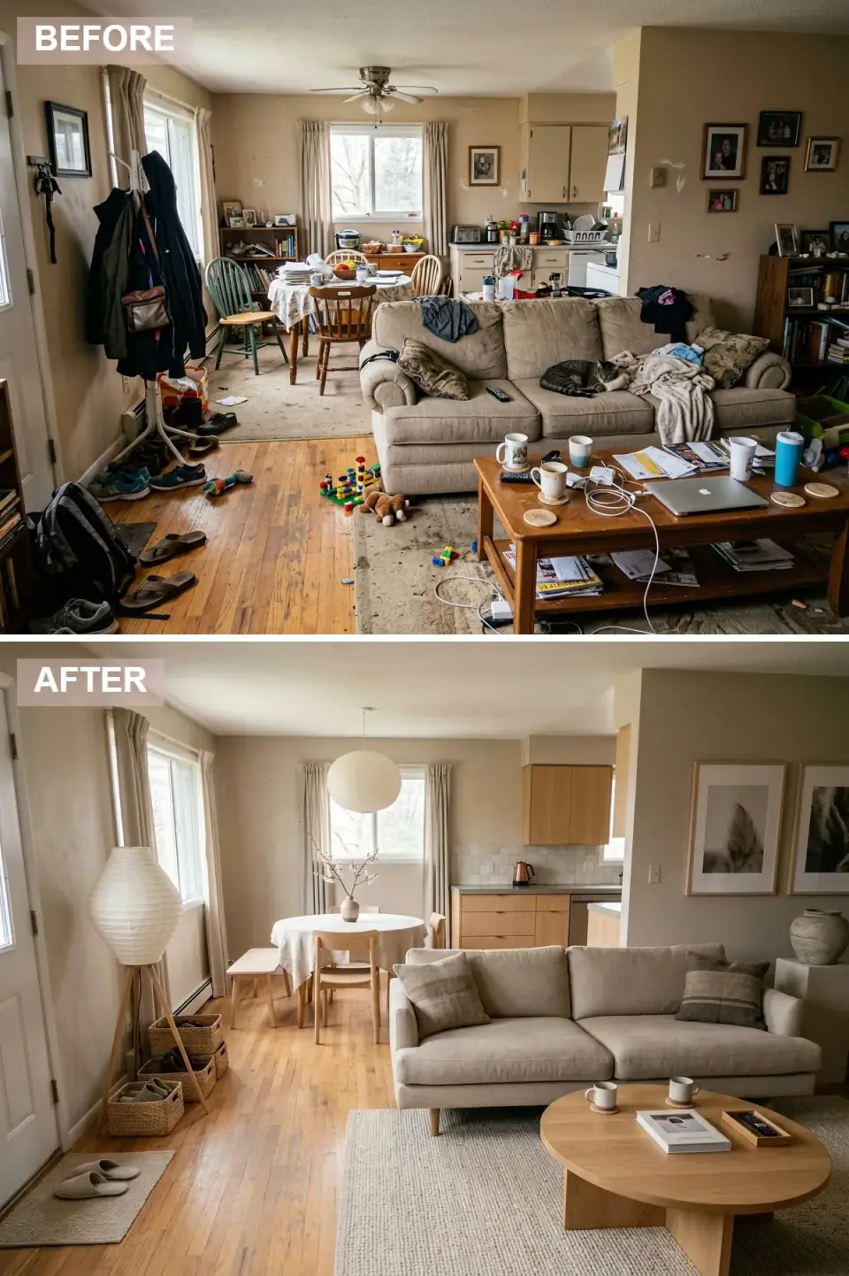
Here the room is stripped to essentials on the Japanese-Scandinavian principle of functional beauty. Walls shift to a warm greige against pale oak cabinetry and a streamlined beige sofa. A sculptural paper lantern replaces the ceiling fan's light; a matching tripod floor lamp adds ambient glow. The dining area centers on a round table in simple linen, ringed by light-wood chairs and a bench, with woven baskets under a pared-down coat rack handling shoes and clutter.
Japandi lives or dies on what you remove, not what you add. Every object earns its place — the single branch in a ceramic vase, the mugs lined on the oak coffee table. For the walls I'd specify Sherwin-Williams Accessible Beige or Benjamin Moore Pale Oak, both of which bridge cool and warm so the oak never goes orange. The plan-aware lesson here is storage: closed baskets and cabinetry keep daily life out of sight, which is the only way a minimalist open plan stays calm past week one.
Color Palette
Greige
#C4BBAF
Soft greige walls bridge cool and warm tones for a quiet backdrop.
Natural Oak
#DCC8B0
Light oak cabinetry and furniture bring Scandi warmth and visible grain.
Unbleached Linen
#E6DDD0
Natural linen textiles soften the room without visual weight.
Warm Sand
#B8A99A
Matte ceramic and stone accents add earthy, tactile interest.
4. Fresh and Rustic: Modern Farmhouse Charm
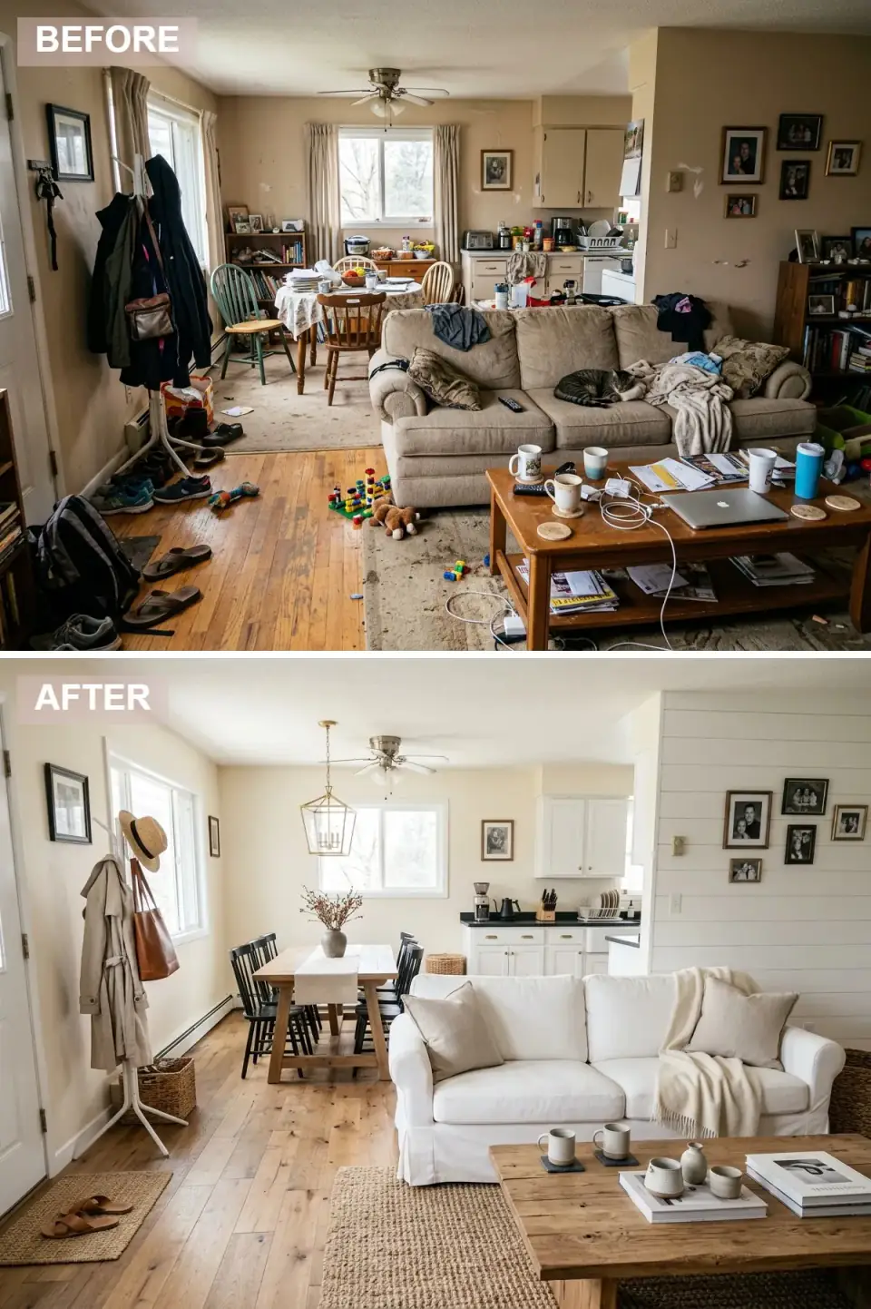
This iteration leans into farmhouse freshness with a white shiplap accent wall and a crisp white slipcovered sofa layered in oatmeal throws. The kitchen refreshes to white shaker cabinets with black hardware; the dining area gets a sturdy wood farmhouse table and black spindle chairs under a brass lantern pendant that marries rustic and refined. The coat rack edits down to a straw hat, a trench, and a woven basket.
Modern farmhouse went from fresh to overdone fast, so the discipline is in the edit. A shiplap wall in Benjamin Moore Simply White with hardware in Sherwin-Williams Tricorn Black gives you the contrast without the "live-laugh-love" cliché. The slipcovered sofa is the smart practical call — washable, kid-and-dog proof, genuinely country. Jute rugs, real ceramic pottery, and a couple of actual books finish it. In Hudson Valley farmhouses, this is the look that ages best because it's rooted in how these houses were actually built.
Color Palette
Ivory White
#F2EFE9
Crisp white shiplap and slipcovers define the bright, rural-modern palette.
Soft Black
#2C2C2C
Black chairs and cabinet hardware add graphic contrast and authenticity.
Warm Wood
#C9A87C
Reclaimed oak tables and flooring bring weathered, organic warmth.
Warm Beige
#D6C8B6
Oatmeal and natural-linen textiles soften the high-contrast scheme.
5. Refined Grace: A Classic Traditional Update
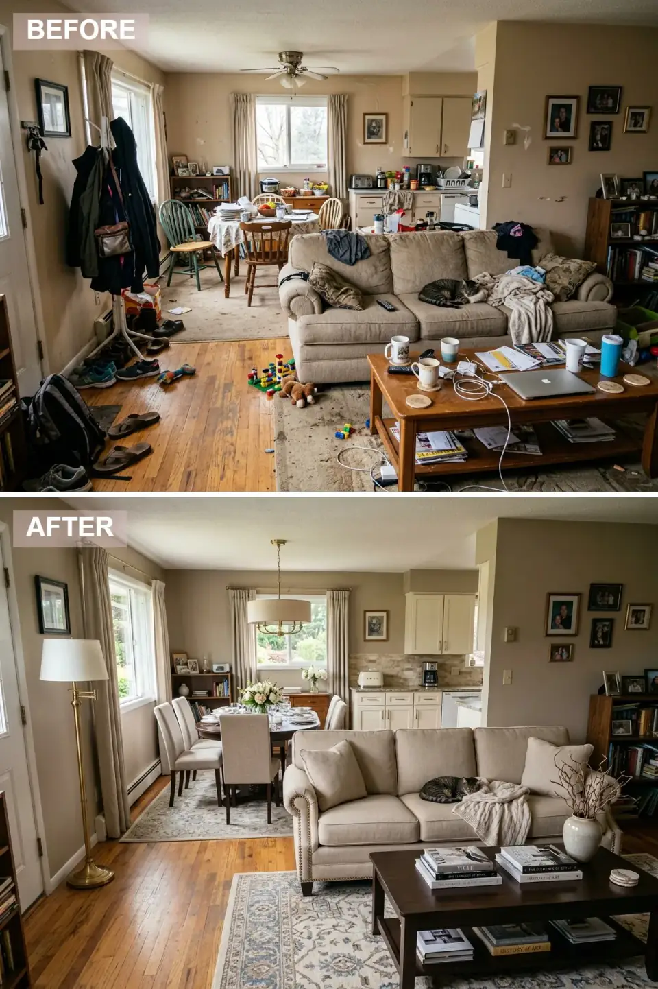
Rather than fight the room's traditional bones, this makeover elevates them. Walls go a sophisticated warm taupe behind a new rolled-arm sofa with nailhead trim — where the cat still happily resides. The dining zone formalizes with an oval dark-wood table, upholstered beige host chairs, and a brass chandelier under a linen drum shade. Coordinated cream-and-dusty-blue rugs tie the living and dining zones together; the kitchen keeps its layout but polishes up with cream cabinetry and a stone backsplash.
This is my favorite kind of project: working with the architecture instead of against it. A warm taupe like Benjamin Moore Revere Pewter or Sherwin-Williams Agreeable Gray gives a gallery envelope that flatters traditional furniture without going stuffy. The smart move is keeping the beloved pieces — the family sofa, the cat — and refreshing around them with tailored pillows and a neat throw. Symmetry does the rest. Traditional reads as "expensive" precisely because it's balanced, and balance costs nothing but attention.
Color Palette
Greige Taupe
#A89F91
Warm taupe walls, near Revere Pewter, create a refined, gallery-like envelope.
Antique White
#E8E2D4
Creamy silk and linen upholstery exude quiet luxury.
Dark Walnut
#4A3728
Rich espresso tables and frames ground the light upholstery.
Pale Slate
#8E9EAB
Subtle blue accents in the rugs add depth without disrupting the neutrals.
6. Retro Revival: A Mid-Century Modern Makeover
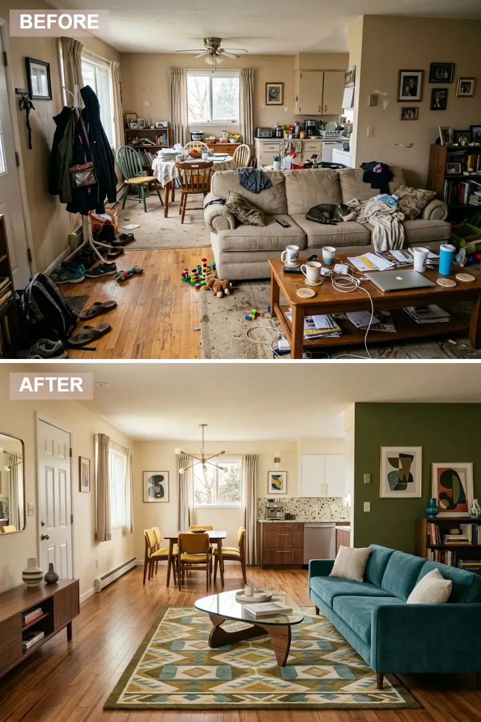
This design sends the space into the 1960s with bold geometry and saturated color. A deep olive accent wall frames a teal velvet mid-century sofa; a sculptural glass-and-wood Noguchi-style table sits on a diamond-patterned rug. The dining area runs a walnut table with mustard-yellow chairs under a brass sputnik chandelier, and the kitchen pairs white uppers with walnut lowers and a terrazzo backsplash. A walnut credenza by the door handles storage and display.
Mid-century works when you anchor it with one or two genuine icons and let everything else play support — a Noguchi table, a sputnik fixture, and you've set the era. The single olive accent wall (Farrow & Ball Bancha territory) is the disciplined choice; olive on all four would close the room in. The white-upper/walnut-lower kitchen split is a period-correct rhythm that still looks current. It's a high-energy look, so the restraint is what keeps it from reading like a theme restaurant.
Color Palette
Deep Olive
#4A5D2F
A single olive accent wall adds retro drama without overwhelming the space.
Peacock Blue
#2E8B8B
A teal velvet sofa delivers the quintessential mid-century color punch.
Golden Yellow
#D4A017
Mustard-yellow dining chairs inject vintage warmth and playful contrast.
Rich Brown
#6B4226
Walnut cabinetry and furniture supply the warm wood tones iconic to the era.
7. Nordic Glow: A Scandinavian Fresh Start
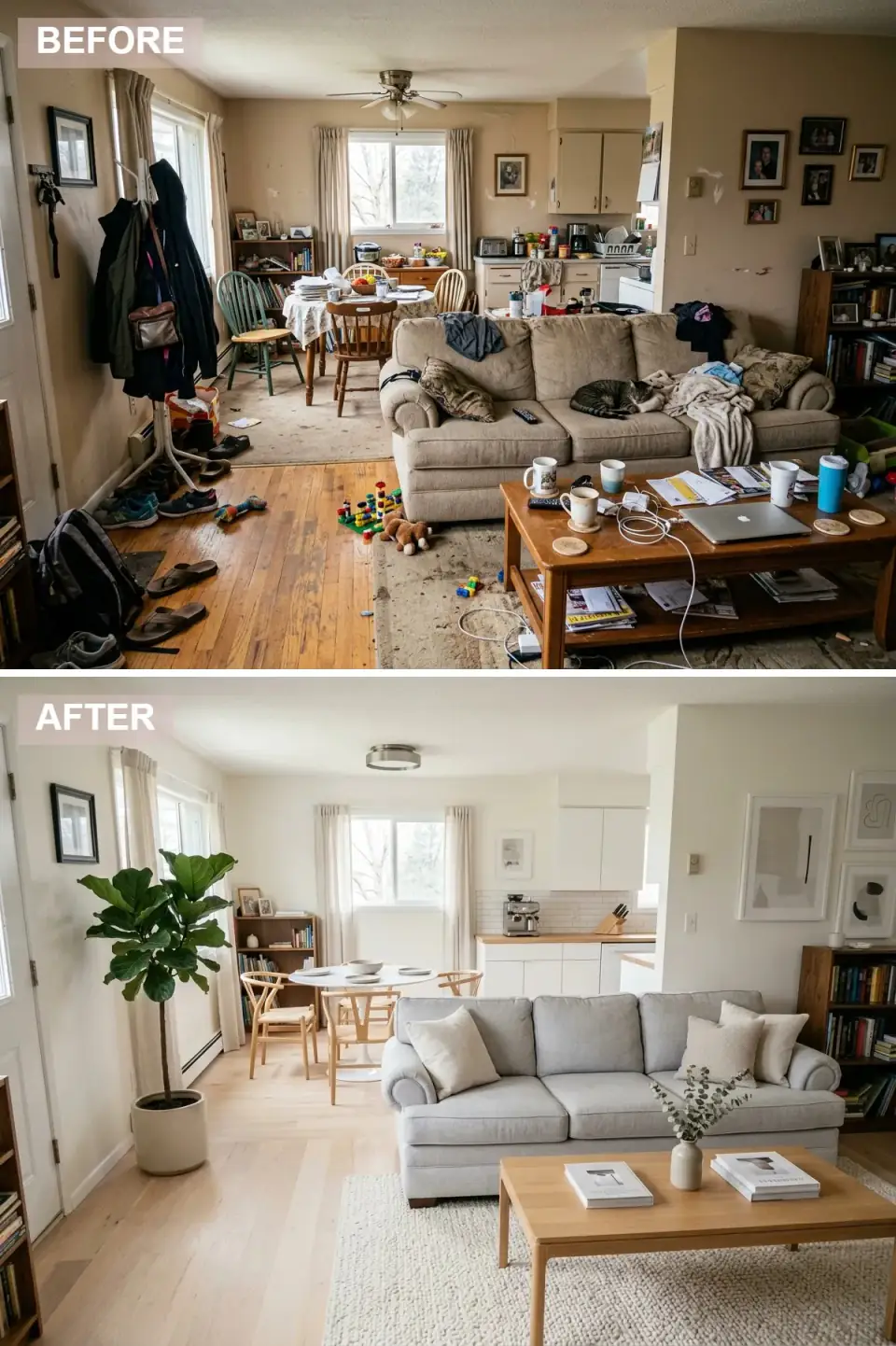
This transformation maximizes light by painting everything a clean soft white and laying pale wood floors. The sofa goes light grey with plush cushions, facing a simple oak coffee table styled with only books and a bud vase. The dining area gets a round white table with Wishbone-style chairs for a breakfast-nook feel, and the kitchen simplifies to flat-panel white cabinets, a wood peninsula, and subway tile. A large fiddle-leaf fig takes over the old coat corner, bringing life and scale.
Scandinavian is the easiest of these eight to get right and the easiest to make boring. Painting walls, trim, and cabinetry one soft white — Benjamin Moore Chantilly Lace is my default — blurs the boundaries and makes a modest open plan feel bigger. The save against sterile is texture: knits, bouclé, smooth oak, and one big living plant doing the work of color. Exposed furniture legs keep the floor visible, which is the quiet trick that makes the whole room breathe.
Color Palette
Soft White
#F7F7F2
Walls and cabinets in soft white, near Chantilly Lace, reflect maximum light.
Light Grey
#B8B8B8
A pale grey sofa adds subtle contrast while keeping the palette airy.
Natural Pine
#E0D0B8
Light oak floors and furniture add warmth without darkening the room.
Muted Green
#8FA88F
The fiddle-leaf fig supplies the only organic color the scheme needs.
8. Urban Edge: An Industrial Rustic Revival
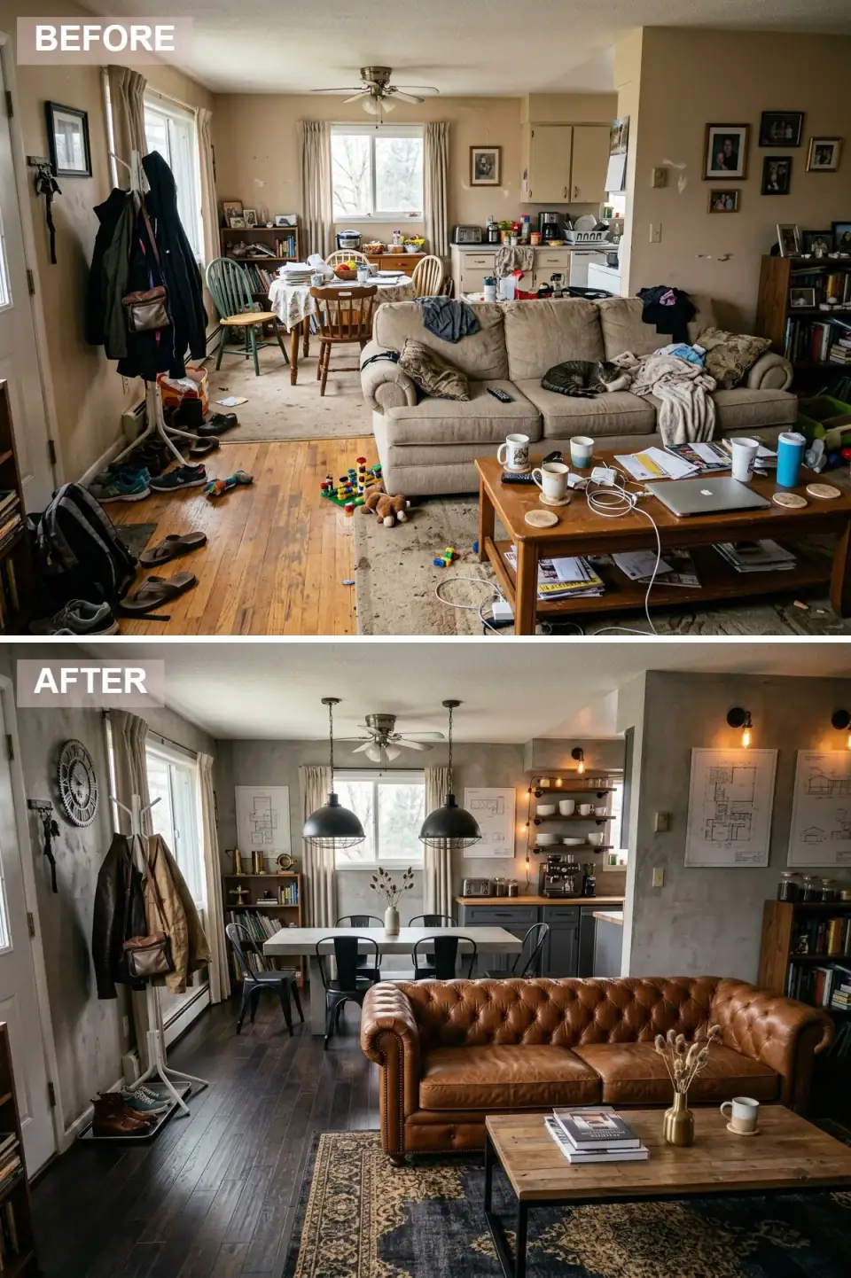
Raw materials and moody tones define this one. Walls take a faux-concrete texture over dark-stained wood floors; a caramel leather Chesterfield becomes the rugged centerpiece beside a reclaimed-wood coffee table and a black-and-gold vintage rug. The dining area runs a concrete-top table with black Tolix-style chairs under twin oversized black pendants. The kitchen sheds upper cabinets for open industrial shelving with Edison bulbs, dark grey lowers, and brass hardware.
Industrial is about honest materials, and the cheat that gets you there without gutting the place is finish, not structure — textured plaster or faux-concrete paint reads as a converted loft on a standard drywall wall. A real leather Chesterfield is the one piece worth the money; it anchors the room and genuinely improves with age. Dark grey lowers in something like Sherwin-Williams Iron Ore, brass to keep the palette from going flat, and architectural blueprints on the wall instead of family snapshots. It's the most "Brooklyn warehouse" of the eight, and the easiest to overdo — one or two raw gestures are plenty.
Color Palette
Cool Grey
#8C8C8C
Textured grey walls mimic raw concrete for an authentic industrial backdrop.
Tan Leather
#B5651D
A caramel leather Chesterfield adds rich, aged warmth and character.
True Black
#1A1A1A
Black metal chairs, pendants, and hardware reinforce the utilitarian loft look.
Dark Gold
#B8A179
Subtle brass accents keep the moody palette from feeling flat.
Pro Tips From the Renovation Designer's Chair
- Clear the room first. Empty it completely to read the bare architecture and find the best layout before a single piece of furniture goes back in.
- Zone without building walls. In an open plan, area rugs, lighting, and a single accent wall do the work of partitions — define living, dining, and kitchen visually.
- Paint is your highest-impact dollar. It's the cheapest big change you can make; refresh ceilings and trim to match so the palette reads cohesive, not patched.
- Edit ruthlessly. Pull 50% of your accessories, then layer back only what serves a purpose or holds real sentimental weight. Clutter is undecided decor.
- Light at three levels. Overhead, task, and ambient together transform both the function and the mood of a multi-use room — one ceiling fixture never will.
Reader Questions on Open-Concept Makeovers
How do I zone an open-concept living and dining space without building walls?
Use three tools: rugs, lighting, and color. A defined rug under the seating and another under the dining table draw invisible boundaries the eye respects. A pendant or chandelier over the table anchors that zone vertically, while a single painted accent wall can claim the living area. The goal is visual separation that still lets sightlines and traffic flow — which is the whole point of buying an open plan in the first place.
Which of these makeovers is the most budget-friendly?
The Scandinavian and coastal versions, by a wide margin. Both rely on paint, editing, and light-colored textiles rather than new furniture or structural work. A few gallons of white or soft blue, sheer curtains, a slipcover, and one large plant will carry most of the look. The industrial and jewel-tone versions cost more because they lean on statement pieces — a leather Chesterfield, velvet upholstery, encaustic tile — that paint alone can't fake.
Can I really use dark paint in a small open-plan room?
Yes, and it often works better than light. Wrapping all the walls — and ideally the trim and ceiling — in one deep hue erases the corners and makes the boundaries disappear, which reads as more spacious, not less. The jewel-tone makeover proves it. What you can't do is paint one dark wall and leave the rest white; that chops the room up. Commit fully to the color or don't go dark at all.
How do I keep an open kitchen from cluttering the whole living space?
Closed storage and a deliberate decision about your upper cabinets. Several of these makeovers swap uppers for open shelving, which looks great only if you keep what's displayed curated — a handful of ceramics, not your everyday clutter. If you're not disciplined about it, keep the closed uppers. Either way, give the kitchen a drop zone or mudroom buffer near the entry so daily bags and shoes never reach the open core.
Where should I start if my room feels cluttered but I have no budget?
Start with editing, which costs nothing. Clear the room, then bring back only the pieces that serve a function or that you genuinely love — usually about half of what was there. Then deal with the front-door drop zone, because an entry pile is what makes most open plans read messy. Paint comes next as your highest-impact cheap upgrade. Furniture replacement is last and often unnecessary once the first three steps are done.
Where to Read Next
If one of these living-room directions caught you, go deeper with our quiet luxury living room design guide and the dining-side companion on quiet luxury dining room ideas. The moody jewel-tone and industrial looks pair naturally with our moody organic modern kitchen design, and the full living and dining archive collects every makeover and guide in one place.
Sources & Further Reading
- Architectural Digest — open-concept design and color trend coverage.
- Remodelista — Japandi, Scandinavian, and minimalist interiors.
- Benjamin Moore — paint color references (Hale Navy, Revere Pewter, Chantilly Lace).
- Sherwin-Williams — color library (Accessible Beige, Agreeable Gray, Iron Ore, Tricorn Black).
- Farrow & Ball — deep heritage colors (Vardo, Bancha).
- Dwell — mid-century modern and industrial interiors.
- The Spruce — decluttering and small-space styling guidance.
Conclusion
Eight makeovers, one footprint — proof that a room's potential lives in the clarity of its design vision, not its square footage. Whether you gravitate toward sun-bleached coast, a moody gallery, or a raw industrial loft, the path from cluttered to curated always starts the same way: editing hard, choosing one color story, and bringing in furniture that fits both the space and how you actually live. Read the architecture first, pick the lane that's genuinely yours, and let the room follow your narrative instead of fighting it.

Nora Whitfield
Renovation Designer & Interiors Editor · Beacon, New YorkNine years of design-build renovation work across the Hudson Valley and the Northeast. Nora runs the Renovations, Room Guides and Renovation Mind desks — before-and-after studies, room-by-room design guides, and the long essays on why what we renovate matters.
More from Nora →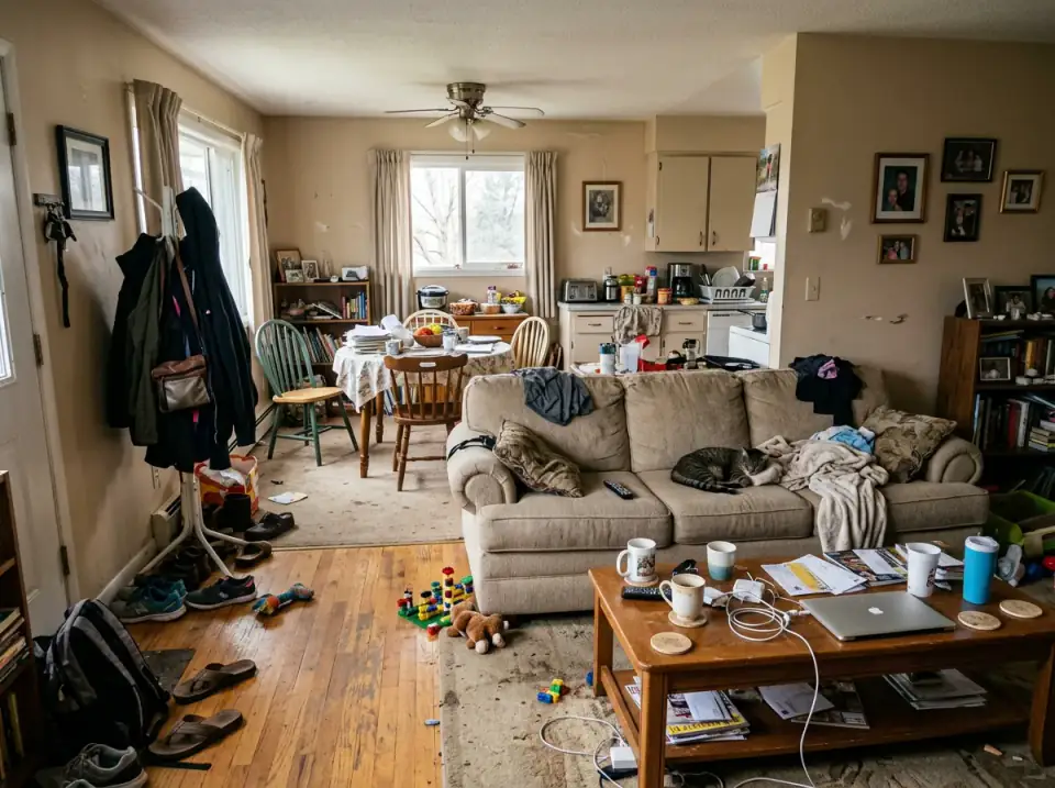

Reader notes