


I have walked more mustard-brick ranches in the Hudson Valley than I can count — Kingston, Poughkeepsie, the outer edges of Beacon, whole streets of them built between 1968 and 1978. Homeowners usually apologize for the house before I get out of the truck. They shouldn't. A ranch is the most forgiving shell in American residential building: shallow-pitch roof, simple rectangular framing, load path that runs straight down the perimeter walls. In this piece I walk eleven exterior directions for the same tired ranch, and for each one I tell you what the framing plan would have to say before you commit.
How I Read a Ranch Before I Redraw It
Seven years of design-build work taught me to open the framing plan before the mood board. On a 1970s ranch the answers I need are always in the same three places: the roof pitch (usually 3:12 or 4:12, which rules out some cladding profiles and rules in standing seam), the header schedule over the front openings (tells me whether that picture window can grow), and the foundation detail at grade (tells me whether stone veneer has a ledge to sit on or needs a supporting angle). Every facade below is a finish decision riding on one of those three structural facts.
The other habit I picked up on Northeast job sites: exterior work is the one moment you can fix the wall assembly for the next forty years. When the old siding comes off, the sheathing is open. That is when continuous exterior insulation, a proper water-resistive barrier, and a rainscreen gap cost a few dollars a square foot instead of a full re-side. I make the same argument in my longer piece on how exterior materials change a house, and it holds here: choose the look, but pay for the assembly underneath it.
1. Board-and-Batten Farmhouse Revival
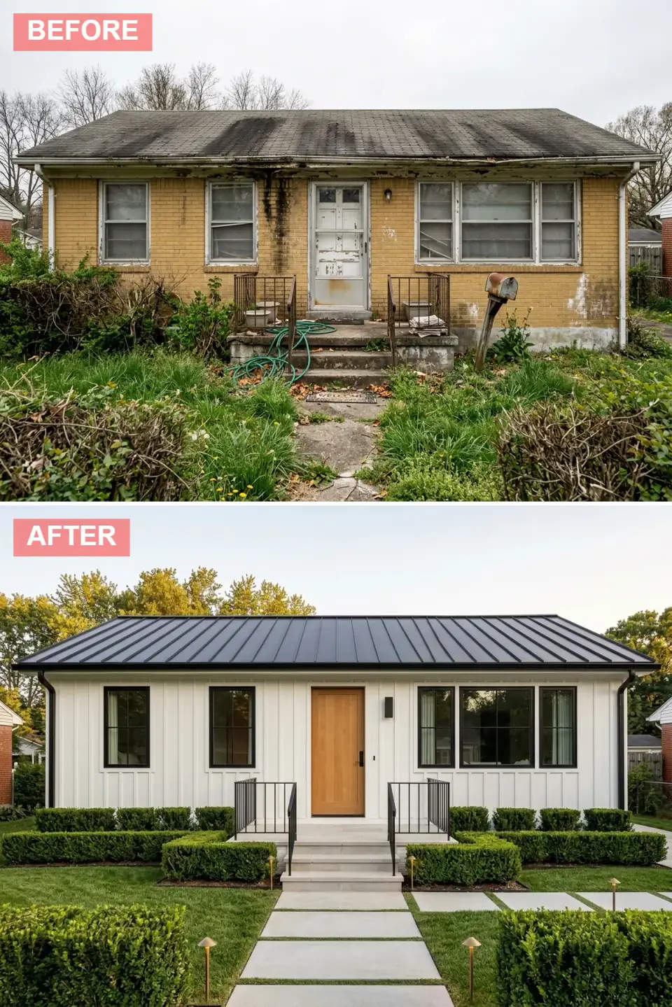
Vertical board-and-batten does something a low ranch badly needs: it fights the horizontal. The mustard brick disappears under a white field of battens spaced at roughly sixteen inches, the algae-stained three-tab shingles give way to a black standing-seam roof, and the aluminum sliders are replaced with grid-free black-framed units that read as deliberate openings rather than leftover holes. A white oak door and a clipped boxwood parterre finish the argument.
Here is what the plan would tell you. Board-and-batten over an old brick veneer means furring strips fastened through to the framing, not to the brick face — and that shifts the wall plane out by an inch and a half, which means new window trim depth, new drip caps, and a rethink of the soffit return. James Hardie's vertical panel with battens holds paint far better than pine in a Hudson Valley freeze-thaw cycle; if you want a real wood look, LP SmartSide is the middle option. Standing seam on a 4:12 pitch is fine, but ask the roofer for a snow-retention detail above the entry — I have seen a sheet of snow take out an entry light in Rhinebeck more than once.
Color Palette
Chalk White
#F2F2F0
Sits almost exactly on Benjamin Moore Chantilly Lace OC-65 — a cool clean white that keeps its temperature under grey Northeast skies instead of yellowing.
Matte Black
#1A1A1A
Read it as a matte black Kynar 500 coil finish; the low-sheen version hides oil-canning on wide panels far better than a gloss.
White Oak
#C19A6B
Rift-sawn white oak finished in Rubio Monocoat Pure keeps this honey tone without the plastic sheen of a marine varnish.
Boxwood Green
#4A5D23
Green Velvet boxwood holds this depth through a Zone 6 winter where English box burns at the tips.
2. Zen Minimalism in Stucco and Stone
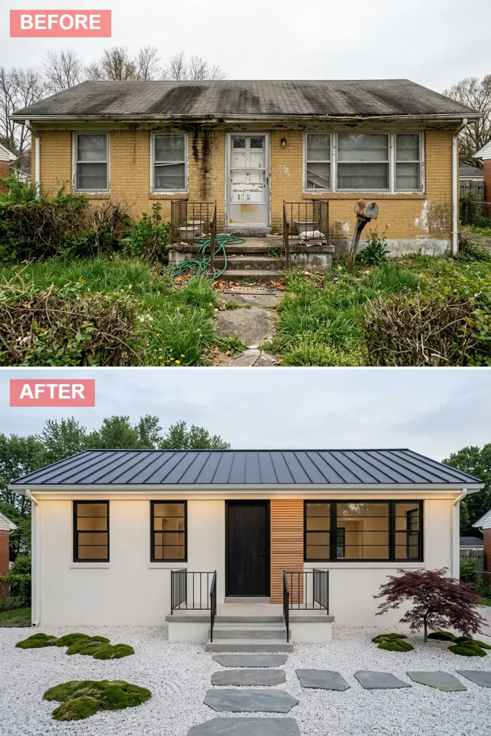
This version buries the brick under an unbroken coat of warm white stucco and lets the house become a quiet volume. The entry does the work: a jet-black door set against a vertical cedar slat wall, washed from above by recessed soffit lighting. The yard becomes a dry garden — white pebble, irregular bluestone steppers, moss islands, and one burgundy Japanese maple carrying all of the colour.
Plan-side reality check, because this is the direction that gets people in trouble in the Northeast. Traditional hard-coat stucco over an old brick veneer traps moisture unless you build it as a drainage assembly — lath over two layers of building paper or a drainage mat, with weep screed at the base and proper kick-out flashing at every roof-to-wall junction. On my Kingston projects I usually specify a Sto or Dryvit drainage EIFS instead of three-coat, precisely because the freeze-thaw cycle here punishes anything that holds water. The cedar slat wall wants a ventilated cavity behind it too, and it wants to be under an overhang; slats in open weather grey unevenly within two seasons.
Color Palette
Warm Ivory
#F0EBE0
Close to Sherwin-Williams Alabaster SW 7008 in an integral-colour finish coat, so chips never show a grey substrate.
Natural Cedar
#D4A373
Clear vertical-grain western red cedar, oiled annually — or thermally modified ash if you would rather not be on a ladder every spring.
Arctic White Pebble
#E5E5E5
Washed marble chip over a permeable fabric; skip limestone chip, which greys within a year under Northeast leaf litter.
Twilight Lavender
#7A6F8B
The dusk tone in the glass — worth matching in the 2700K lamp choice so the windows read warm, not blue, from the street.
3. Painted Brick, Tailored and Timeless
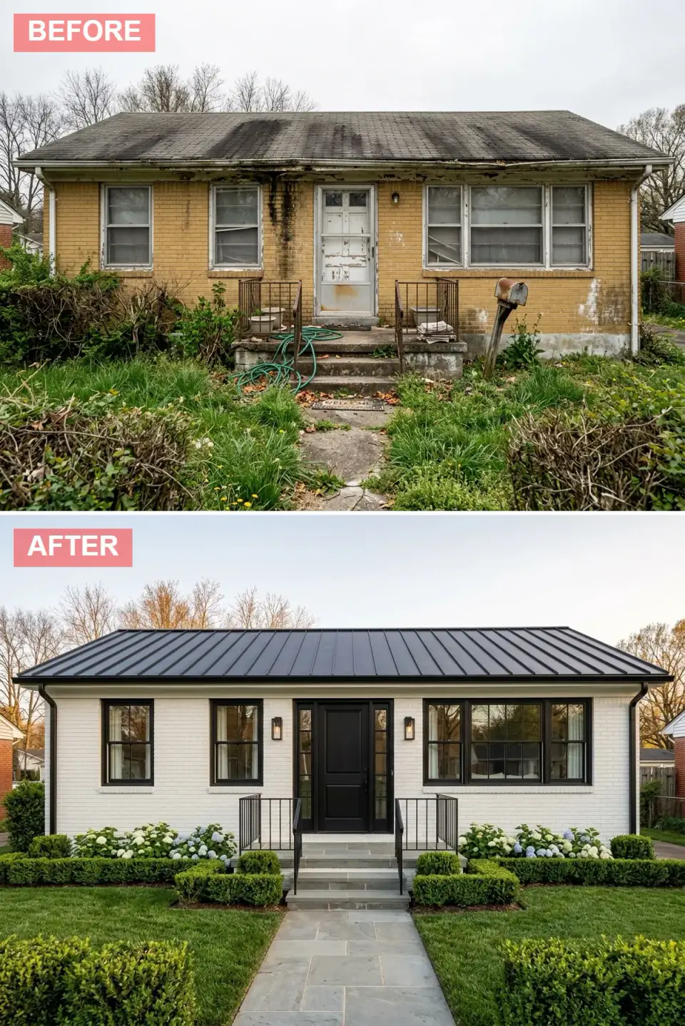
Rather than hiding the masonry, this direction keeps its texture and changes only its colour. Gallery white over the mustard brick, a black standing-seam roof, black-framed windows with a restrained grille, and a black door between slim sidelights under paired brass lanterns. Bluestone treads climb through layered boxwood and hydrangea in blue and cream.
This is the cheapest of the eleven by a wide margin and the one I recommend most often to clients who plan to sell within five years. The condition to check first is the brick itself: if the mortar joints are soft, if there is efflorescence at the base course, or if the house has no vapour issues resolved, paint will blister. Use a mineral silicate paint such as Keim or a breathable masonry coating like Romabio — standard acrylic exterior paint forms a film that stops the wall drying outward. My cost-vs-transformation ranking is the same one I use in the cottage exterior makeover comparison: paint first, windows second, roof third, cladding last.
Color Palette
Gallery White
#F5F5F0
Benjamin Moore White Dove OC-17 territory — warm enough to keep the brick texture readable instead of flattening it into drywall.
Ebony
#222222
Pairs with Marvin Ebony or Andersen Black window frames so the roof and glazing read as one continuous dark line.
Hydrangea Blue
#8DA6C1
Nikko Blue holds this tone only in acid soil — most Hudson Valley beds need sulphur amendment or the flowers come up pink.
Bluestone Gray
#7D868C
Full-colour Pennsylvania bluestone, thermal finish, two-inch treads set on a compacted base with a mortar-free joint.
4. Prairie Organic: Stone, Stucco, and Lavender
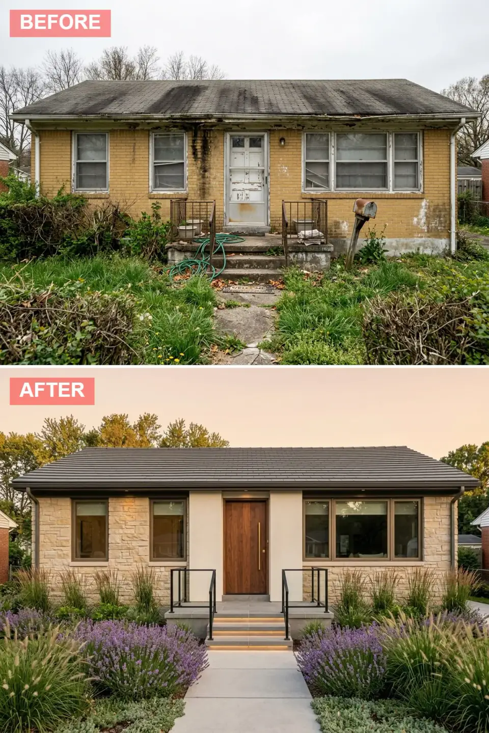
Two materials, one conversation. Stacked stone anchors the ends of the facade, smooth ivory stucco frames the entry between them, and a charcoal shingle roof with a generous overhang gives the whole thing Prairie shelter. Bronze window frames echo the vertical-grain wood door and its oversized brass pull, and the old concrete stoop becomes wide floating bluestone treads with concealed lighting. Lavender, ornamental grasses and silver groundcover replace the lawn entirely.
The structural question here is weight. Full-bed stone veneer runs roughly forty-five pounds per square foot and needs a supporting ledge cast into the foundation — on a 1970s ranch that ledge does not exist, so you are either bolting a steel angle to the foundation wall or specifying a thin-veneer product like Boral or Eldorado at around fifteen pounds per square foot, which mounts on lath and scratch coat with no structural ledge. Nine times out of ten I draw thin veneer. Also worth noting: that deep overhang is not decorative. On a south-facing Hudson Valley ranch a thirty-inch soffit projection shades the summer sun and still lets December light in.
Color Palette
Harvest Limestone
#D6C6A8
A tan-and-cream dry-stack blend; ask for a full pallet mock-up before setting, since veneer colour runs vary batch to batch.
Ivory Linen
#EDE8DE
Reads near Sherwin-Williams Shoji White SW 7042 — a visual pause that keeps the two stone masses from colliding.
Rich Walnut
#5C3A21
Marvin's Bronze cladding sits in this family and pairs with a walnut or sapele slab far better than black does.
Soft Lavender
#9B7EBD
Munstead or Hidcote English lavender survives Zone 6 if the bed is sharply drained — plant it on a gravel berm, never in clay.
5. Twilight Sanctuary in Dark Stone and Steel
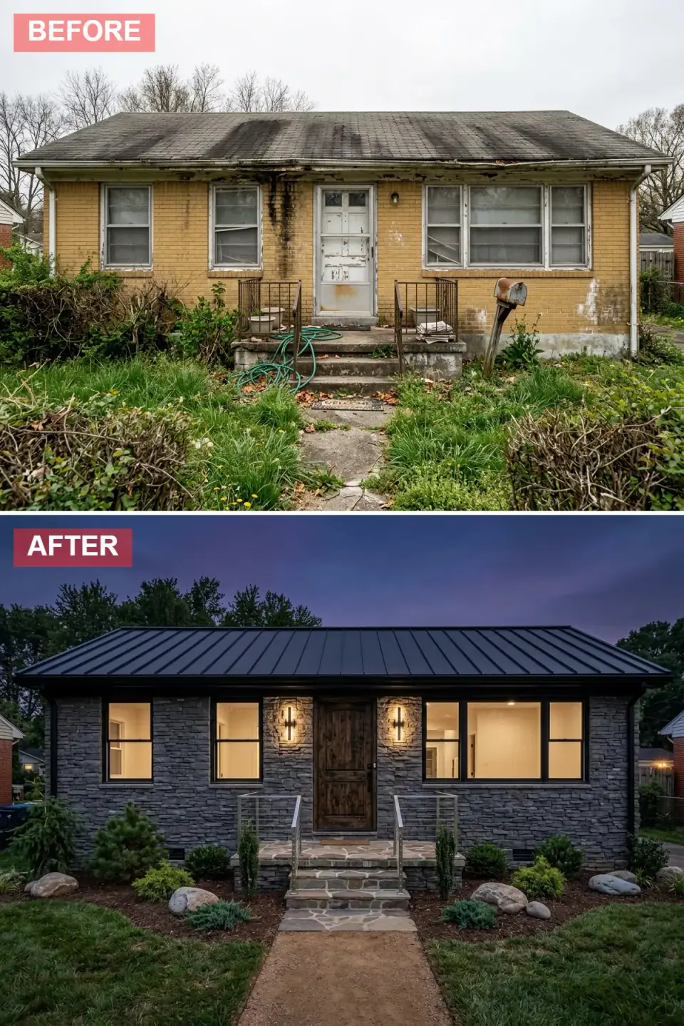
The moodiest of the eleven, and my personal favourite for a wooded lot. Charcoal ledgestone wraps the whole shell, a black standing-seam roof continues the plane, and generously scaled black-framed windows glow amber from inside so the house becomes a lantern at dusk. A heavy hand-carved plank door, vertical steel sconces, stainless cable railings on irregular flagstone, and a landscape of evergreens, boulders and decomposed granite finish the shift from suburb to ridge line.
Two plan-level notes. First, those bigger windows are the expensive part, not the stone. Widening a front opening on a ranch means a new header — typically a doubled LVL or a flitch plate depending on span and the point loads above — plus temporary shoring while the wall is open, and that is a permit item in every Hudson Valley municipality I work in. Budget the structural work separately from the window unit. Second, a fully dark facade in a wooded site swallows light; without the soffit and sconce layer the house reads as a hole in the trees after four in the afternoon.
Color Palette
Charcoal Slate
#4A4E52
A dry-stack charcoal blend; on a thin-veneer product ask for corner units rather than mitred returns, which chip.
Warm Amber
#F2C94C
This is a 2400–2700K lamp reading through low-E glass; anything at 3000K or above kills the lantern effect from the road.
Weathered Walnut
#3E2723
A solid plank slab in this depth needs a storm-rated overhang or the top edge checks within three Northeast winters.
Decomposed Tan
#A89880
Decomposed granite compacts well but needs a stabiliser binder on any slope over five percent or it migrates downhill.
6. Coastal Cottage With Navy Accents
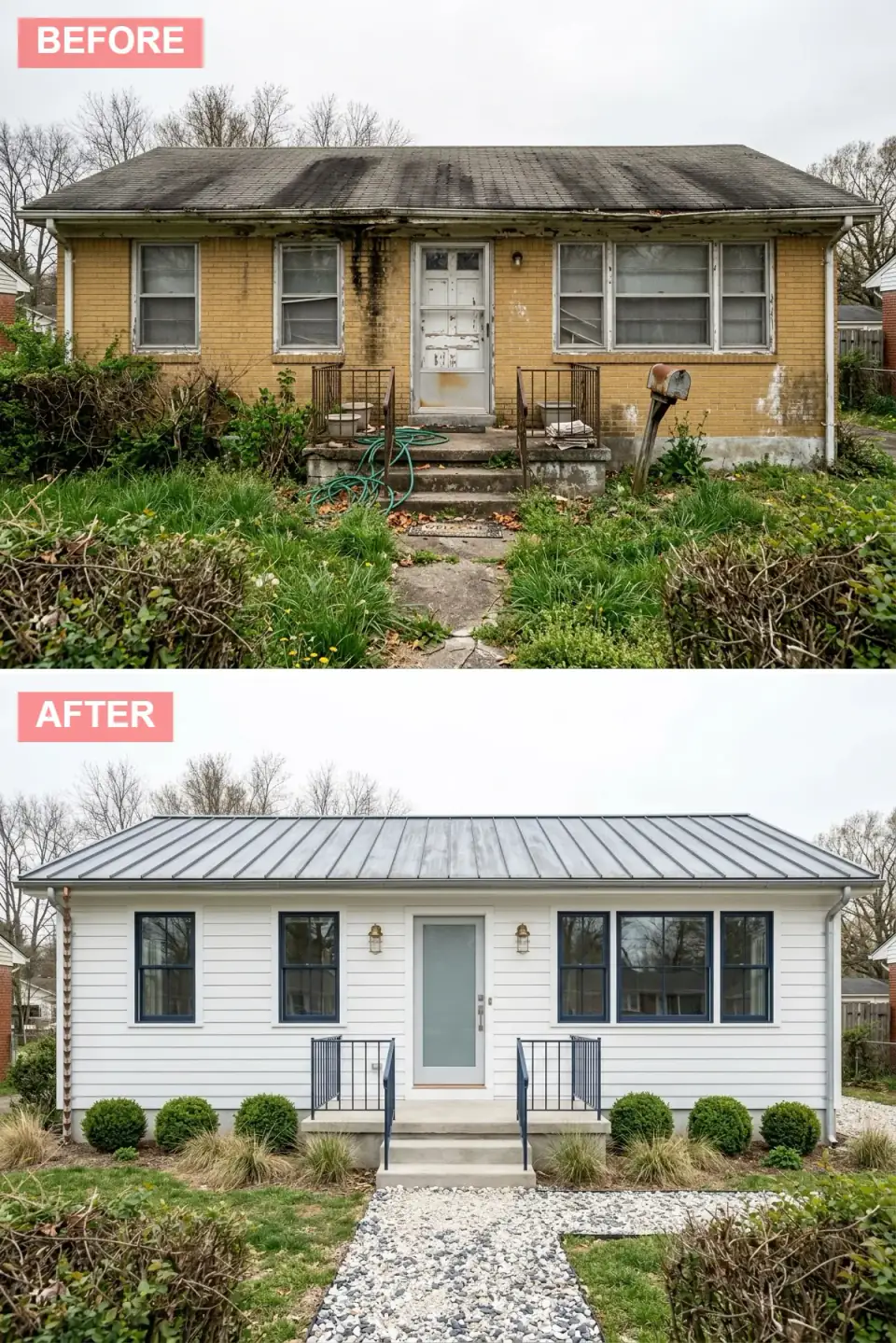
Crisp white horizontal lap siding gives the ranch a cottage lightness, and a galvanised standing-seam roof reflects the sky rather than absorbing it. Navy window frames and railings supply the only saturated colour on the shell. A frosted sea-glass door in pale sage adds privacy and a second, quieter hue, flanked by brass ship lanterns. The overgrown foundation planting is edited down to boxwood spheres, ornamental grass tufts and a mixed pebble walk.
The move I want to flag is the exposure. Four-inch lap gives a fussier, more cottage-like shadow line than seven-inch, and on a long ranch elevation the narrower exposure reads better because it multiplies the horizontal lines instead of stretching three of them across forty feet. James Hardie ColorPlus in Arctic White will hold that finish for well over a decade without a repaint in this climate. And do not skip the navy on the railings — an accent colour used on exactly one element looks accidental; used on two related elements it reads as a decision.
Color Palette
Sea Salt White
#F7F9FA
James Hardie ColorPlus Arctic White is the factory-finish match; the baked-on coating beats field paint on a coastal-look facade.
Deep Navy
#1B2A41
Benjamin Moore Hale Navy HC-154 in a satin exterior finish — deep enough to read black at distance and blue up close.
Pale Seafoam
#B2C5C1
Acid-etched laminated glass, not applied film — film delaminates at the edges after a couple of Northeast summers.
River Rock Gray
#C4C4C4
Three-quarter-inch washed river rock over a stabilised base; anything smaller tracks indoors on every shoe.
7. Desert Modern: Stucco, Steel, and Succulents
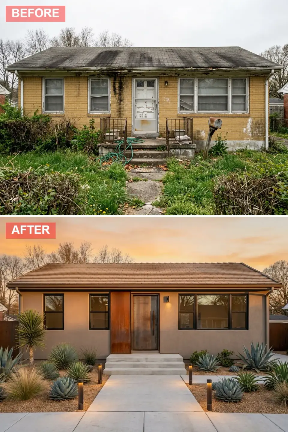
Warm taupe stucco, a flat terracotta tile roof, black-framed glass, and an entry that pairs a raw steel door with a copper side panel already starting to patina. Wide poured-concrete steps and walk give the composition mass, framed by agave, yucca and golden gravel that ask for almost no water. Bronze bollards line the path and pick up the sunset.
I include this one honestly labelled: it is a regional transplant. A clay tile roof weighs roughly nine to twelve pounds per square foot — two to three times an asphalt shingle — and a 1970s ranch truss designed for shingle plus a Northeast snow load has no margin for it. In Arizona or New Mexico this is a straightforward build. Here it means a structural review and probably sistered rafters, which is why I would draw a flat concrete tile or a standing-seam profile in terracotta before I would draw genuine clay barrel. The xeriscape, on the other hand, travels well — swap agave for hardy yucca, sedum and blue fescue and the same gravel-and-sculpture logic works in Beacon.
Color Palette
Warm Taupe
#B8A99A
Sherwin-Williams Accessible Beige SW 7036 territory in an integral-colour finish coat that hides hairline crazing.
Terracotta Sand
#C69C7B
Specify a lightweight concrete flat tile in this colour rather than true clay if the existing trusses are staying.
Aged Copper
#8C5E3C
Leave copper unsealed and let it go; a lacquer coat fails unevenly and you end up stripping it in year three.
Golden Gravel
#D4B483
Warm-tone decomposed granite; edge it in steel so the gravel line stays crisp against the concrete walk.
8. Japandi Forest Retreat in Cedar and Moss
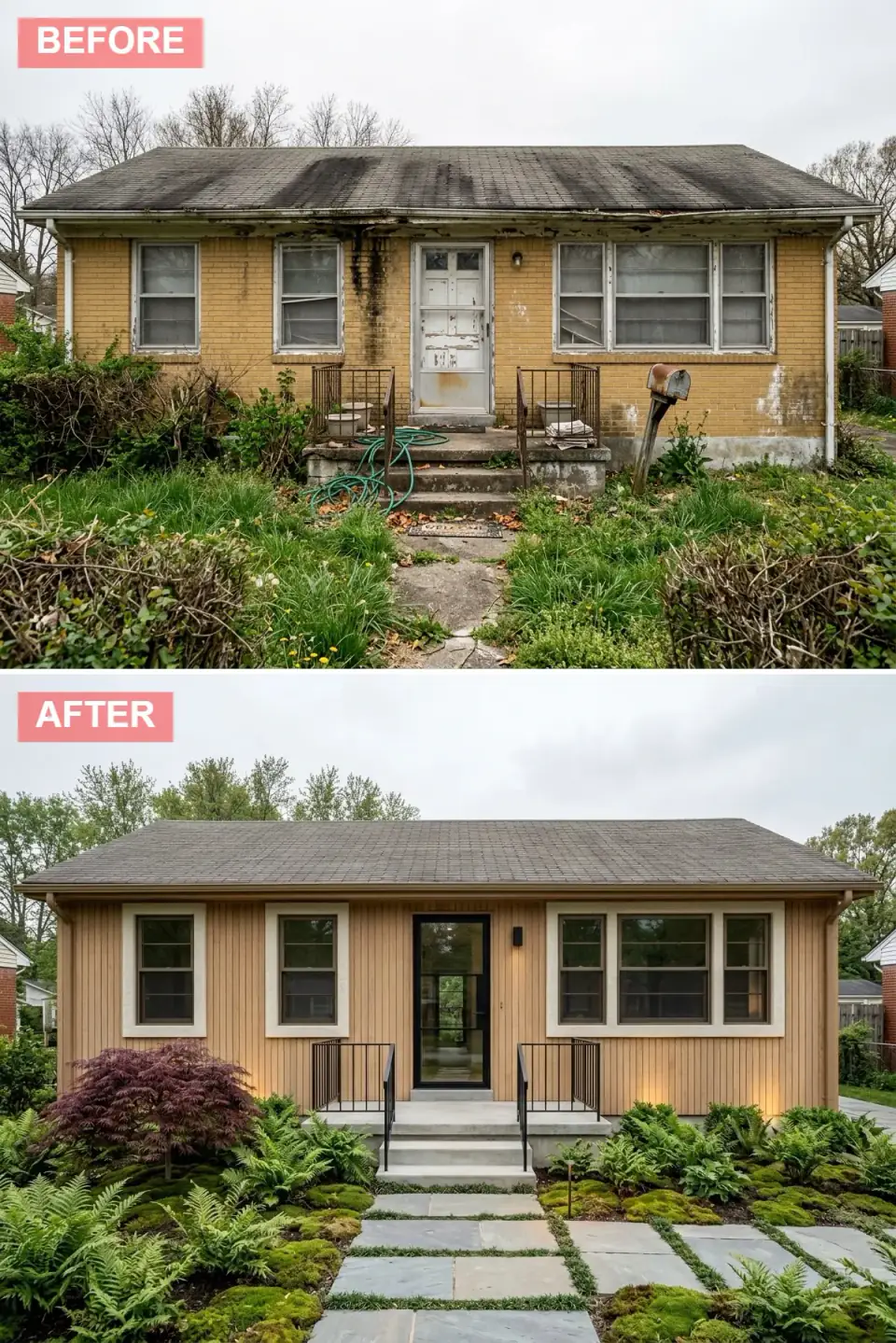
Vertical natural cedar replaces the institutional brick, and the house immediately reads as a cabin that belongs to its trees. White trim boxes the dark bronze windows and the black-framed glass door, layering three tones without a single loud one. The roof stays a modest grey shingle so the walls and the ground plane carry the story: emerald moss, ferns, one cascading Japanese maple, and bluestone pavers set with moss joints that slow your walk to the door.
What the plan would tell you is about the back of the board, not the front. Vertical cedar over an old wall assembly must be installed on horizontal furring with a vented gap at the bottom and a vented soffit at the top, otherwise the boards cup within two seasons — the wood needs to dry from both faces. Leave the cedar untreated and it silvers to a soft grey in about three years here; oil it and you have signed up for a maintenance cycle every eighteen months. I usually ask clients to pick one honestly rather than starting with oil and quietly giving up on it. This is the same reasoning I lay out in the Scandinavian brick-box conversion, where the wall build-up did more work than the finish.
Color Palette
Natural Blonde Wood
#DAB785
Fresh western red cedar; expect this tone for roughly two years before it moves toward driftwood grey.
Cloud White
#FAF9F6
Benjamin Moore Simply White OC-117 on a PVC or Boral trim stock so the white never checks against wet cedar.
Fern Green
#4F7942
Ostrich and Christmas fern both hold this depth in dry shade — the hard condition on most wooded Northeast lots.
Blue Gray Slate
#708090
Irregular bluestone with two-inch moss joints; set the pavers slightly proud so leaf blowing does not scour the moss.
9. Graphic Contrast: Charcoal Shell, White Portal
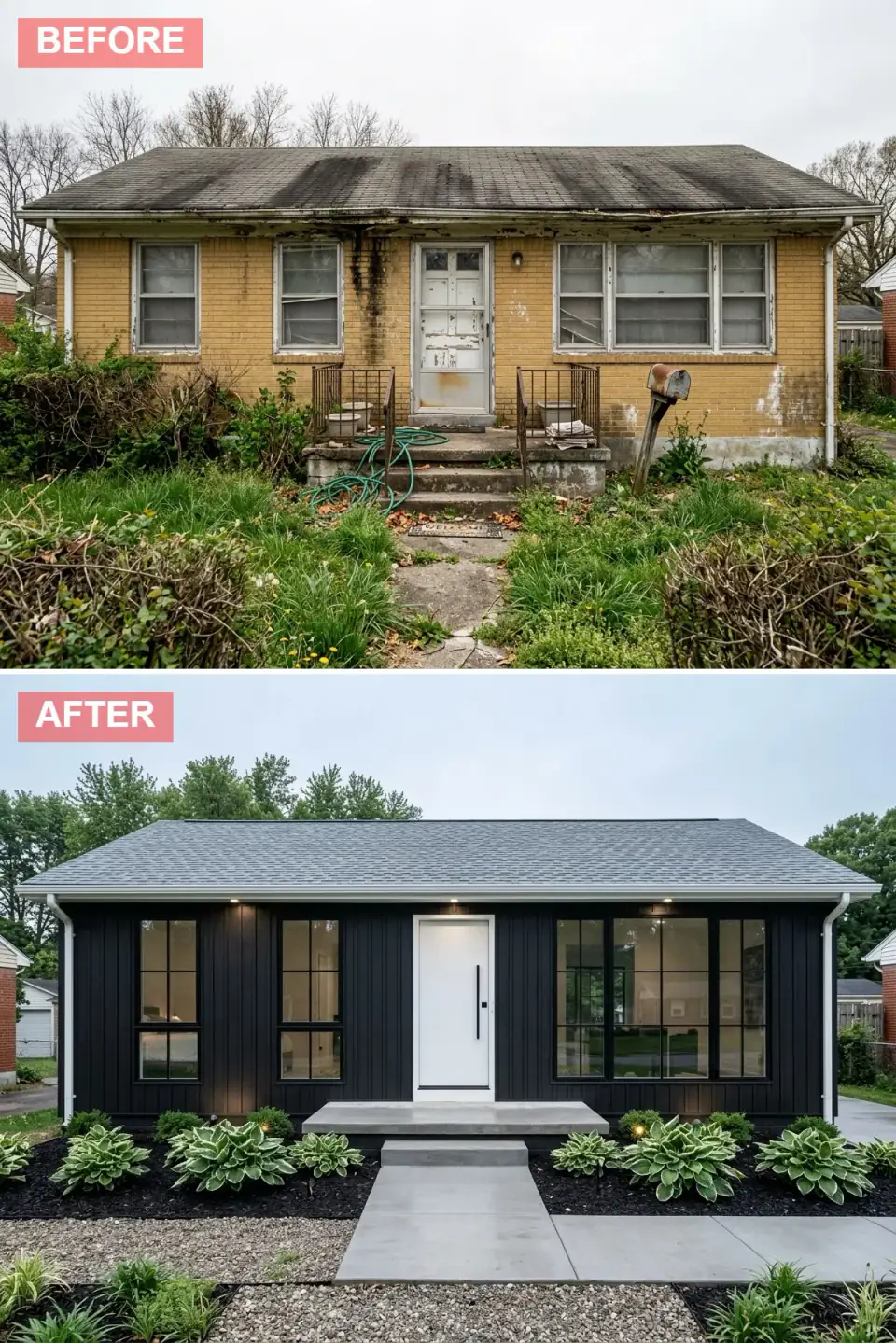
Against the grain of every bright makeover on this list, this ranch goes fully charcoal in vertical siding and becomes a shadow box for its own windows. A pure white door is the single focal point — a bright portal punched into the dark with one long vertical pull. Grey shingles stay understated, black window frames vanish into the field by day and glitter at night, and the landscape is edited to dark mulch, variegated hosta, concrete slabs and bands of grey river stone read as stripes.
Dark cladding has one technical consequence people underestimate: heat. A black wall on a south elevation can run forty to sixty degrees above ambient in July, which cooks vinyl outright and moves wood enough to open joints. Fiber cement in a factory-baked dark colour, or a thermally modified wood, is the honest answer — and behind it, a rainscreen gap matters more than on a light facade because the assembly needs somewhere to dump that heat. The soffit downlighting is not optional either, for the reason the plan makes obvious: a dark house with no facade wash disappears at night, and a house that disappears has no curb appeal at all after six in the evening.
Color Palette
Charcoal Black
#2B2B2B
James Hardie ColorPlus Iron Gray sits close; a factory finish resists the chalking that plagues field-painted dark walls.
Pure White
#FFFFFF
Benjamin Moore Decorator's White CC-20 in a high-gloss exterior enamel so the portal reads as an object, not a hole.
Graphite Gray
#5A5A5A
A mid grey that bridges black siding and green planting; without it the beds read as a void at the base of the wall.
Variegated Sage
#8FBC8F
Halcyon or Frances Williams hosta — the creamy margins are what make the planting legible against a black wall.
10. Prairie Craftsman With Stone Wainscot
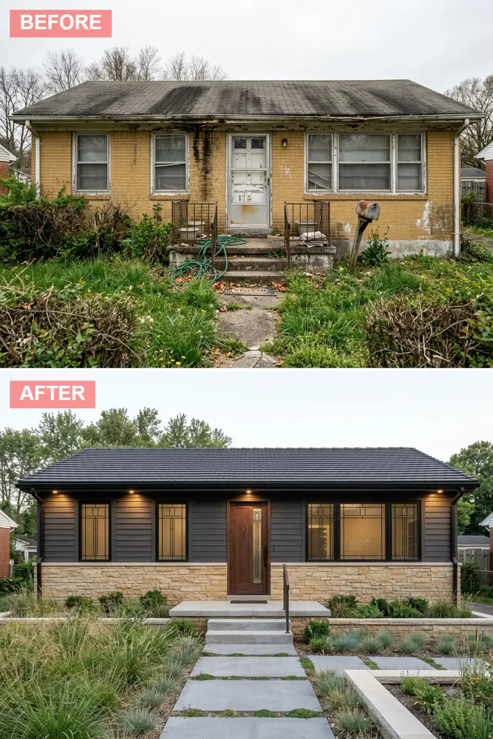
Splitting the facade horizontally gives the ranch a base it never had: tan ledgestone below, graphite clapboard above, a dark shingle roof with a deep overhang shading bronze-trimmed windows whose Prairie art-glass grilles glow amber at dusk. The door is a walnut slab with a vertical art-glass sidelight, lit softly from the soffit. Out front, a native meadow of tall grasses and blue fescue is crossed by oversized concrete steppers with grass joints and a low concrete wall that doubles as a bench.
The plan-literate reason this works is proportion. A ranch elevation is one long horizontal band, and the eye has nothing to measure it against. Introducing a wainscot at roughly thirty-six to forty-two inches gives the facade a datum line, and suddenly the house has a bottom, a middle and a top instead of one undifferentiated stripe. Stop the stone at a consistent height across the whole elevation even where grade falls — stepping the wainscot to follow a sloping lawn is the detail that makes it look like a veneer job instead of a base.
Color Palette
Graphite Gray
#3E3E3E
Benjamin Moore Kendall Charcoal HC-166 territory; on a lap profile it emphasises the horizontal without going black.
Honey Limestone
#CDB89F
A warm ledgestone with a bluestone sill cap — the cap is what keeps water out of the top of the wainscot.
Burnished Walnut
#5D4037
Quartersawn white oak in a walnut stain reads more Craftsman than actual walnut and costs a third less.
Sage and Wheat
#A8B88E
Little bluestem and Elijah Blue fescue carry this tone from June through a Hudson Valley January.
11. Heritage Modern: Limewash and Parterres
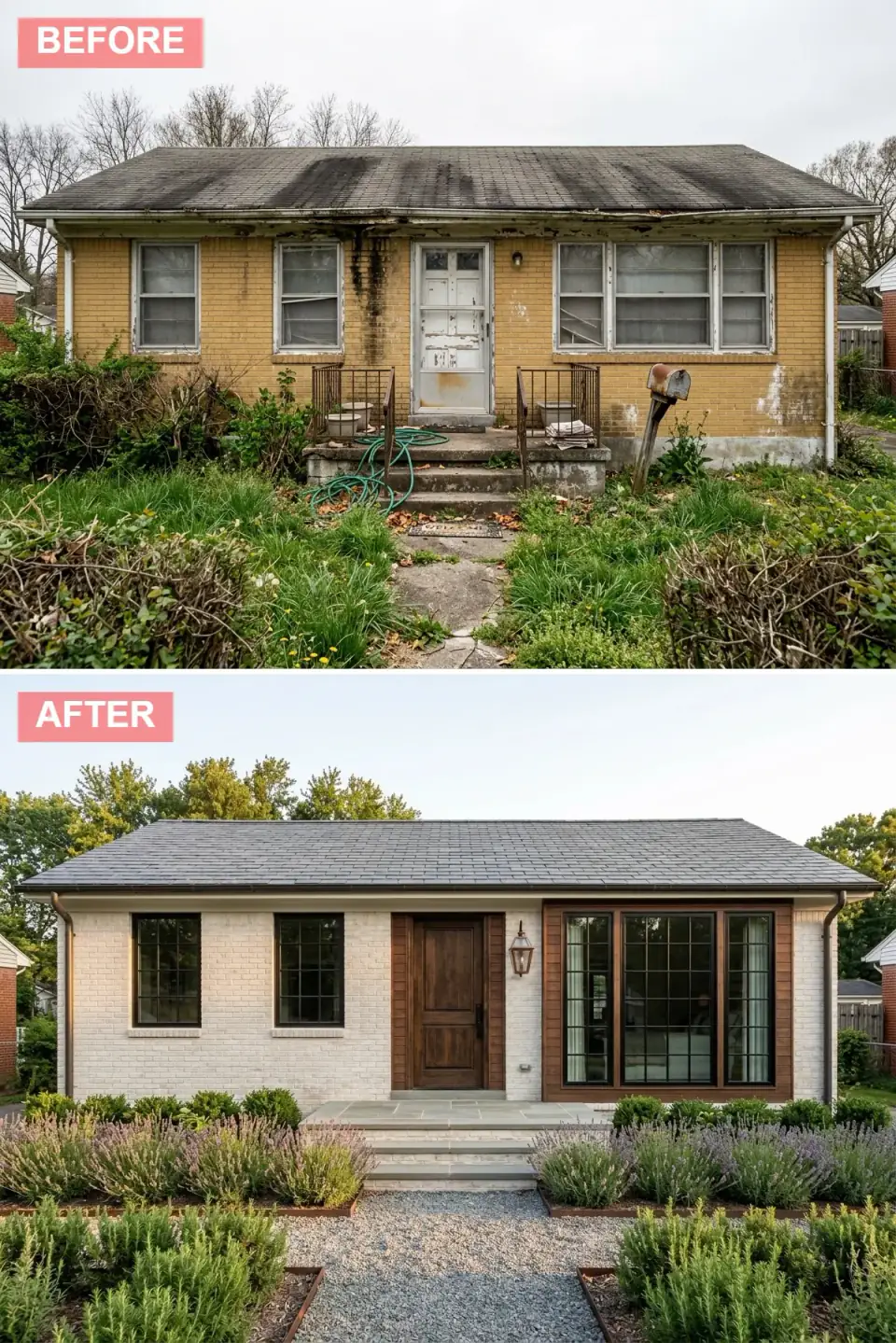
The last direction is the gentlest and, for a house with decent brick, the one I would argue for hardest. Limewash mutes the mustard to a soft mottled white while leaving every irregularity in the masonry visible. A grey shingle roof and black windows sharpen the edges; a walnut door and a vertical slat panel to its right add warmth and rhythm. One copper lantern nods to colonial precedent without costume. Out front, formal parterres of lavender and rosemary edged in rusted steel sit in gravel, with bluestone treads and landing giving the entry permanence.
Limewash is a genuinely different product from masonry paint. It is slaked lime that penetrates and carbonates into the brick rather than forming a film, so the wall keeps drying outward and the finish weathers by thinning at the high points instead of peeling in sheets. Romabio Classico is the product most of my Hudson Valley clients end up using; it takes a full mist-and-brush application and it looks wrong for about two weeks while it cures. Wait it out. And plan the parterres for winter — lavender goes leggy and grey by December, so the corten edging and the gravel geometry are what hold the composition together for four months a year.
Color Palette
Oyster White
#EAE6DA
Romabio Classico in Bianco White, thinned and brushed back at the corners so the original brick ghosts through.
Heritage Walnut
#4E342E
A deep chocolate on both door and slat panel; repeating one wood tone twice is what makes the accent look intentional.
Corten Rust
#8B4513
Weathering steel edging; set it on a gravel bed and keep it off the bluestone, since corten runoff stains light stone permanently.
Dusty Purple
#967BB6
Phenomenal lavandin is the reliable Zone 6 performer here — it survives wet Northeast springs that kill French lavender.
Pro Tips From the Renovation Designer's Chair
- Open the wall once. The week the old cladding comes off is the only cheap moment to add continuous exterior insulation, a proper water-resistive barrier and a rainscreen gap. Skipping it to afford a nicer door is the trade I talk clients out of most often.
- Fix the roof line before the wall colour. A shallow ranch pitch with sagging three-tab shingles undermines every other decision. Standing seam or an architectural shingle changes the silhouette more than any paint choice.
- Bigger glass is a structural project. Widening a front opening means a new header, temporary shoring and a permit. Price the framing separately from the window or the budget will surprise you at exactly the wrong moment.
- Treat landscape as architecture. Hedges, stone treads and a layered lighting plan restructure a facade's proportion before anyone reaches the door. On most of my jobs the ground plane carries a third of the visual change.
- Give the facade one natural material. Stone, real wood, or unsealed copper. An all-manufactured elevation photographs well and feels sterile in person — the eye reads the absence of grain even when it cannot name it.
- Match the direction to the region. Terracotta tile in the Hudson Valley and cedar-and-moss in Phoenix both fail the same test. The strongest exteriors on this list are the ones that could only be where they are.
Cost-Saving Moves
- Limewash or breathable paint over re-cladding. On sound brick this is roughly four to seven dollars per square foot installed in the Hudson Valley versus eighteen to thirty for fiber cement — the same visual reset for a quarter of the money.
- Thin stone veneer instead of full-bed. Around fifteen pounds per square foot rather than forty-five, which removes the foundation ledge or steel angle from the scope entirely. That structural line item alone often runs five figures.
- Keep the rough openings, change the units. Replacing windows within the existing framing costs a fraction of enlarging them. Black frames and a grid change do most of the modernising work on their own.
- Spend the landscape budget on the entry twenty feet. Treads, path, one specimen tree and four fixtures. The far corners of the lot can wait a season and nobody photographs them anyway.
Reader Questions on Ranch Exterior Renovation
Is it better to paint 1970s brick or cover it with siding?
If the brick is structurally sound and the mortar joints are tight, paint or limewash it. You keep the texture, you keep the wall breathing, and you spend a quarter of what a re-clad costs. Cover it with siding when the brick is failing, when you want to add continuous exterior insulation, or when the design genuinely needs a vertical material to fight the ranch's horizontal proportion. One caution: use a mineral or breathable masonry coating rather than standard acrylic exterior paint, which forms a film and traps moisture inside the wall.
What does it cost to reface a ranch exterior in the Hudson Valley?
As of 2026, limewash or breathable masonry paint runs roughly four to seven dollars per square foot installed. Fiber cement lap or board-and-batten lands between eighteen and thirty depending on trim complexity and whether you add a rainscreen. Thin stone veneer runs thirty to forty-five installed, standing-seam metal roofing fourteen to twenty per square foot. Labour in the Beacon–Kingston corridor sits above the national average by roughly fifteen percent. Add ten to fifteen percent contingency for the surprises that always appear once the old cladding is off.
Can I put a metal roof on a low-pitch ranch?
Yes. Standing seam performs on pitches as low as 3:12, and on some mechanically seamed systems lower still with the manufacturer's approval — always check the specific product's minimum slope. On a 1970s ranch the bigger questions are deck condition and load. Metal weighs less than asphalt, so structure is rarely the issue; rotten sheathing under thirty-year-old shingles usually is. Budget for deck replacement in the contract as a unit price per sheet so it does not become a change order argument mid-job.
Do dark exterior colours cause problems in a cold climate?
Heat, not cold, is the issue. A dark south-facing wall can run forty to sixty degrees above ambient in midsummer, which distorts vinyl and moves solid wood enough to open joints. Fiber cement with a factory-baked finish or thermally modified wood handles it; so does a rainscreen gap that lets the assembly vent. In winter a dark wall actually sheds snow and ice a little faster. The real design risk is nighttime: a dark house without soffit or facade lighting simply disappears from the street.
Which of these eleven directions adds the most resale value?
In the Northeast market, the painted or limewashed brick schemes and the board-and-batten farmhouse consistently return the most, because they read as broadly desirable rather than personal. The National Association of Home Builders' remodelling data has ranked exterior work — siding, windows, entry doors — among the highest-recouping projects for years. The dark stone and desert modern directions are the strongest design statements on this list and the narrowest audience. If you plan to sell within five years, choose from the first group; if you plan to stay, build the house you actually want.
How much of the transformation comes from landscaping alone?
More than most homeowners expect. On my projects, restructuring the ground plane — treads, walkway, foundation planting, one specimen tree and a layered lighting scheme — accounts for roughly a third of the perceived change, at maybe a tenth of the total budget. It is also the only part you can phase over two or three seasons without the house looking half-finished. If the money is tight, do the entry sequence properly and let the cladding wait a year.
Where to Read Next
If you want to see the same before-and-after logic run across a wider set of houses, start with ten exterior makeovers from bland to breathtaking, then compare it against the material-first breakdown in how exterior materials change a house. Everything filed under exterior renovations follows the same rule I use on site: read the plan, then choose the finish.
Sources & Further Reading
- National Park Service, Preservation Brief 1: Assessing Cleaning and Water-Repellent Treatments for Historic Masonry Buildings — on why film-forming coatings fail on brick.
- U.S. Department of Energy Building America, Solution Center guidance on wall assemblies, water-resistive barriers and continuous exterior insulation.
- Building Science Corporation, BSD-013: Rain Control in Buildings — the rainscreen and drainage-plane reasoning behind every re-clad above.
- National Association of Home Builders / Remodeling, Cost vs. Value Report — recouped-cost data on siding, window and entry-door replacement.
- Metal Construction Association, technical bulletins on standing-seam minimum slope and snow retention.
- James Hardie, HardiePlank and HardiePanel installation and ColorPlus specifications.
- LP Building Solutions, LP SmartSide product and application data.
- Natural Stone Institute, technical resources on adhered stone veneer and full-bed masonry support.
- Western Red Cedar Lumber Association, installation and finishing guidance for exterior cedar siding.
- Cornell Cooperative Extension, plant selection guidance for New York State growing conditions.
- This Old House, exterior renovation archive.

Nora Whitfield
Renovation Designer & Interiors Editor · Beacon, New YorkNine years of design-build renovation work across the Hudson Valley and the Northeast. Nora runs the Renovations, Room Guides and Renovation Mind desks — before-and-after studies, room-by-room design guides, and the long essays on why what we renovate matters.
More from Nora →
Reader notes